Can I edit landing page styles for desktop and mobile separately?
Yes, you can.
In the page editor, click the 'Edit styles' icon at the top of the preview page.
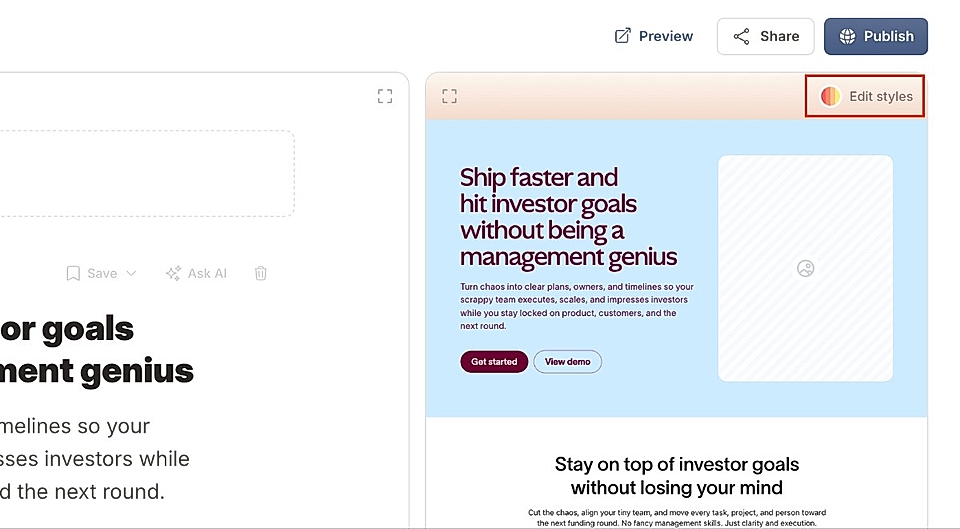
This opens a chat box where you can ask for any design changes, separately for desktop and mobile.
For example, you can say:
"Change the hero title to 36px on desktop and 24px on mobile".
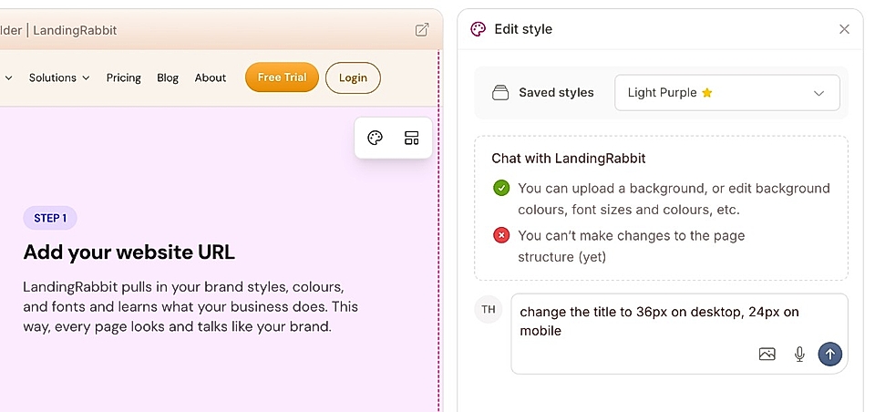
LandingRabbit will apply those changes for you in a few seconds. When you preview the page in both desktop and mobile views, you'll see that each screen has a different font size after your changes.
What can be styled separately for desktop and mobile?
You can adjust (at least):
- Font sizes
- Spacing between elements like titles and descriptions
- Padding above and below each content section
- Order of images in boxes and alternate layouts
All of these can be customized independently for desktop and mobile layouts.
Where can I find more information about section-specific styles?
Learn more about global and page-specific styles and for section specific instructions, see:
If you need any help with design or have feature suggestions, don’t hesitate to send us a message via [email protected]