19 best call-to-action examples to inspire your next landing page
Have you ever visited a landing page and thought, “How do I get started?”
You’re not alone.
We’ve all experienced that – you land on a page, read a bit, and then you are lost. You’re not sure where to go or what step to take to try this solution or get someone to help you with questions.
You don’t want that to happen to your SaaS.
That’s where carefully planned call-to-actions (CTAs) come in. A strong CTA guides the page visitor already in the hero, gives them a nudge after scrolling the whole page, and makes sure they don’t leave without taking some action.
But there’s no single formula for the call-to-action button and text. Indeed, as the examples from the best B2B websites below show, the CTAs are context-specific and keep changing even inside your website.
In this post, you’re going to see the best call-to-action examples from various landing pages and learn what makes them work. Spoiler alert: it’s all about speaking to your visitors like a human and showing them what’s in it for them.
Call-to-action best practices for SaaS landing pages
But before we dive into 19 call-to-action examples, let’s briefly discuss some of the best practices that every SaaS marketer should follow.
1. Use actionable language
Tell visitors exactly what to do next. Keep call-to-action texts short and simple, and use first-person when possible to make it feel personal.
2. Make it clear what to expect
Let visitors know what to expect when they agree to sign up. Remove uncertainty and build trust by showing the price, possible free trial length, if a credit card is required, or what to expect next (for example, a call from your team).
3. Show what’s in it for the page visitor
Highlight the outcome they’ll get. Make it clear why clicking your CTA is worth their time versus something else they could build for their business at the same time.
4. Consider the buyer’s journey stage
Tailor your CTA to where the visitor is in their decision-making process. Did they just start exploring, or are they looking for something very specific? Use a softer approach or create a sense of urgency depending on the buyer’s journey stage.
5. Tailor to the user intent and page type
Match your CTA to the page’s purpose, the page content, and your SaaS product complexity. Most SaaS companies create several landing page types, and most of them need custom call-to-action texts for optimal results.
6. Add social proof
Build trust by showing others have taken the action and benefited. Testimonials or user counts can help remove hesitation.
Hero section call-to-action examples for SaaS landing pages
Most visitors don’t scroll further, and they stop at the hero. You lose some as visitors hit the back button. But for the rest, you’d want them to either hit the CTA button in the hero or continue reviewing your offering.
That’s why it’s crucial to plan your hero texts and CTA buttons carefully. Let’s take a look at some of the best SaaS CTA examples for the hero section.
Hoppy Copy
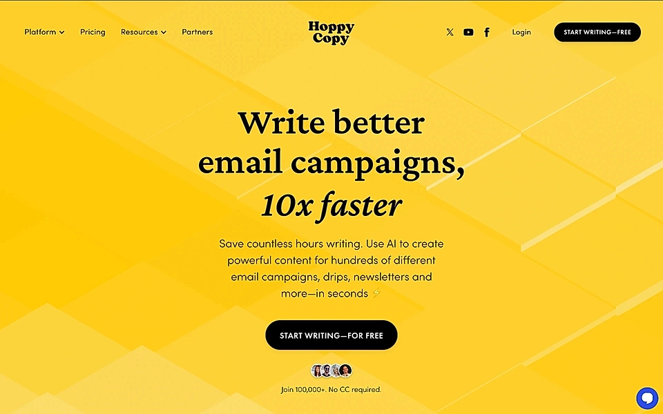
Hoppy Copy is one of my favourite SaaS websites. It all starts with the title, ’Write better email campaigns, 10x faster’ and the connected CTA button copy text saying ‘Start writing – for free’.
Just like the best CTA button texts in general, it’s actionable and removes hesitation. The social proof with authentic user images and the text, ‘Join 100,000+’, gives confidence to every page visitor thinking to sign up.
Take notes: this combination is designed to increase sign ups and suits any SaaS landing page.
OpusClip
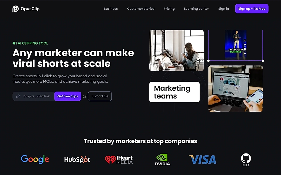
OpusClip shows how actionable a SaaS hero section and its call-to-action button can be when it’s all in.
As the page visitor, you can either add a link to a YouTube video and click ‘Get free clips’ or upload your own file, and that action kickstarts your journey with the product.
If you are looking to activate as many page visitors as possible and your SaaS has an onboarding journey, including an upload of a video or image, this tactic might be yours to steal.
Copperx
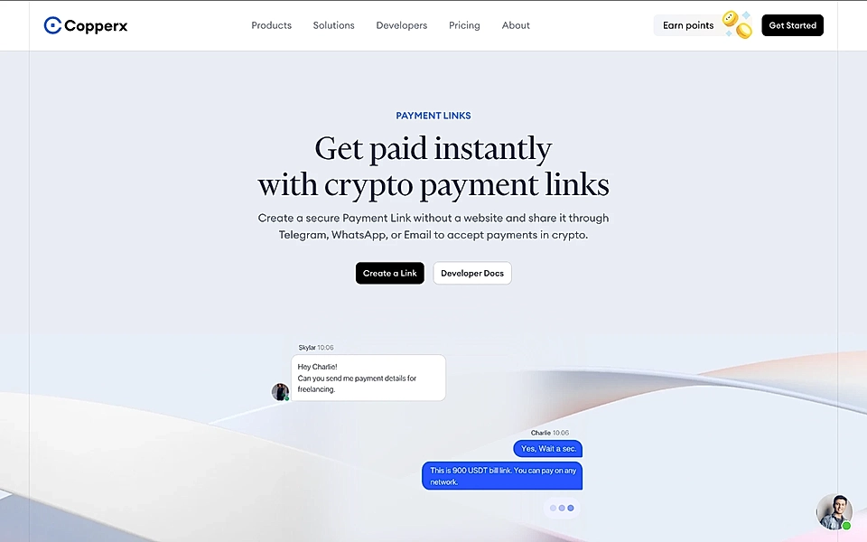
Copperx’s landing page hero section goes against the default advice of having just one CTA button.
But there’s a good reason for it.
If your SaaS is selling something very technical, visiting the developer documentation might be as important in the buyer’s journey as creating the account. Often, before you even consider signing up, you can find test examples from the documentation to simulate how the integration would work.
Users who first visit the documentation to learn more about your developer-focused SaaS product features are likely to be successful in your onboarding flow and with the steps immediately after. With the documentation, they might have already planned it all, and the actual sign up and following steps are just the well-orchestrated work to be done.
So don’t always listen to the most common SaaS landing page best practices – building a high-converting landing page starts from understanding your ideal customers thoroughly and tailoring the experience to maximize every sign up’s success potential.
Do you struggle with creating landing pages that convert? With LandingRabbit, you can plan audience and keyword-specific pages for your SaaS.
Lemlist
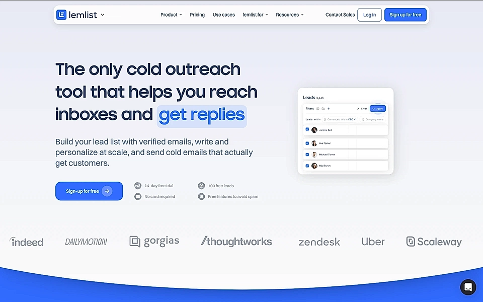
Lemlist’s SaaS landing page hero texts are fantastic – they resonate with customers who’ve struggled to get their email messages delivered and personalized to each recipient.
The CTA button text, ‘Sign-up for free’, is generic and doesn’t steal the limelight from texts on the right. ’14-day free trial’, ‘100 free leads’, ‘No card required’, and ‘Free features to avoid spam’ answer to frequently asked questions and things the page visitors might consider blocking their decision.
Adding small texts, typically just below the call-to-action button, can help page visitors make their minds faster – especially if you position your SaaS as low risk and something that takes minimum effort to get started with.
Showdini
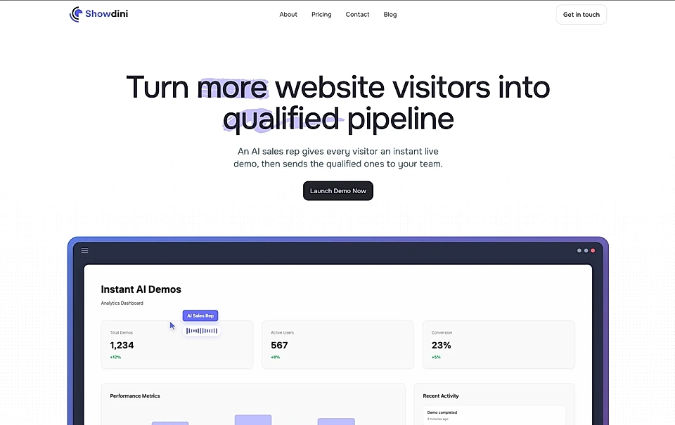
One of the most interesting landing page call-to-actions I've seen is with Showdini, an app that allows you to create a demo where an AI agent guides you through your service.
When you go to the Showdini website, you'll see a fairly typical hero section with a "Launch Demo Now" button. You can also hover over the video below the hero text, which lets you access the demo as well.
But this isn't just another typical click-through demo as you would have with Arcade or similar tools. Instead, it's a call with an AI agent that has a recording of your service overview, including the most typical actions a user can take.
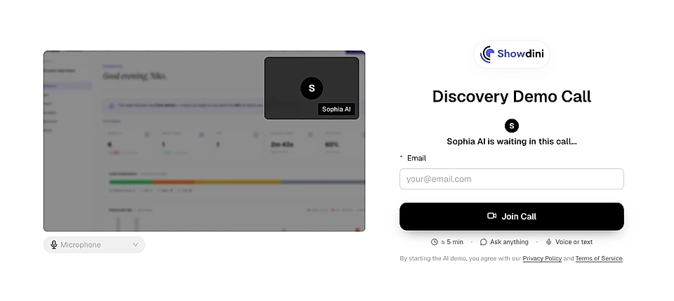
When a user chooses to see the demo, they're first asked to enter their email address. After that, they can have a natural discussion with the AI agent, which walks them through the core functionality of the service while answering any questions they have along the way. It truly feels like another Google Meet, focused on the service, of course.
Showdini's page shows a brilliant call-to-action example for those who want to demonstrate their service to prospects, but don't want to push them to book a call. With Showdini, you can build the same experience, too.
Dosu
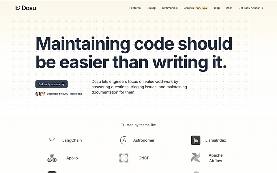
When your customers search for a solution, one of the questions in their mind is if anyone else is using this product. Especially if your SaaS is starting out and you are not included in the top 10 lists in your product category.
That’s when adding social proof just below your call-to-action button can help. Dosu’s hero section has a CTA button text ‘Get early access’, indicating that the product is not ready for launch just yet. However, Dosu’s website team has balanced that nicely with the small text, ‘Used daily by 2000+ developers', and a handful of authentic user images.
Being transparent that it’s early days for your SaaS, but showing that others have already signed up builds trust and increases your chances for conversions.
Quickbooks
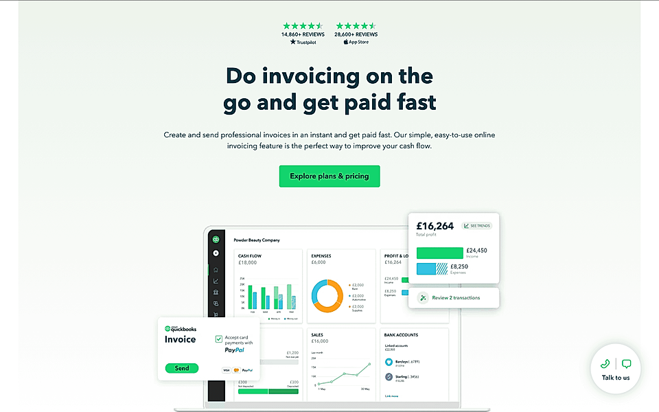
If you are selling something more complex than a one-feature app, consider softening your call-to-action button text.
That’s what Quickbooks's hero does with the call-to-action text ‘Explore plans & pricing’.
Changing your invoicing software is a big deal, and no business would casually take over that project. Because this Google Ads landing page targets entrepreneurs and small businesses that are very price-sensitive, a softer CTA to compare plans totally makes sense – it’s one of the first things leads would like to check before digging deep into the features.
Are you running Google Ads campaigns but struggle with converting visitors into leads? A Google Ads landing page builder helps you tailor pages to the campaign’s audience.
Call-to-action section examples for SaaS landing pages
One of the most important elements of a high-converting SaaS landing page template is the CTA section. Just before the footer, it’s the last call for any website visitor to continue the journey with you. If your lead scrolled all the way, they are likely to consider your services seriously, and you want to use your last opportunity wisely.
Let’s take a look at how some of the best SaaS companies are doing it today.
Supahub
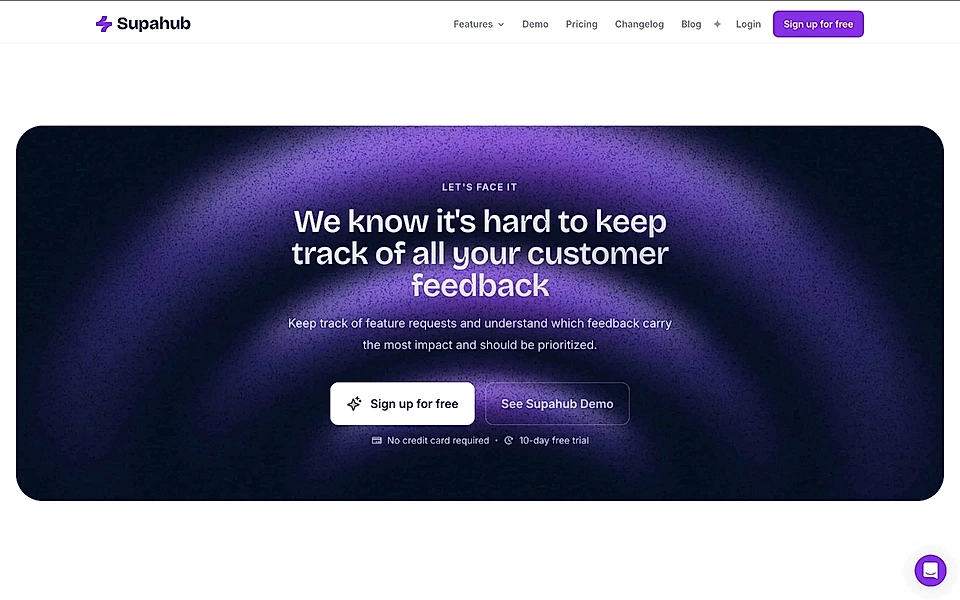
I’m a big fan of Supahub’s landing pages, and the CTA section is one of the many reasons why.
The landing page shows a feedback collection solution, and the CTA section agitates page visitors’ pain one more time. ‘We know it’s hard to keep track of all your customer feedback’ conveys that Supahub is there for their customers, really gets it, and reminds the customer why they landed on this page in the first place.
All Supahub’s CTA sections are context-specific and tailored to each landing page, which increases conversions instantly.
Are you looking to create context-specific landing pages? A SaaS product page builder makes sure prospects know if you can help with their specific job to be done
OpusClip
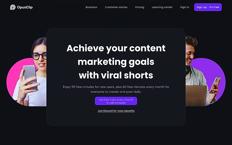
As we saw with the best hero sections, OpusClip is doing a great job with its website and landing pages in general, and the CTA section is no exception.
The description text underneath the title clearly tells what you get if you get started. Instead of using “Sign up” in the CTA button, the text ‘Get fee clips every month’ motivates the page visitor to get started without risk and no credit card needed.
OpusClip’s CTA section is an excellent SaaS copywriting example that makes it more likely to convert traffic into sign ups.
Hotjar
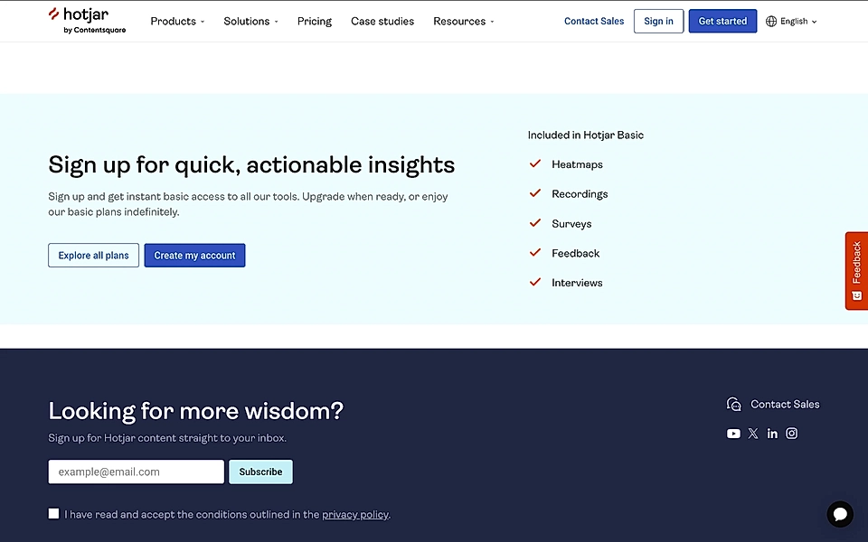
What’s the primary goal of the call-to-action section?
It’s to motivate the lead to take action and continue the buyer journey with you.
Hotjar’s CTA section has many ingredients that drive success. It starts with the title, ‘Sign up for quick, actionable insights’, highlighting the key capability.
But what makes this CTA section stand out from the crowd is the clarity of what you get if you sign up. On the right, you’ll see a list of features included in the Basic plan. On the left, the description text reveals that you can use the Basic plan for free – ‘Upgrade when ready’.
Hotjar’s CTA removes some of the anxiety SaaS buyers feel when searching for a solution – way too often, costs and what features are included in a specific plan can be relatively tricky to find on SaaS websites.
Typeform
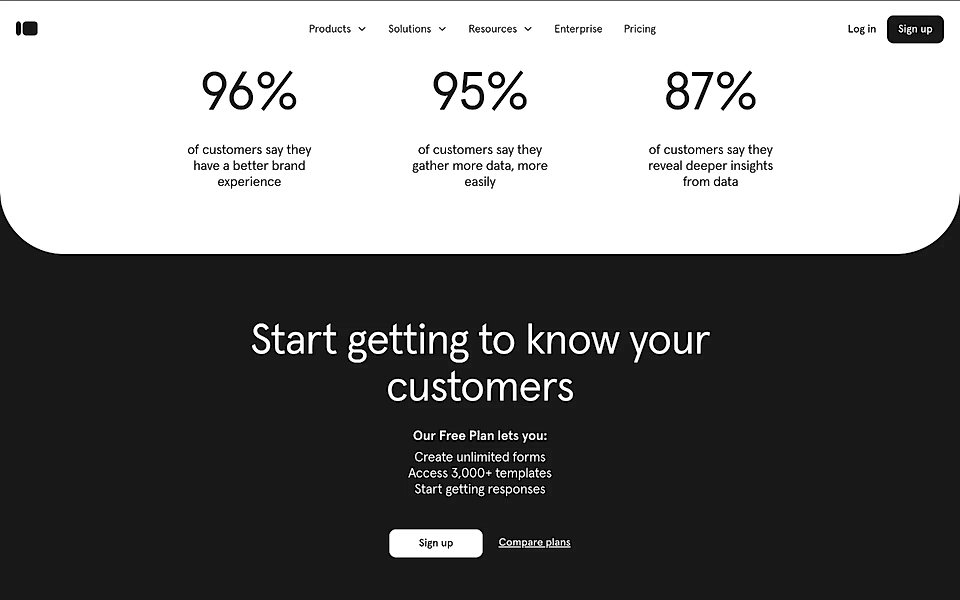
If you love copywriting, Typeform’s homepage has quite a few pieces in the right place. The CTA section is one of them.
The hero text starts with ‘Get to know your customers with forms worth filling out’, and just like you’d expect from a top-quality SaaS website, the CTA section references the title. ‘Start getting to know your customers’, and a detailed list of what you get with the free plan is optimized for conversions.
If I could change the button text from ‘Sign up’ to something more actionable, this call-to-action example would get 5/5 from me.
Storytale
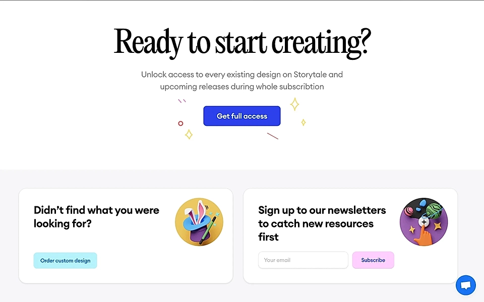
Storytale’s CTA section starts with an actionable question, ‘Ready to start creating?’. Adding a question to the section’s title can be an effective way of stopping someone scrolling – it’s pointing directly at them and, most likely, makes them consider if they are ready or need more information.
Storytale has also added two softer CTAs right below the main CTA section. It can be a clever tactic, especially on homepages, which tend to gather traffic from various sources and visitors with very different buyer’s journey stages.
Tally
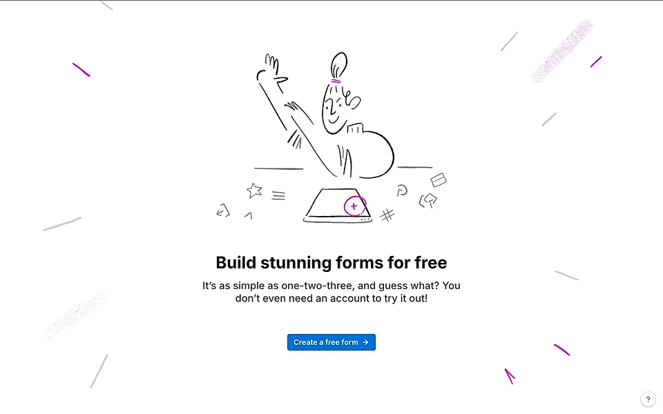
Even if your startup landing page is perfect, page visitors might still hesitate. Some of that hesitation can be removed with copy texts; some of it is out of your control and related to the situation the visitor finds themselves in at work.
One of the common hesitations is how much work the setup will be and whether the user has time for it. That’s what Tally’s CTA section is trying to tackle with ‘simple as one-two-three’ and ‘don’t even need an account to try it out!’.
The CTA button text, ‘Create a form for free’, is actionable and matches the copy above.
In general, I’m not a big fan of illustrations for SaaS landing pages as they are hard to maintain and further develop in the long run. Still, here, the playful design really conveys that you will enjoy trying the software, and it should not be too much work.
Seline
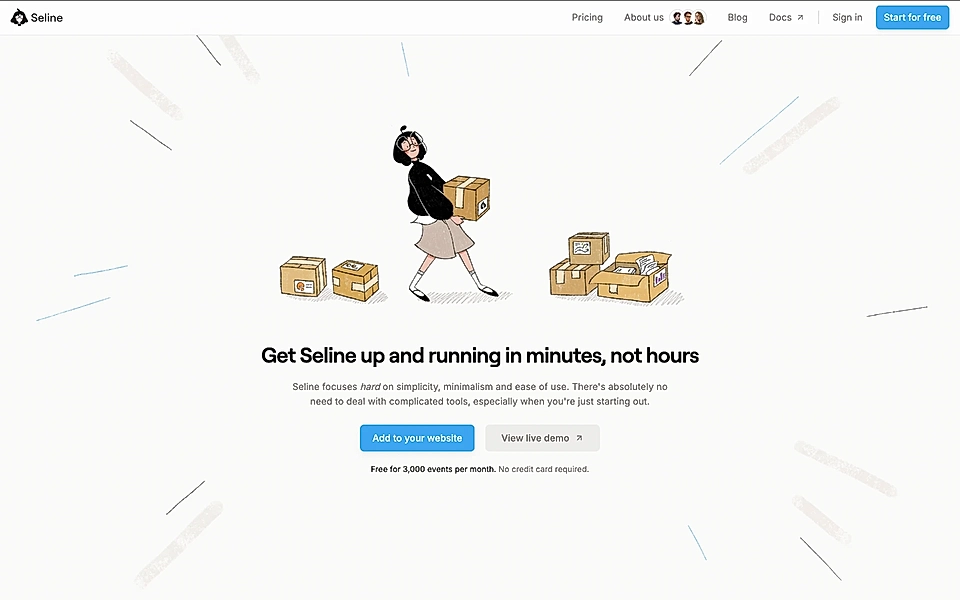
Speaking about getting started easily, ‘Get Seline up and running in minutes, not hours’ and ‘there’s absolutely no need to deal with complicated tools’ totally hit that goal.
The description uses a copywriting tactic where the SaaS service conveys that they are on the customer’s side and focus on things that make customers’ lives easier. Taking a stand and saying, "We are here for you", makes the sentence more powerful than just listing those same words as benefits you get.
In addition to benefits, the copy texts cleverly communicate who the ideal customer is (‘you’re just starting out’) and what they get when signing up (‘Free for 3000 events’).
Finally, ‘Add to your website’ in the call-to-action button text is spot on and much more powerful than the typical ‘Sign up’.
InfluenceKit
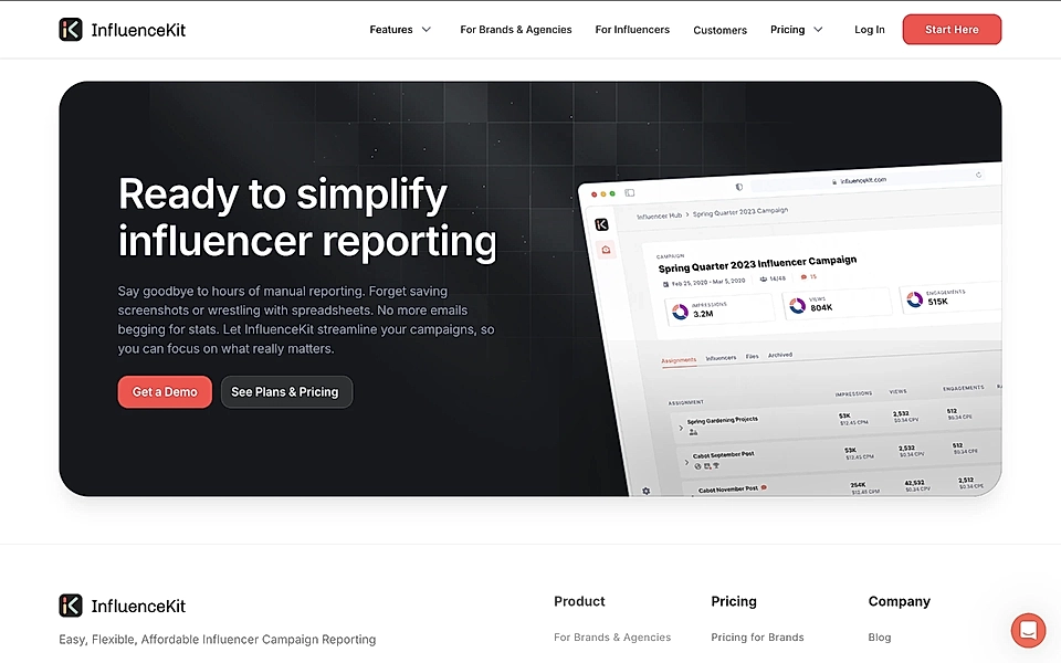
PAS copywriting (Problem-Agitation-Solution) is a powerful way of triggering action and overcoming page visitors’ hesitations – asking themselves if they have landed on the right page.
You can use PAS in the call-to-action section, too.
‘Say goodbye to hours of manual reporting’, ‘Forget saving screenshots’, ‘wrestling with spreadsheets’, and ‘begging for stats’ are all examples of PAS in action. In InfluenceKit’s CTA section, they remind the page visitor why they landed here, and the rest of the copy text pushes the visitor towards the call-to-action.
Asana
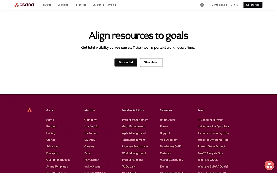
The CTA section at the end of a product page is often underestimated – but you shouldn’t let that happen. It's the final push for visitors to either sign up or move forward.
On Asana’s product landing pages, the call-to-actions align with the specific content of the page. For example, the CTA on the resource planning page reminds visitors what you can achieve with this specific solution and why it’s important.
Contextual call-to-action examples for SaaS landing pages
Call-to-action buttons don’t only appear in the hero and CTA sections; they tend to repeat all around the SaaS landing page. Let’s take a look at some of the most common examples.
Loom
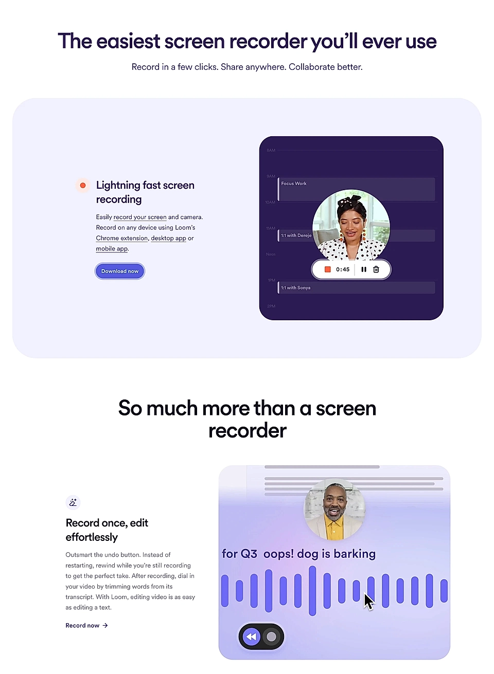
Loom’s features section is a fantastic SaaS copywriting example from which to learn. Everything, starting from the title, ‘The easiest screen recorder you’ll ever use’, is very benefits-driven and positions Loom as a tool for everyone in your team.
Each feature comes with a tailored CTA button text matching the context. Imagine if they’d replace ‘Download now’, ‘Record now’, ’Start sharing’, and ‘Connect over video’ with a standard text like ‘Learn more’. I bet Loom would lose quite a few clicks and sign ups.
Lemlist
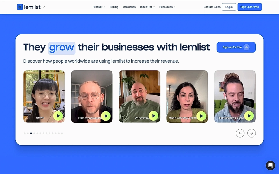
Lemlist secures a second mention in this blog post by adding the call-to-action button to the social proof element.
Video testimonials are powerful, and if they match with the landing page copy, adding a sign up button in the same element makes a lot of sense. The likelihood of a page visitor clicking the sign up button increases a lot if they hear another customer explaining how your SaaS helped overcome a very similar struggle.
Paperbox
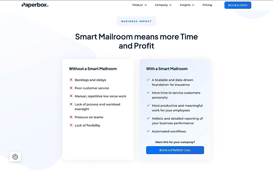
Paperbox, a shared email inbox for insurance claims teams, shows how SaaS companies can add a problem section to their sites.
The with/without format is an effective way to highlight what visitors may be missing. On Paperbox’s problem section, phrases like ‘poor customer service’ and ‘pressure on teams’ instantly connect with page visitors. The CTA to book a call might well get quite a few clicks – the page visitor is painfully aware of what they are missing out on.
Personio
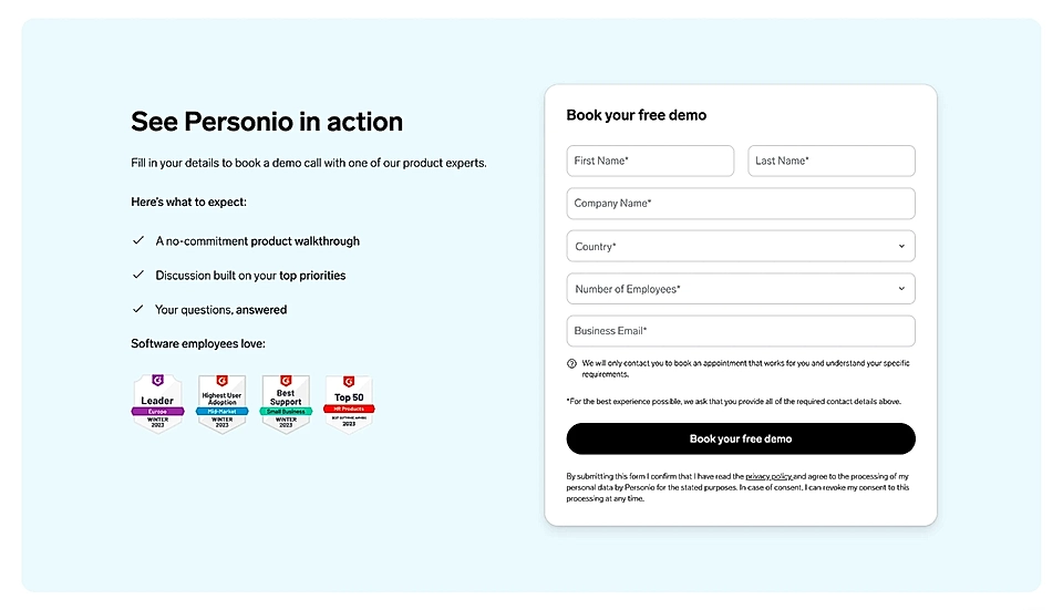
If you’ve been reading all the way here, you might have wondered where a call-to-action example with a form is.
Here we go – Personio’s landing page ticks many ingredients of a successful form placement.
On the left, you can learn what to expect if you hit the ‘Book your free demo’ call-to-action button. Also, the social proof from a third-party reviews service will increase the likelihood of a page visitor signing up and giving a slot from their busy work calendar.
Conclusion
These 19 examples show how relatively small tweaks can lead to big conversion improvements.
CTAs are a critical part of any SaaS landing page, and there’s no one-size-fits-all approach. But by following the best examples and tailoring them to fit your business and customer journey, you can turn a higher percentage of your visitors into leads and subscribers.
Do you struggle with converting page visitors into warm leads? With LandingRabbit, you can make sure your prospect stop wondering if you can get their job to be done.