Have you browsed through tens (or hundreds) of landing page examples, only to remain unsure how to build one for your SaaS?
It’s frustrating to see what works for others but feel lost when it comes to crafting your own. The writer’s block hits more often than not.
Imagine having a proven template that removes the guesswork. One that you can adapt quickly to build targeted landing pages for Google Ads, email outreach, social media, and more. Together with a guide, real-life examples, and copywriting tips.
You’ve found it.
In this guide, I’ll walk you through a high-converting SaaS landing page template.
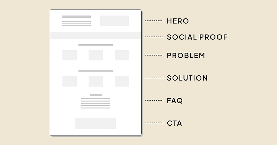
This template isn’t just for one-time use – we all know the best B2B SaaS websites a lot of landing pages, and the template gives you reusable building blocks for all your future work.
Before we build the template piece by piece and take a look at examples, let’s discuss the elephant in the room – SaaS landing page copywriting that converts.
Copy is king
No template (or fancy design) can save a poor and unclear copy.
But the good news is that writing a powerful landing page copy isn’t rocket science.
It all comes down to understanding three things:
- User intent: What’s the user’s motivation to find something online?
- Customer problem: What are the pain points customers face, and how do alternatives solve them today?
- Your unique selling point: What’s your secret sauce and indisputable benefit you offer? Why would a customer switch from an alternative to your solution?
Let’s look at each of them briefly.
Understanding the user intent
It would be a waste of time to go through the template elements without discussing the goal and purpose of the landing page.
First of all, there are a lot of SaaS landing page types – you might, for example, already have pages for various features, industries, and job functions. Or perhaps you’ve built competitor comparison and event pages.
While the content might be radically different, all page types share one thing: they need to match the user intent – your customers’ motivation to find something online.

Your customers might not have a burning problem to solve (or they aren’t aware of it), and they are searching for informational and helpful content. An example of a search phrase with informational intent is ‘CRM best practices’ – the user is not ready to purchase CRM software just yet.
Navigational searches are looking to find a certain page. For example, users type ‘Salesforce login’ in Google.
In this guide, we’ll focus on commercial and transactional user intents: customers who are already aware of the problem or even certain solutions. In the CRM market, they might search for ‘best CRM tools’ or comparison pages like ‘Salesforce vs. Hubspot’.
Describe customers’ problem in their words
On a landing page that converts, you’ll need to show that you really know the pain yourself and that you are on the customer’s side.
That’s why the landing page template uses the PAS formula. It keeps you focused on the problem – without forgetting the solution.
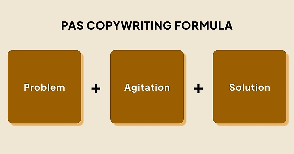
The PAS formula is easy to demonstrate with a concrete example from Frankli, a performance management platform for HR teams and people managers.
Straight after the hero text, Frankli’s page explains the problem:
"Performance management is a shared responsibility, but people managers often lack the tools needed to actively support the process."
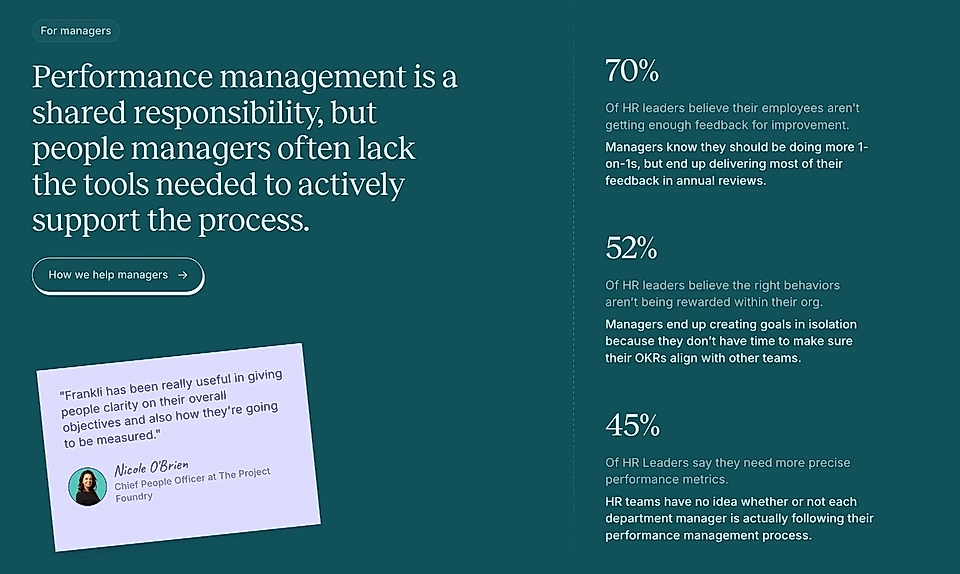
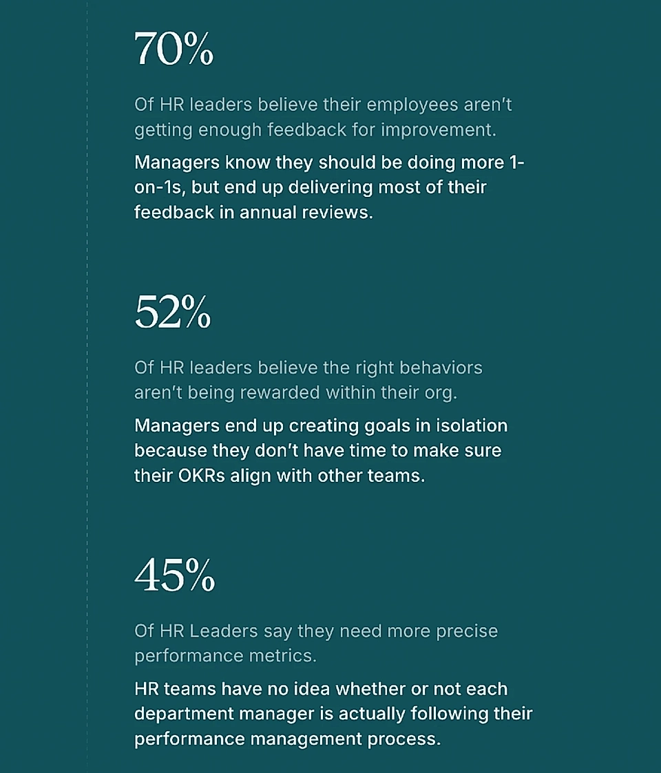
The right-hand side then agitates the problem. For example:
"70% of HR leaders believe their employees aren’t getting enough feedback for improvement. Managers know they should be doing more 1-on-1s, but end up delivering most of their feedback in annual reviews."
When you scroll past the problem (P) and agitation (A) sections, it’s time to answer.
What makes Frankli’s page exceptional is the neat connection between the problem and solution – each agitation point is responded to in the solution section of the page.
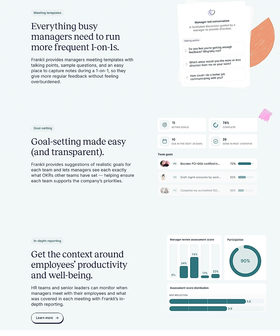
This tactic is very powerful – if the page visitor is your ideal customer and you use their words in the problem section and solution elements, your page has achieved its goal.
Other factors might come into play – timing, competitors, internal politics – to mention a few, and the user won’t convert. However, a well-implemented PAS formula will leave a mark in visitors’ memory, and they are more likely to remember your service when the timing is right.
What is your unique selling point (USP)?
Your solution to the problem is like a bridge in the gap between the customer’s pain point and dream outcome.
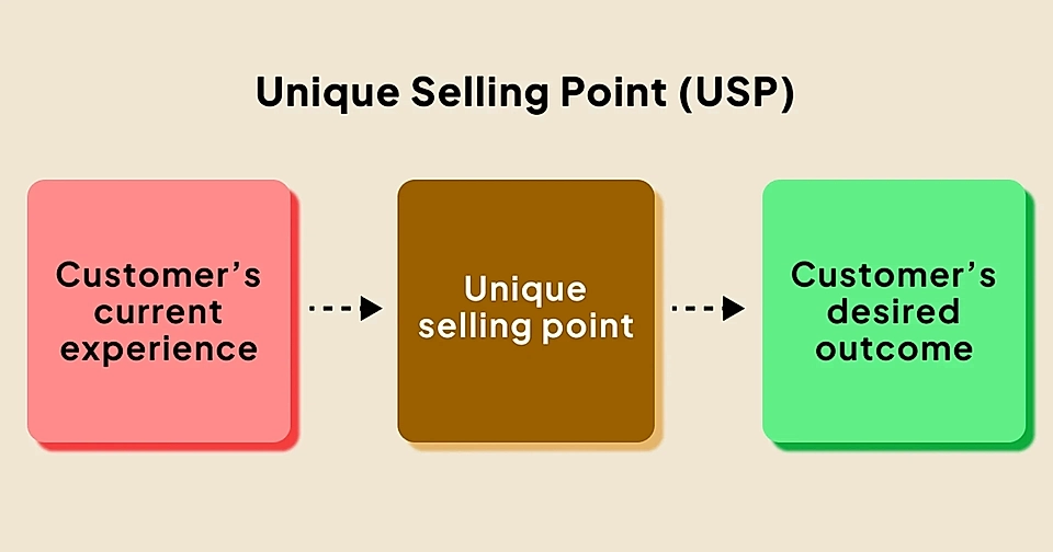
But there are other players in the market.
And more often than not, you aren’t only competing against other solutions. Your worst enemy might be inaction, a manual process, or a collection of tools that, in not-so-optimal ways, get the job done.
To create a high-converting copy, you’ll need to define your unique selling points. I’m sure you have an idea of that based on customer discussions, but some of these questions might help you find additional angles:
- Are you faster or cheaper?
- Is your ideal customer very specific?
- Do you have a unique feature?
- Can you bring together something that previously needed multiple tools or steps?
- Is your pricing criteria different from others?
Sometimes, the advantage is unexpected and not so easy to see from the outside.
For example, my previous SaaS business had a unique pricing model compared to tens of competitors – while everyone else capped the number of widgets and page views, all of Flockler’s features were built around the core premise of unlimited page views and how easy it was to remix your content in countless digital services.
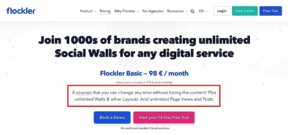
The best USPs are like that – hard to copy and embedded in everything the company does, from product development to marketing. They are core truths that define the solution’s infrastructure and all other technical choices, eventually leading to a unique feature and capability that is visible to the customer.
High-converting SaaS landing page template

Now that we’ve discussed the key ingredients of a great copy – user intent, customer problem, and your USP - let’s examine each element of the SaaS page template through examples.
Hero
Second to none, the page hero is the most important element of the template.
If it fails to catch the attention of the visitor in a few seconds, none of the other elements matter.
A fantastic website hero section copy includes three ingredients:
- It’s actionable: Get, start, play, etc., instead of passive forms such as empowering.
- Promotes outcomes: What’s in it for your customer? Why should they care?
- Uses you/your: The page should talk to the page visitor directly, building trust instantly.
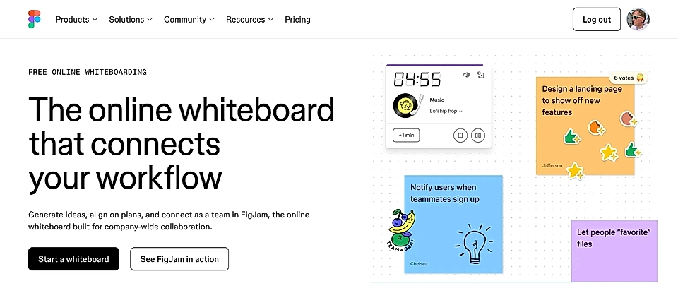
A great example is a product landing page by Figma, focusing on the search term ‘online whiteboard’.
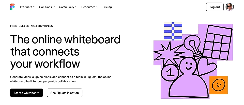
The title instantly tells you what the product does and gives you a hint of the outcome. The description continues the same story – and uses ‘your workflow’ and actionable verbs like get, align, and connect to talk to you.
The only thing I’d improve is the image on the right. Illustrations don’t immediately convince the page visitor that they’ve found what they are looking for.
For example, if Figma had used one of the examples further down the page, the visitor would be even more likely to stay on their Google Ads landing page.
Or what do you say about this one-minute mockup with a product image and post-it notes vs abstract illustrations?
Social proof
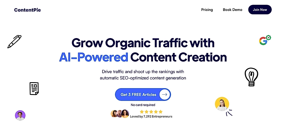
The next element on the SaaS landing page template is social proof.
Social proof helps visitors make decisions faster. Whether it’s fear of missing out, an influencer’s example, or the sense of belonging, seeing the product in action speeds up decision-making.
Adding customer logos immediately after the website hero section is a great choice – many leads expect to see that as it has become the de facto SaaS landing page element.

But if you, for example, have a video straight after the hero element, consider placing the social proof below the CTA button.
Problem
As mentioned at the start, I like the PAS model, which instantly makes the page copy more focused and relatable.
But not all products and services solve a burning problem, and you can skip this element if you aren’t fully convinced – forcing this element into the page template will ruin your credibility.
Previously, we had a look at the PAS formula in action for Frankli. Here’s another example from Antimetal, a company that helps tech teams save money in AWS.
Their problem section starts with the title 'The cloud is complicated'.
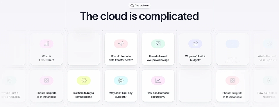
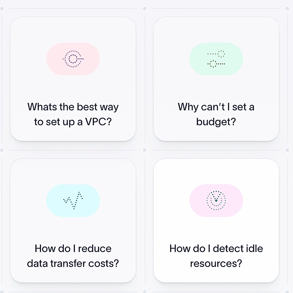
But when it all really hits home, the real customers agitate the problem. If your team has chosen AWS, I’m sure the questions resonate.
Solution
Just like we saw in the Frankli example, the solution section of the SaaS landing page template is a direct answer to the problem.
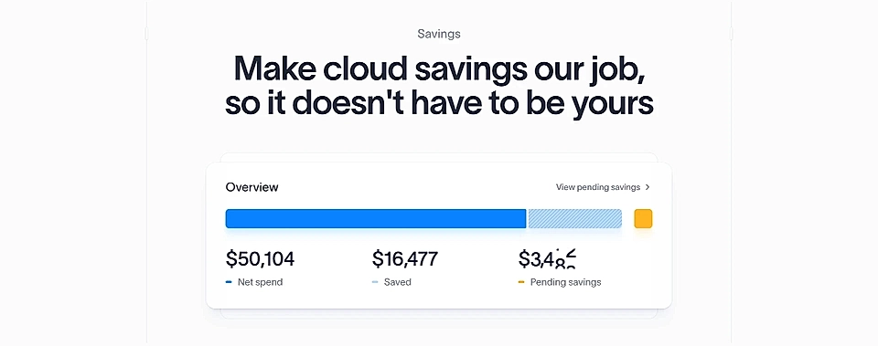
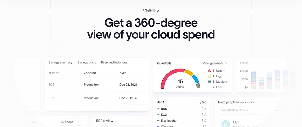
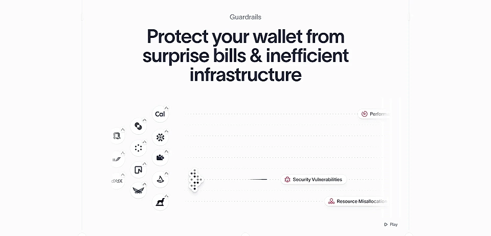
On Antimetal’s website, the solution element shows how you get instant savings through automation, visibility on your spending, and guardrails to protect you from surprises.
Can you see the power of the PAS formula? If you are unsure how to use it for your SaaS, LandingRabbit can help. Sign up for our 14-day free trial to build high-performing SaaS landing pages fast and easy.
FAQ
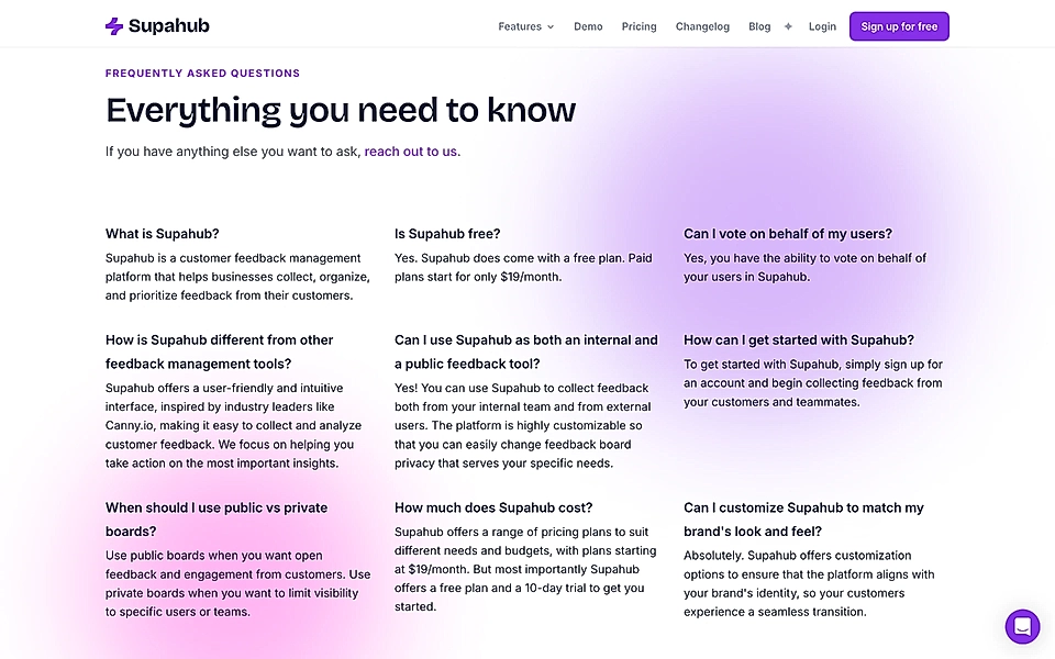
Frequently asked questions (FAQ) are a fantastic element on a SaaS landing page template.
The FAQ element gives you an opportunity to answer some of your customers’ most common questions and hesitations in a relatively concise visual format. The better you know your customers and the more customer chats you have online or offline, the easier it becomes for you to write the FAQ.
CTA element
Place the CTA element just before the footer. It will be your last chance to convince the user.
And not just any user – they’ve scrolled through all your copy, and you must have done something right to achieve that.
Make sure the CTA element reinforces the problem customers experience and the USP you bring to the table.
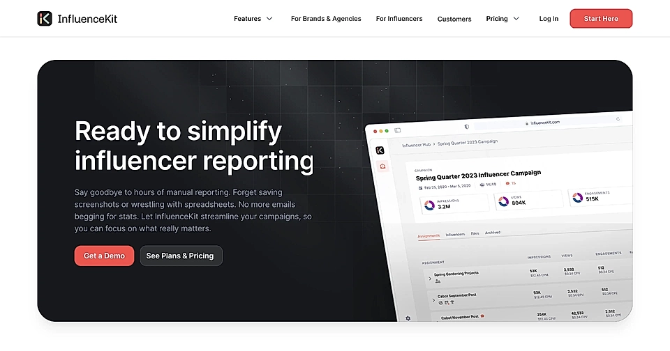
Bonus: Features, Case studies, and Pricing
The core elements of the SaaS landing page template are a hero, social proof, problem, solution, FAQ, and CTA.
If you follow the template structure and write a stellar copy, you don’t need to make the page more complex.
However, depending on the rest of the website and the complexity of your service, you might consider adding three elements: product features, case studies, and pricing.
Sometimes, the solutions element will be sufficient to showcase your product and key features. However, some products compete in a crowded market with established players, and in order to convince the page visitor, you’ll need to show the breadth of matching features.
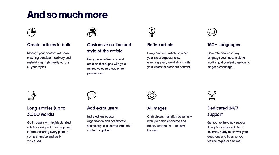
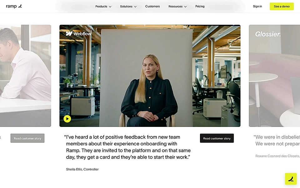
If you are selling a service with a high average customer value and you are not looking to convert page visitors to self-serve, then adding a case study section might be useful. The more complex your service is to buy, and the more decision-makers are involved, the more valuable case studies are.
Last but not least, make sure your page has easy access to pricing. If you don’t have a separate pricing page or you’ve decided to keep your landing page navigation simple, add the pricing element to your landing page template.
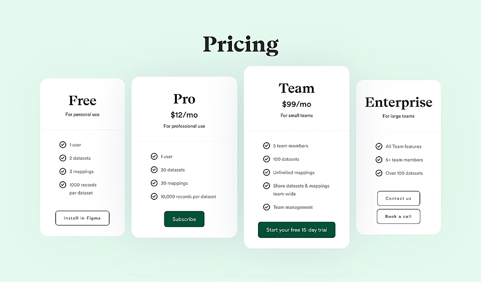
Being transparent about pricing immediately increases conversion rates, and hiding that information is one of the most common reasons why website visitors don’t convert into sign ups.
Would you like to follow the landing page template but feel unsure about copywriting? LandingRabbit can help! Sign up for our 14-day free trial to write and publish SaaS landing pages in minutes.