How to create a perfect SaaS landing page hero section
The web is full of generic advice to help you design the website hero section:
“You need a capturing hero image”.
“Your CTA buttons need to stand out. Use orange color!”.
However, very few articles will help you write powerful and actionable copy texts. Ironically, the only thing that truly matters is usually an afterthought.
Not in this blog post, though.
Crafting the hero text starts with best practices of landing page copywriting.
The most successful SaaS businesses and their marketing teams will need to craft hundreds of hero sections for landing pages – for Google Ads, SEO, social media campaigns, newsletters, and many other marketing activities that require targeted and high-converting pages. Each new page they create needs hero section copy texts and designs that match the user's intent.
In this blog post, I’m looking to show what elements belong to your landing page hero section and share concrete tips on how to craft the best possible copy and design – accompanied by the best B2B SaaS website examples to inspire your work.
Start from the user intent
Before you start designing and writing content for the landing page hero section, you’ll need to map out the user intent.
The user intent reveals what the website visitor is looking to find and what stage of their buyer journey they are in right now. You can divide the user intent into four categories: informational, educational, commercial, and transactional.
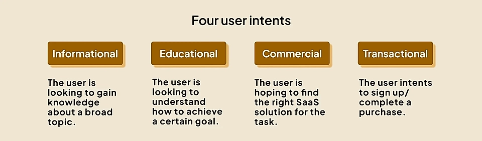
Are they trying to get an idea of the big picture and broader topic (informational intent)?
Or are they ready to make a purchase if they find the right solution (commercial intent)?
Your landing page hero section will be entirely different depending on the answer. The further away your lead is from the purchase decision, the more educational the page should be.
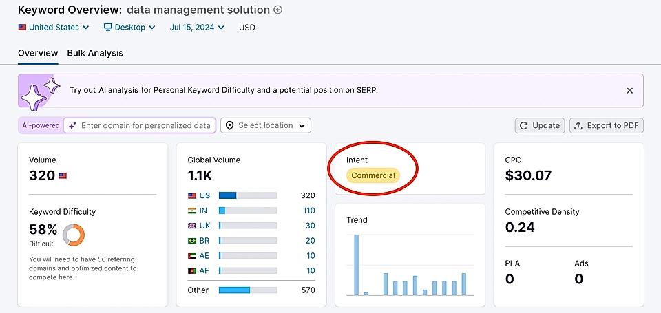
Say you are selling a data management solution, and someone is searching for “what is data management”. The best possible page starts by answering the question in detail and later educates the visitor on the areas you need to consider when choosing a data management solution. If your hero element is trying to convince that specific page visitor to sign up for a free trial, they might hit the back button immediately.
Meanwhile, someone searching for the “best data management solution” might be ready to take the next step when they see your “Get started for free” CTA button in the Google Ads landing page hero element.
If you are unsure about the user intent, SEO tools like Semrush can be helpful. They track more than 25 billion search phrases and label each with the closest matching search intent category.
Craft a guiding value proposition
Every landing page needs a guiding value proposition – an easy-to-understand reason why a customer should buy your SaaS service.
The value proposition should be built around a concrete problem your customer is facing. If you fail to be very specific, your value proposition will feel bland and uninspiring. You get fewer conversions and lose money.
That’s why you should spend time on this task before jumping into hero element copywriting and design.
To help you craft your landing page value proposition, you should have a clear idea of the following attributes:
- Persona: Who’s the ideal customer profile?
- Alternative: What tools and processes do they have at the moment?
- Problem: What is the obstacle my ideal customer is facing?
- Capability: What’s the secret sauce your solution provides?
- Features: What features make it possible to deliver the secret sauce?
- Benefits: What does the customer get? What’s in it for them?
After answering the above questions, try to write a few sentences – keep them as concrete as possible to make sure your value proposition statement guides the landing page copy and design in the best possible way.
Here’s how your value proposition statement should sound like:
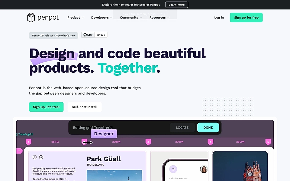
"Penpot is for software teams (Persona) who are currently designing products and features in Figma (Alternative) but struggle with the development process from design to ready product (Problem). Penpot makes it easy to export designs as code (Capability) without forgetting powerful design, prototyping, and collaboration tools (Features). Penpot improves quality and eliminates the back-and-forth between devs and designers (Benefits)."
The more coherent and to the point your value proposition is, the easier it is to create your SaaS landing page.
My value proposition statement for Penpot might not be 100% accurate, but here’s what they communicate on their website hero element:
Master the title and description copy texts
Now, you should be well-equipped to write the landing page title and description. Instead of trying to be overly smart and witty, make sure your hero answers three simple questions:
- What does your tool do?
- Who is it for?
- Why should they care?
Mercu’s hero element is a fantastic example.
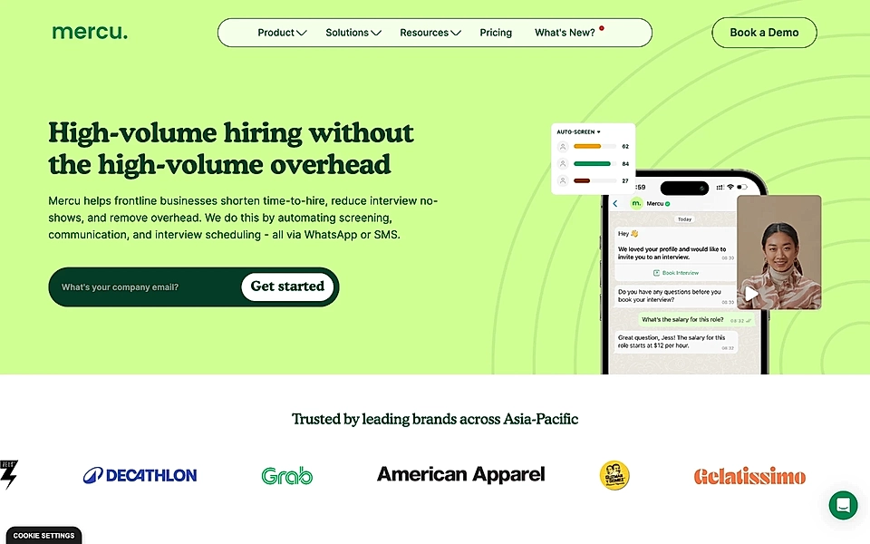
The title “high-volume hiring without the high-volume overhead” communicates the what and why – the who is if for (frontline businesses) is revealed straight at the start of the description. The description manages to communicate benefits and what the tool actually helps customers do in a relatively concise way.
Better Stack’s hero element shows that you don’t need a long copy text to get it right.
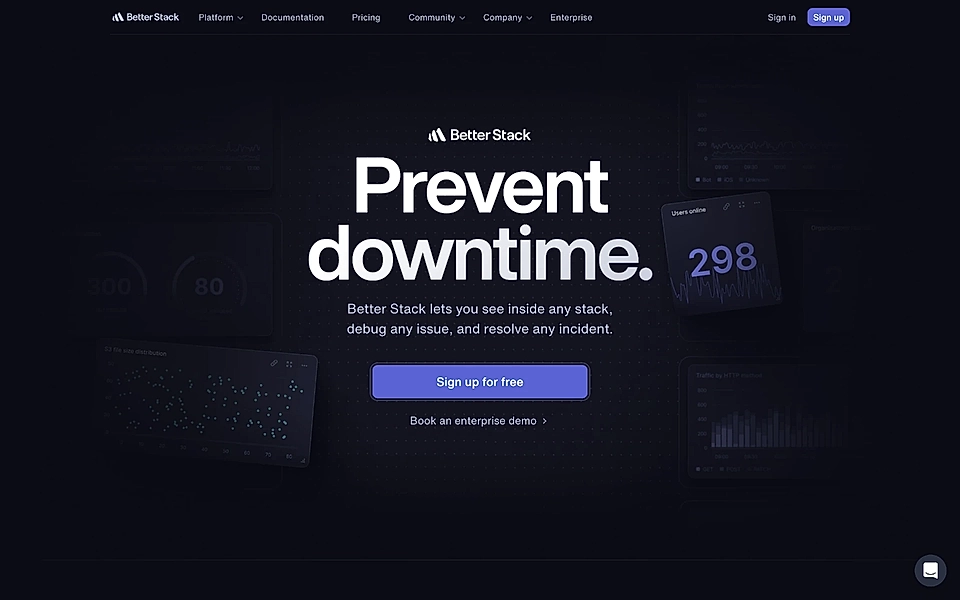
One reason they are able to keep the copy short is that everything else reveals Better Stack to be a developer tool – nevertheless, hats off to the team behind this hero element.
Similarly, data.to.design has kept their hero element copy texts short and sweet.
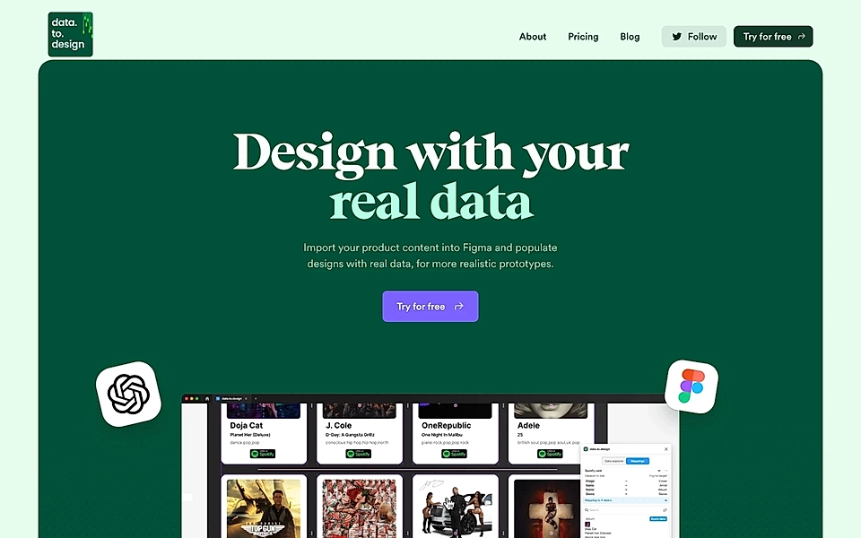
While the copy doesn’t explicitly say the tool is for designers, leads that are not their ideal customer profile won’t scroll further.
Paradoxically, your landing page hero element’s goal is to ensure visitors scroll further – but only those who are your ideal customers. You are better off if people who aren’t your ideal customers click the back button quickly.
Are you struggling to get high-quality leads? A Google Ads landing page builder can help you make sure you attract the right audience.
Use actionable CTAs
Too often, landing page hero elements have call-to-action buttons that say something generic, like “Free trial” or “Sign up.”
The best CTAs are actionable – they tell you immediately what you get and use actionable verbs like get, start, join, etc.
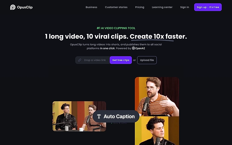
Opus Clip’s hero element has a perfect CTA button example. It asks you to drop a link to a video (or upload a file) to “Get free clips”.
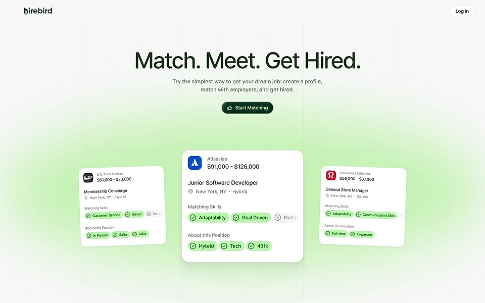
Another great example is “Start Matching” by Hirebird. The CTA repeats the first verb used in the hero title.
By default, I recommend having just one CTA button in the website hero element, but there are some exceptions. For example, a large portion of Stripe’s audience is developers and a secondary CTA driving traffic to the documentation is a clever one.
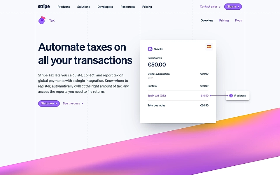
It’s interesting that, by looking at the website hero element, you can tell that Stripe really knows its ideal customer profile.
Match visuals with copy texts
As mentioned at the start, many articles have been written about the website hero section design. To summarize their learnings, just like any other element on your landing page, the hero section design should help your copy stand out and give the website visitor a clear sense of hierarchy. Images, videos, and interactive demos can help convince visitors to continue scrolling.
However, Geckoboard’s hero element design goes beyond the ordinary and deserves to be highlighted in this copywriting-focused blog post.
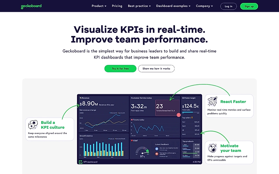
The hero image not only shows how the tool looks but also communicates the benefits and key features in an easy-to-digest way.
Add social proof
People love to copy the actions of others – that’s why social proof, typically customer logos, quotes, and ratings, helps you drive conversions.
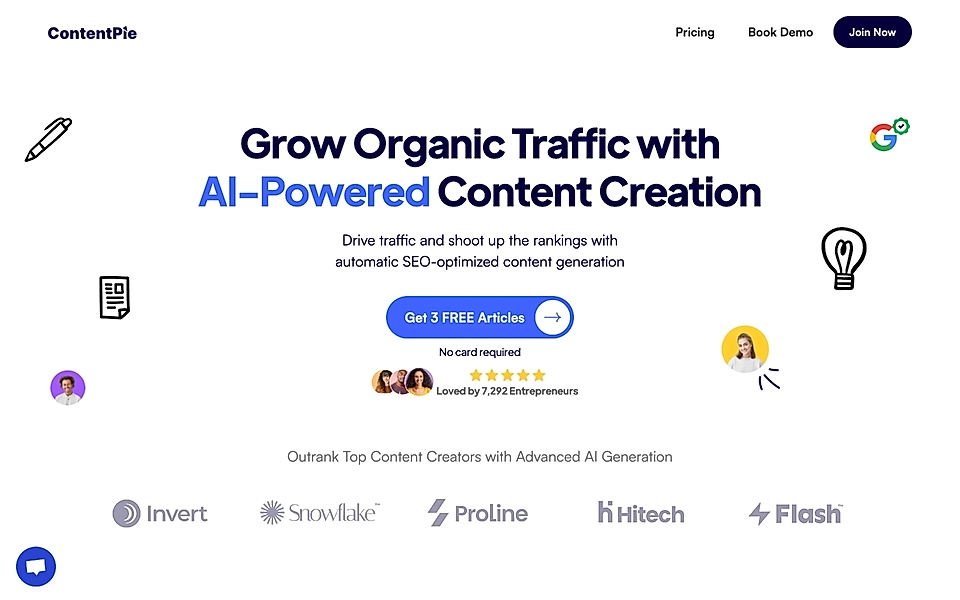
ContentPie’s hero shows the rating and the number of people who have signed up so far. By adding a handful of profile images, they look to increase trust even further.
Mercu has taken a slightly more traditional approach by showing some of the customer logos. As long as the logos match your ideal customer profile, they are an easy and efficient way of signalling trust.
Bonus: Keep your navigation simple
I’ll admit that SaaS marketers are divided here, and you should take this tip with a pinch of salt.
Some recommend keeping the same navigation across the homepage and landing pages, while others say landing pages need simple navigation.
I’m one of those who’s rooting for a simple one.
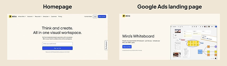
The more complex the navigation, the more likely it is that your potential lead will get lost on a page that doesn’t match their user intent. While homepages serve a broad audience, and your navigation might be helpful for users who first arrive there (e.g., via brand search), landing pages are supposed to serve a very specific intent and need.
Are you building a growing SaaS company and looking to create landing pages? At LandingRabbit, we hope to make landing page copywriting and publishing lightning-fast for you and ourselves. Sign up for our 14-day free trial and start publishing high-converting landing pages without the guesswork.