14 SaaS product landing page examples you can copy
Most product landing page listicles casually mix e-commerce and SaaS examples.
That doesn’t make much sense.
Although there are some similarities, a cosmetics product (e-commerce) and a cold email outreach tool (SaaS) require different copy and structure to convert visitors effectively.
In this blog post, I’ll walk you through 14 SaaS product landing page examples.
Rather than discussing full pages with their varied strengths and weaknesses, I’ve hand-picked individual components of high-converting pages.
Together, these components from 14 companies create a template for you to publish better SaaS landing pages faster.
What makes a perfect SaaS product landing page?
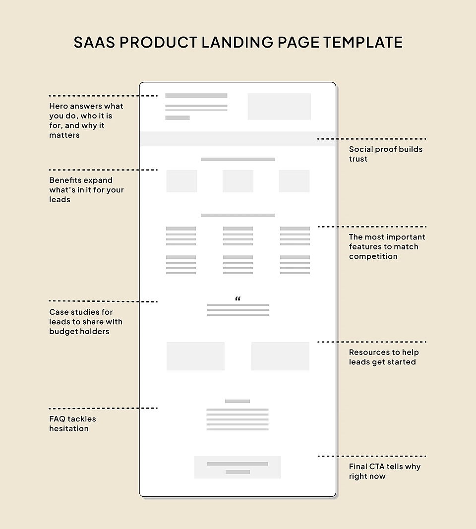
To answer the question, I analyzed 100 SaaS product landing pages and listed the elements they use.
Based on the data (and with the help of AI), here’s a perfect SaaS product landing page template:
- Hero
- Social proof
- Benefits
- Features
- Case studies
- Resources and use cases
- FAQ
- CTA
Next, let’s have a look at some of the best SaaS landing page examples to help you make that template come alive.
Hero
Most marketers spend a lot of time designing the hero element.
And they should – the SaaS website hero element makes users decide whether to stay or not in seconds.
The key elements of a perfect hero are:
- Title and description tell what the product is, who it is for, and what outcome your customers get.
- An actionable CTA button.
- Appealing and concrete visuals supporting the copy.
Supahub’s feedback board product page is a fantastic example.
The title ‘Give your users a place to give feedback and share ideas’ is actionable (give) and says ‘your users’ to make you feel that Supahub is on your side. The title and description clearly communicate what the product does and why it matters, and the image on the right reinforces the message.
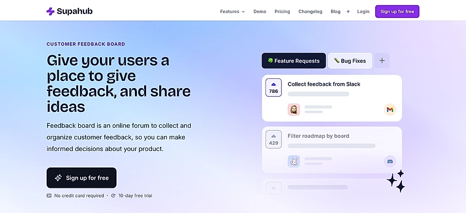
The sign up button text could be replaced with something more concrete, like ‘Create your free board’, but pay attention to the small texts underneath. ‘No credit card required’ is a perfect way to tackle customer hesitation.

Another great example is the hero text of Mercu’s product landing page.
The title instantly tells what the product does and what’s in it for recruiters and HR teams.

The start of the description highlights the problem – the high volume of calls, emails, and messages – and the rest of the description finishes the job by sharing how the product solves it.
It’s fascinating how much can be packed into 30 words when you take the time to learn SaaS landing page copywriting and use your customers’ words.
Social proof
Social proof increases revenues – that’s why 66% of SaaS product landing pages have social proof included.
The most common way of adding social proof to your landing page is to show customer logos below the hero element. Why reinvent the wheel when website visitors expect to see logos?
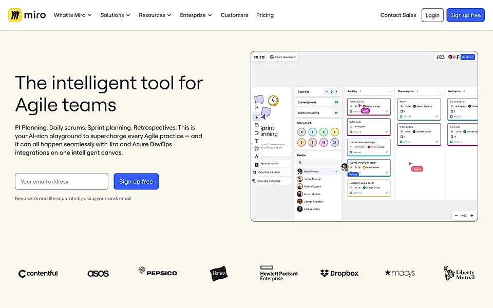
Miro’s product page has one extra trick you might want to follow: all logos are black and proportionally sized to make them a bit more subtle and fit better into the brand style.
Sometimes, it might be difficult to choose the right logos – especially if you are targeting small and medium-sized businesses and don’t want to repel potential customers by displaying the Nikes and Teslas of the world.
If that’s the case, consider Brevo’s approach of showing ratings from trusted third-party sources like G2, Capterra, and Trustpilot.

Benefits
Often, it’s easier to list features, focus on what your product can do, and forget to mention what’s in it for your customer.
Don’t beat yourself up – it happens to all of us.
However, when crafting your next product landing page, remember the SaaS copywriting mantra 'benefits over features'.
Usually, you can combine the features and benefits in one.
Just like Puck’s product page, which highlights the outcome, ‘eliminate miscommunication’, and the image shows how the product delivers the promise.

Slightly less concrete and feature-rich but powerful benefits are displayed on Intercom’s Messenger product page.

Features
Oh, now we are in every SaaS marketer’s comfort zone. We spend countless hours building a product and are proud of our features – usually for a good reason!
As we saw previously, marrying benefits and product features is powerful and makes your page much more compact.
However, your SaaS might be competing in a relatively crowded space. While you have your secret sauce and unique selling points, page visitors need to be sure your product can cover the most critical features of the existing solution. Otherwise, they’ll look foolish when introducing your SaaS to their colleagues.
That’s why many SaaS product landing pages are heavy in features.
Webflow’s SEO product landing page covers much more than tools for website search engine optimization. After all, it’s hard to imagine anyone choosing something complex like the content management system purely based on SEO features.

If you want to make your features and solution stand out even more, use the PAS copywriting formula and include a problem section just above the features.
Getproven’s product page highlights the typical buying process pain points for startups dealing with larger companies.

The solution and features section then answers those pain points and explains how an organization responsible for the area’s economic development can benefit from Getproven’s product.

If you decide to run this idea, consider editing the landing page template to show elements in this order: problem, benefits, and features.
Are you planning to create a product page but need help writing the copy? LandingRabbit can help you plan the best possible structure and content for your page. Sign up for our 14-day free trial to build SaaS landing pages without the back-and-forth.
Case studies
We discussed social proof and how to display it straight after the hero element, but case studies towards the end of the product page are another chance to build fear of missing out and urgency to buy in your prospect’s mind.
Also, case studies make it easier for leads to share details about your product with the rest of the team – especially with those who might not use your product but hold the wallet in your lead’s organization.
Remote’s HR software landing page combines an authentic customer quote and a link to a case study page.

Testimonials are powerful.
Testimonials with a link to a full case study focusing on benefits – take my money!
Resources and use cases
When you start your SaaS marketing, the product is often fairly simple. It may get only one job done.
And that’s how you should start.
However, over time, your SaaS will get more features, and the product will start to cover more tasks.
That’s when resources and use cases show up on a SaaS product landing page.
Homerun’s job application tracking page directs to two closely connected products: career sites and application forms.

It’s helpful to be explicit about who this solution is for. Loom’s product page has a video animation, and the most typical use cases are listed below.

FAQ
When you meet a lot of customers or chat with them online, you’ll quickly gather a list of questions repeating day after day. No landing page can answer all questions – and it’s even more rare for a visitor to read all the content.
That’s why an FAQ element towards the bottom of the product page makes a ton of sense. It will give your website visitors a chance to get an answer to a burning question that is stopping them from signing up.
The FAQ element on Ramp’s product page is a perfect example.

Even without being a domain expert, you can tell that Ramp’s customer questions can be relatively specific. The FAQ element provides answers in a concise format and helps to keep the core page content straightforward.
CTA
The CTA element at the end is the final call. The product team and copywriters can already be proud of themselves when the analytics show people travelling all the way there.
It’s time to close the deal – or say goodbye (for now). A great copy boosts conversions.
The core message of Retool’s product page is that the software gives you building blocks to build your internal dashboard much faster than you think.
Therefore, the CTA element’s tagline ends with ‘in under 10 minutes’ – the tagline neatly summarizes what you get and why you choose Retool.

Design matters, too.
Focal challenges the standard CTA design with almost a website hero’s look & feel.
The copy text is actionable, talks to the customer directly, and tells what’s in it for them. A perfect way to finish our SaaS product landing page template.
Are you looking to create a product page but need help with content? LandingRabbit helps SaaS teams plan the perfect structure and content for any landing page. Sign up for our 14-day free trial to build SaaS landing pages without the back-and-forth.