10 fantastic SaaS landing page examples
Most blog posts listing the best SaaS landing pages tend to use the same examples; Asana, Miro, Figma, and Monday are some of the most common names.
There’s nothing wrong with that – they are indeed great examples.
But in this blog post, I want to feature some of the less well-known SaaS companies doing stellar work with sometimes limited budgets. While their B2B SaaS websites are fantastic in many ways, I’ve picked one element from each. Together, these elements start to form the perfect SaaS landing page – let’s have a look at them 👇🏻
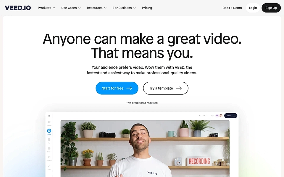
Veed.io handles objections in the hero
Veed.io makes it super easy to edit videos. I’ve used it for simple tasks like converting video to another format and adding captions.
Their website hero section is a perfect example of how to handle objections right off the bat. The tagline “Anyone can make a video. That means you” speaks to all those users who think they’ve seen the first part of the headline before, but the reality has proven different after the sign up.
June.so uses a “show, don’t tell” strategy
June.so is an innovative product analytics platform for B2B SaaS. On the homepage, they follow a powerful “show, don’t tell” strategy. Immediately below the hero texts, you’ll find an automated, interactive demo showing the key features and benefits.
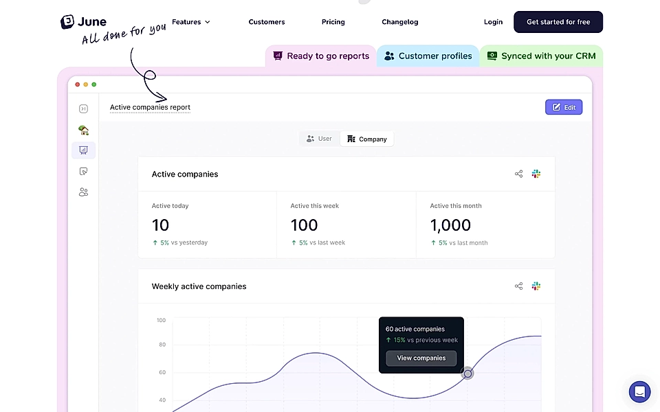
If you are looking to use this strategy, make sure you don’t leave out any of the most essential features and benefits from the sections below the video. Only a portion of visitors will watch your video or demo – and even smaller audience is watching it in full.
For inspiration, learn what elements belong the SaaS landing page template.
Blaze shows social proof
Blaze is an AI-powered tool that helps marketers create social media posts, newsletters, blog posts, and more through an easy-to-use interface. In addition to content creation, you can, for example, schedule social media posts.
What I really like about their landing page is the targeted messaging and the social proof section. The whole page and messaging echo the idea of Blaze being a tool for teams of one – turning a single marketer from overwhelmed into a superhero.
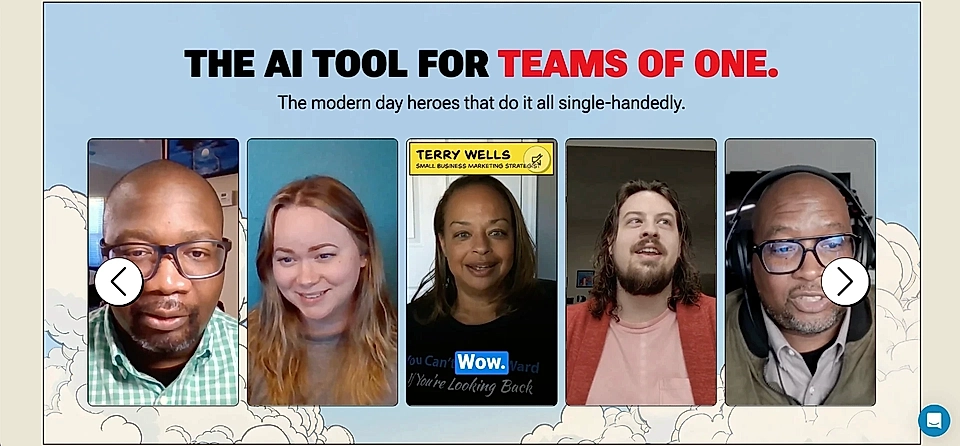
The social proof element, with the tagline “The AI tool for teams of one“ and short, Instagram Reels-style customer testimonial videos, is spot on.
Narrative BI’s got a perfect pricing page tagline
Have you ever found yourself staring at the Google Analytics dashboard and not really knowing what to look for?
I’m sure we’ve all been there, and the launch of GA4 did not do us a favour.
That’s where Narrative BI comes in. Their product seeks to explain analytics data in plain English and turn numbers into insights. Instead of just making a prettier dashboard, the platform highlights insights from your data and shares them in a snackable format.
One of the best parts of their SaaS landing page copywriting is on the pricing page: “This is not a software purchase. This is an investment in your growth.”

Too often, the pricing page feels like an afterthought, while in reality, that page can help you differentiate yourself from competitors. Investing time in pricing page copywriting and making it easy to compare your pricing against others quite literally pays off.
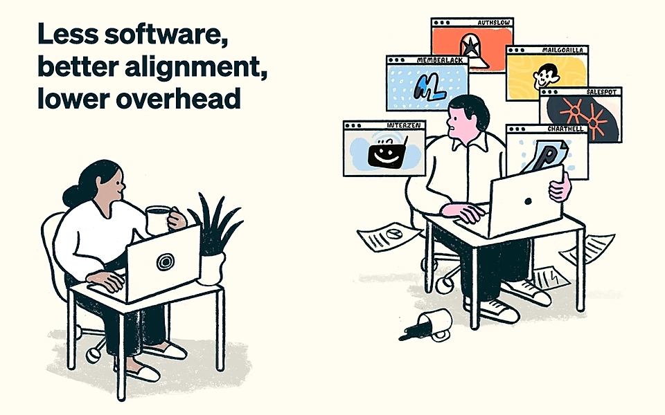
Outseta visualizes the before-and-after state
Outseta helps creators and website owners monetize their online community via membership software. Instead of combining a CRM, email marketing platform, payment solution, etc. on your own, Outseta gives you all those tools in one place.
Straight after the hero element, their team has done a fantastic job visualizing the before-and-after state. In the illustration, a happy Outseta customer on the left greets the seemingly stressed out community manager on the right, who is juggling various tools that aren’t optimized for membership management.
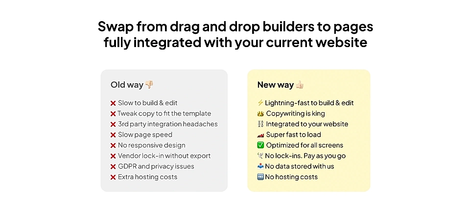
If you want to take this approach to something more concrete, here’s a comparison element I’ve been working on for LandingRabbit. I aim to show the difference between a landing page builder and LandingRabbit’s future offering.
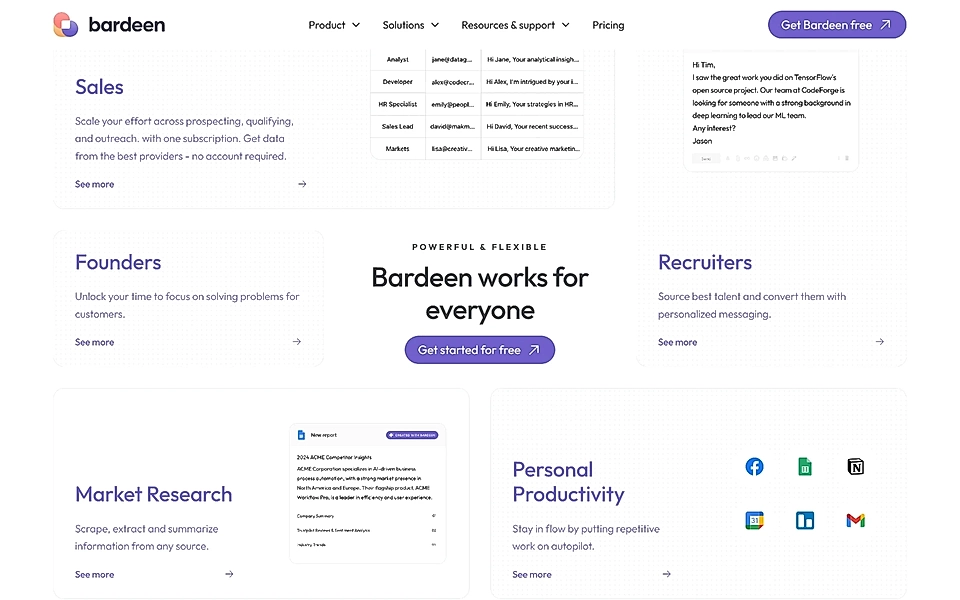
Bardeen’s use cases drive sign ups
Showing the most common use cases helps visitors quickly grasp if your SaaS could be something for them (or a friend).
Bardeen has been able to innovatively combine its sign up CTA with use cases where the platform brings value. If the user hesitates, seeing their job function and the key benefits might push them over the line.
Rupt turns visitors into customers via a benefits calculator
Sometimes, companies create a pricing calculator, which can be incredibly helpful, especially when the software is rather complex.
But perhaps even better, a “how much you save/gain” calculator immediately shows what the visitor is missing out on if they don’t sign up for your product.
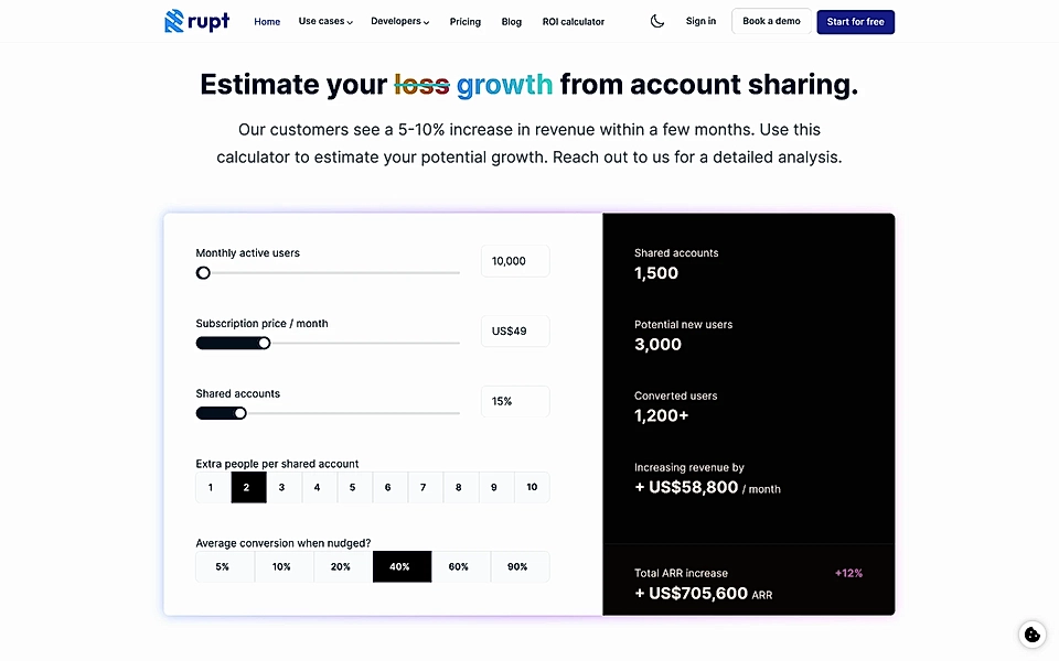
That’s what Rupt, a tool to prevent account sharing, has added to their website. Their calculator helps you estimate how much your SaaS loses due to account sharing and how much you can claim back by adding Rupt to your stack.
llama life tells a touching founder story
llama life is not just a to-do list app; it also helps you focus on what matters and manage your projects more efficiently.
One powerful marketing tactic they use is a founder’s personal story, which makes the software feel personal, warm, and approachable.
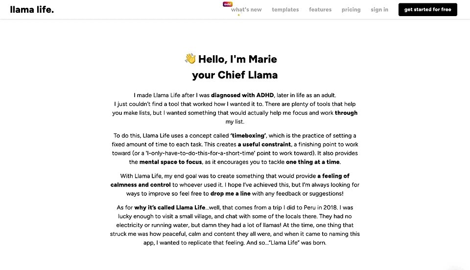
A story sharing why you built the app and your experience instantly adds credibility and can help your SaaS beat competitors with a bigger marketing budget.
GoodCourse’s FAQ answers the most common questions
GoodCourse is a training platform with TikTok-style videos that helps any organization create personalized courses. The CTA button “Try Learning 2.0” summarizes its value proposition quite neatly.
In addition to crisp messaging, GoodCourse is one of the many SaaS companies with an FAQ section. An FAQ section is pretty easy to create, and it doesn’t need to be perfect from the start. You can improve it over time by tracking the most common questions in customer support chats (and the most viewed help pages) and updating the section on the way.

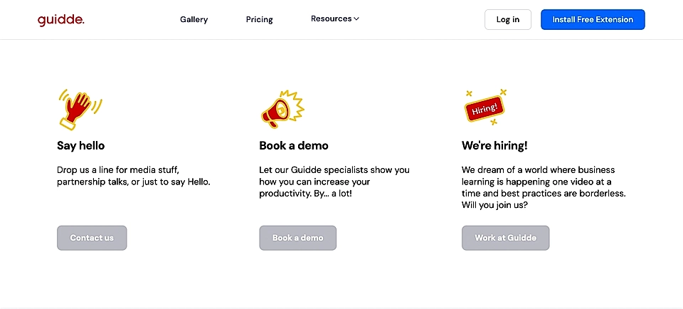
Guidde keeps visitors engaged with soft CTAs
Not everyone is ready to sign up for your product immediately after visiting your page for the first time. To avoid losing a potential customer, offering softer CTAs at the end of the page might do the trick.
Guidde’s element after the free trial CTA and before the footer is a great example.
******
Are you looking to create landing pages but unsure where to start?
With LandingRabbit, you get help in planning the best possible page structure and content. Sign up for our 14-day free trial today and publish SaaS landing pages without the back-and-forth and guesswork.