Why the best B2B SaaS websites have a lot of landing pages
Is your B2B SaaS website stuck in MVP mode while your product grows?
A simple startup landing page might have been perfect at the start, but as your product scales, so should your website.
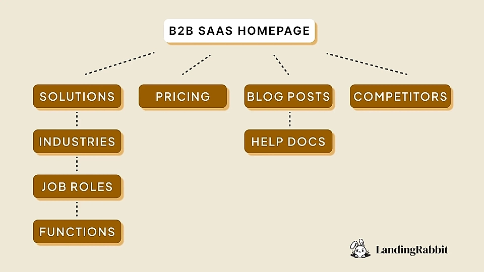
A separate pricing page and feature-specific pages are often the first ones to break out from the homepage. Before you know it, you’ve got a long list of other SaaS landing page types, like competitor comparisons, Google Ads landing pages, industry-specific pages, and more, to work on.
In this post, I'll show you why the best B2B SaaS websites have a lot of landing pages and what page types are crucial to drive sales. We’ll break down the key elements that make those pages stand out and give you the tools to copy their tactics, too.
Why do B2B SaaS websites need a lot of landing pages?

While an online shop selling shoes might have one template for most products, a growing B2B SaaS company needs a lot of page variations to maximize sales. Customers might buy sneakers on a single visit to Nike’s online store, but they would not typically purchase a new CRM immediately after browsing the SaaS website for the first time.
Buying B2B SaaS products is complex.
Instead of focusing all your efforts on improving your homepage, you’ll need a variety of pages to convince leads to give your SaaS a go – and eventually, buy the software.
There are four reasons why you need a lot of landing pages in B2B SaaS:
- Short attention span.
- Traffic source and user intent.
- Non-linear buyer journey.
- Multiple stakeholders.
1. Short attention span
In theory, a single SaaS landing page could cover all your marketing needs.
But humans are not like the ChatGPT – it takes us a lot of time to read and analyze long-form content and pull out the most relevant pieces of information related to our use case.
Call it short attention spans or just our cognitive limits; we want results immediately. If we don’t understand the landing page content and what benefits your SaaS offers, we’ll find the information elsewhere – in a clearly packaged format.
Takeaway: Make sure you have targeted landing pages that answer the specific problems and needs of your customers.
2. Traffic source and user intent

The traffic source makes a ton of difference – and it usually changes the user intent quite a bit as well.
You might, for example, run Linkedin Ads and promote a downloadable guide in exchange for leaving details like email address and company name. When you contact leads via email later, they might know very little or nothing about your solution and the problem it solves. Instead of a hard sell page, your best choice would be to continue the discussion with something educational and informative.
On the other hand, someone might be searching for the ‘best CRM for startups’ in Google, and a page showing the solution’s benefits for small businesses and strong CTAs driving sign ups would be just right.
Takeaway: Make sure you have landing pages matching various user intents, from informational to transactional.
3. Non-linear buyer journey
The buyer journey and how the user intent develops over time aren’t linear.
Before booking a demo call or signing up for a free trial with your product, the lead has most likely visited your website and browsed your social media content – it might take tens of touch points to convince a SaaS page visitor.
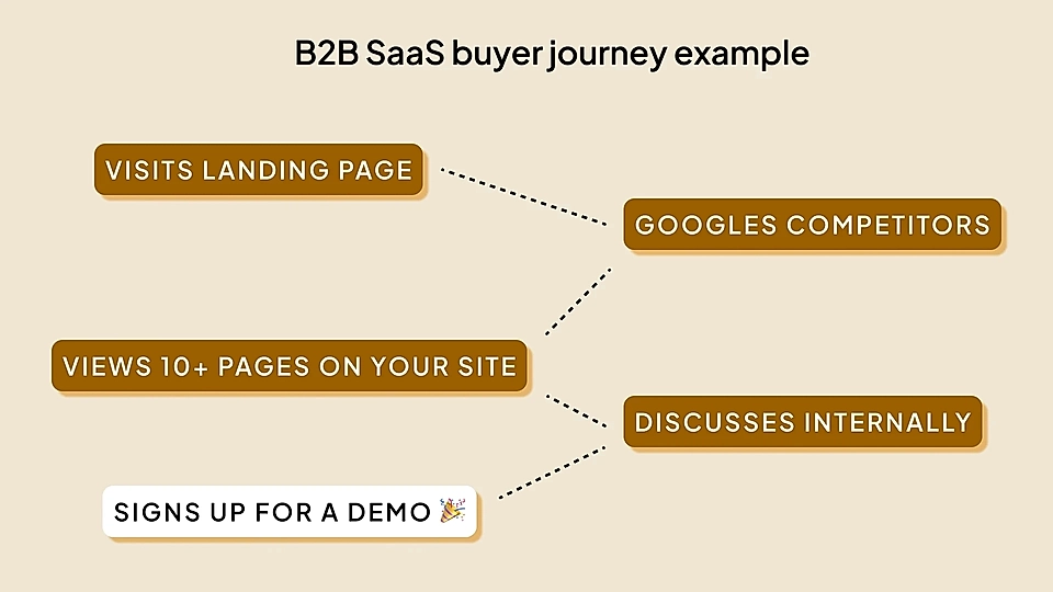
Also, it’s very common that someone in the buyer’s team has already created a quick product comparison summary based on the materials on multiple SaaS providers’ websites. If you fail to serve pages that match the buyer journey and information buyers need to put together for the wider team, your competitors will most likely win the comparison.
Takeaway: Make sure your landing pages and resources, like help documents, match the competition and show how you stand out in the market.
4. Multiple stakeholders
Your B2B SaaS website often needs to convince multiple stakeholders.
While some products work well for a single user, most B2B buyers need approval from their boss.
And suppose you are selling something more complex to large organizations. In that case, you might need to convince the IT and security teams, data protection officers, product users, purchasing managers, and many more. Messaging apps like Slack need to eventually onboard the whole company – the amount of decision-makers is high, and their job role and ladder in the organization might surprise you.
Takeaway: Make sure you have landing pages to convince everyone from a product user to a budget holder.
Pages that make your B2B SaaS website sell
Now, let’s take a look at the B2B SaaS website designs and examples that capture the short attention span, serve various user intents, adapt to the non-linear buyer journey, and answer questions of multiple stakeholders.
Best homepage for B2B SaaS websites
Role:
- Give an overview to people visiting through brand name search and other direct traffic.
- Help decision-makers in your buyer’s organization to understand the key benefits.
- Guide users who revisit your site to find the right information quickly.
Let’s start with the obvious. Every company needs a homepage, and almost all customers will visit your SaaS homepage eventually.
Previously, I was running a fairly simple SaaS where some conversions might have come through a targeted PPC landing page instantly. However, the more common route was to step back from the landing page and view the more generic product offering on the homepage (and a bunch of other pages) before signing up.
In addition to feature-specific product landing pages and SEO-friendly blog posts, many SaaS website visitors come through a brand name search on Google. They have either seen your content elsewhere, been directed to your B2B SaaS website via colleague and word-of-mouth, or previously browsed through your offering and are now further down the buyer journey.
The best possible B2B SaaS homepage has a clear hero messaging that focuses on the key task the product solves and the benefits it serves. Even if the product is relatively complex and serves multiple use cases, you want to make sure page visitors immediately get your value proposition and what’s in it for them.
Loom’s website with the hero text, ‘Share a video, not a calendar invite’ is a fantastic example.

Decision-makers who haven’t spent much time thinking about your product (but have been asked to review the purchase) understand what Loom does in a few seconds (and words).
If your SaaS really grows big – tens or hundreds of millions of dollars in yearly revenues – you might have multiple products. For example, Salesforce has acquired companies like Slack and Tableau, which are far from the original product (CRM).
You might be surprised when you see Salesforce’s homepage to promote a CRM. Shouldn’t they promote all products?

Instead, Salesforce has chosen to promote the central product they believe brings the most value to the company and drives the adoption of other products later. They know that most homepage visitors, through Google search and word-of-mouth, are looking for a CRM, and other apps have their dedicated landing pages.
If an occasional user needs help, extensive but clearly designed navigation should guide them towards the right product.

Even if you don’t have multiple products yet, the complexity tends to grow, and your SaaS might serve multiple use cases. That’s when a section like “Dashboard examples” seen on Geckoboard’s B2B SaaS website can help.

Templates give users a quick way of solving a specific problem and make it faster to get to the a-ha moment when using the product for the first time.
Pricing page for B2B SaaS websites
Role:
- Remove early hesitation before spending more time on research and signing up for a call or trial.
- Help users choose the right subscription plan and request the right budget.
- Help users further down the buyer journey to compare you against competitors.
The pricing page is one of the most underrated pages on a B2B SaaS website. Often, you’ll see poorly implemented pages that try to copy competitors and other SaaS solutions but don’t help visitors understand how the pricing and features compare against competitors.
You can assume that your page visitors have viewed your competitor’s pricing – or are about to do so shortly. The best SaaS pricing pages instantly tell why the customer should choose this specific product over competitors and tackle the most common questions in the buyer’s mind.
Flockler’s pricing page is a perfect example.

Most of Flockler’s competitors are a lot cheaper but don’t allow users to create unlimited social media widgets, and they restrict page views, too. Those two parameters happen to be the most common hesitations for new customers who aren’t really sure how many widgets they’d need and how popular their websites and user-generated content campaigns become over time.
Basecamp’s pricing page shows a couple of more ways to stand out: keeping it simple and showing social proof.

“Another 1,724 organizations signed up last week.” is a perfect way of saying that organizations similar to yours trust this solution. Having just two plans with a capped pricing at $299/month makes the decision easy.
Solution and feature-specific pages for B2B SaaS websites
Role:
- Provide information about use cases at the start of the buyer journey.
- Convert commercial and transactional search and ad traffic into sign ups.
Solution and feature-specific pages are the most common landing pages for B2B SaaS websites. In addition to SEO traffic, the majority of paid traffic from Google Ads and social media is directed to them.
In addition, those pages can help people at the start of the buyer journey to find targeted and condensed information about how the software can serve their needs.
Based on our research and reviewing hundreds of SaaS landing pages, here’s a perfect SaaS product landing page template for you to copy.

Supahub’s feedback board page is one of my favourite landing pages.
The hero clearly communicates what the product does, who is it for, and why you should care.
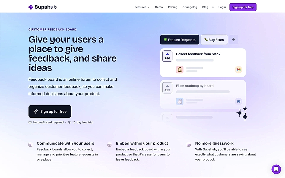
The page then continues with benefits, how to get started, product features, FAQ, and CTA element – all ingredients of a high-converting SaaS landing page.
Are you looking to expand your B2B SaaS website with targeted and focused landing pages? With LandingRabbit, you get help in planning high-converting pages. Sign up for our 14-day free trial to build SaaS landing pages in 15 minutes, not weeks.
Industry-specific pages for B2B SaaS websites
Role:
- Give the buyer real-life examples from other organizations in the same industry.
- Help stakeholders quickly understand why buyers in other organizations choose the product.
The best industry-specific pages help visitors find real-life examples from similar organizations, and they tend to capture organic search traffic. It’s not likely that many companies would have written long-form posts focused on certain features for a specific industry (e.g., ‘task management tool for education’), and it should be relatively easy for you to rank in the top 10 search results.
Also, suppose your SaaS has a customer live chat for those who haven’t signed up yet. In that case, one of the most typical questions is, “Are there any [my industry] examples?” – just like any other content, most B2B SaaS website pages can serve multiple needs and steps of the buyer journey.
Monday’s retail page is a fantastic example. The page explains various use cases on how retailers can use the software but also highlights some of the customers and their case studies.


Job role and function-specific pages for B2B SaaS websites
Role:
- Target a specific buyer job role and their use case.
- Help decision-making in organizations that might have multiple functions using the product.
Somewhat similar to the industry pages, job role and function-specific pages (e.g., ‘task management tool for marketing teams’) help your SaaS capture organic search traffic and also make it easy for page visitors to learn about your product in the context of their daily work.
Also, some software and apps require participation from various organizational functions, and a SaaS buyer equipped with function-specific pages can easily convince different departments of the company.
Asana’s dedicated page for marketing teams is a fantastic example – the page comes with tailored examples and use cases on how marketing teams specifically can benefit from Asana’s project management tools.

Competitor comparison pages for B2B SaaS websites
Role:
- Help visitors compare you against other products they evaluate.
- Help crystallize what type of organizations choose your SaaS and why.
Well-implemented competitor comparison pages make it easy for buyers to evaluate multiple tools and learn about the key differences quickly. Instead of creating a page that makes your SaaS shine and beat competitors in every aspect, focus on showing the capabilities that make your SaaS stand out from the competition.
Zapier’s comparison page against Make is a great example. In addition to a traditional feature comparison table, the page comes with content sections that clearly explain the key differences.

Blog posts on B2B SaaS websites
Role:
- Build brand awareness with content that keeps showing up in multiple channels.
- Get shareable content for social media channels to reach those in the early stages of the buyer journey.
- Help visitors in all stages of the buyer journey through SEO and targeted search traffic.
Blog posts, videos, and other shareable content are the best way to reach customers who are very early in the buyer journey. Sometimes, they haven’t even recognized the problem and aren’t seeking for a solution yet.
Being consistent and showing up on social media channels with relevant and targeted content helps get your message across and build brand awareness. And with SEO-friendly content on the SaaS website, you’ll have a chance to steer customers through the buyer journey.
Klientboost has a perfect example of a blog that covers tons of focused content for the agency’s potential customers. Collections like this help customers from a very early stage to the final decision-making.

Help documents on B2B SaaS websites
Role:
- Answer hesitations at the start of the buyer journey and just before purchasing the product.
- Help users feel comfortable getting started and introducing your product to the organization.
While help documents obviously serve those who have already signed up, they play a critical role in customer acquisition, too.
For example, your potential customer might be looking for a very specific integration before getting started.
The integrations page of Supermetrics is a great example of a helpful and simple listicle page.

And before future customers decide to shortlist your SaaS as one of the options for a wider team to look into, they want to see screenshots and videos of the product in action. Recommending a product is a big step – your customers have their reputations on the line.
If you are looking for a stellar example, navigate to Posthog’s documentation.

Would you like to expand your B2B SaaS website with targeted and focused landing pages? With LandingRabbit, SaaS teams publish landing pages fast and easy. Sign up for our 14-day free trial to create high-converting landing pages for your existing website.