21 ways to write engaging SaaS features section copy
Too often, SaaS landing pages list features without showing why they matter. A section titled "Our features" doesn’t grab attention or inspire action. It’s easy to ignore.
But visitors don’t ignore features when they’re tied to real benefits.
In addition to the obvious benefits like saving money and increasing revenues, SaaS buyers want to, for example, advance their careers, make tasks easier, and avoid looking bad in front of their team.
In this post, I’ll walk you through inspiring examples of 21 SaaS companies that connect features with real, meaningful benefits. These examples will help you write copy that engages, motivates, and drives conversions.
21 inspiring examples of product features copy texts for SaaS
Beehiiv
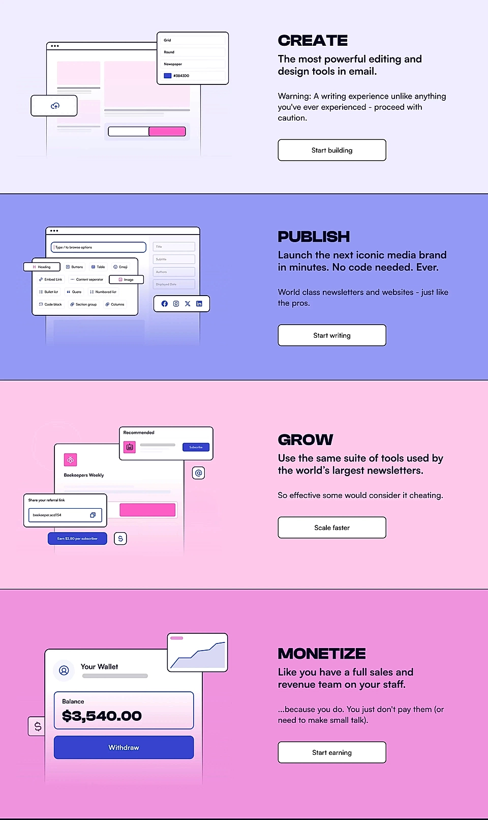
What's not to love about Beehiiv's features section?
The goal of a SaaS homepage is to provide visitors with a clear overview without overwhelming them, leaving more detailed info for focused product landing pages.
And that’s what Beehiiv masters.
The headings take you through a smooth journey from creation to monetization.
The descriptions are both witty and accessible, making visitors want to read more.
Plus, the tailored call-to-actions for each product feature are the cherry on top.
Cal
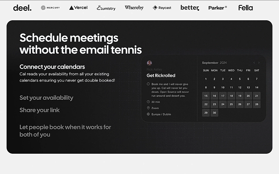
After reading the title of the section, ‘Schedule meeting without the email tennis', you might assume it's a benefits section.
And that's exactly how it feels.
But in reality, this part explains how Cal works, highlights the key product features, and makes it clear why those features matter.
If you're thinking about adding a ‘How it works’ section to your SaaS landing page template, take inspiration from this example and make sure your section has:
- Clear steps.
- Approachable language that speaks directly to the visitor.
- The “why” front and centre.
Does your website have tailored pages for use cases and jobs to be done? A SaaS product page builder can help you make sure visitors turn into warm leads.
ConvertKit
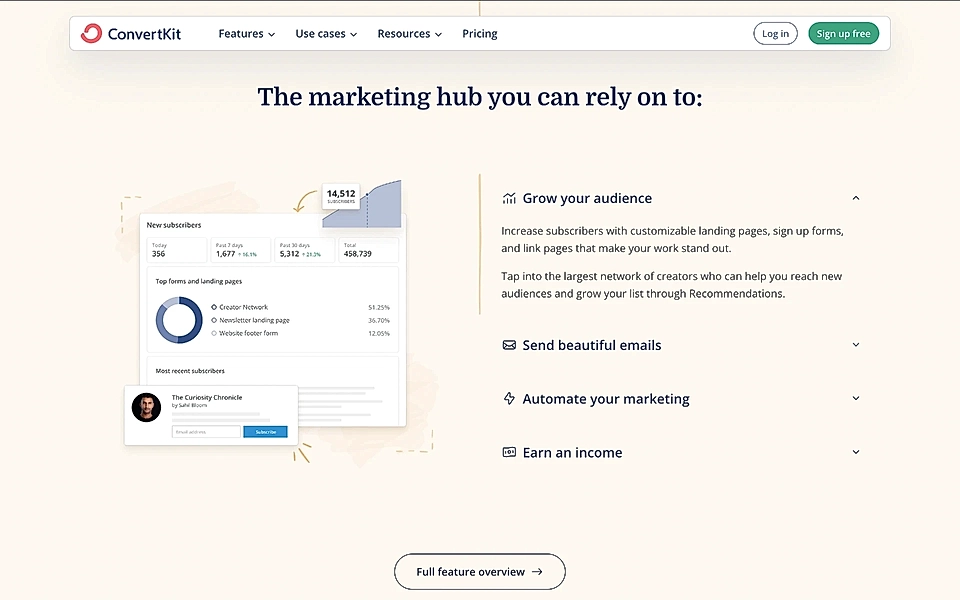
ConverKit’s features are called ‘Grow Your Audience’, ‘Send Beautiful Emails’, ‘Automate Your Marketing’, and ‘Earn Income’ – it speaks volumes about the company and the expertise of its marketing team.
The benefits-focused copy presents features in a logical sequence with clear, direct language. The tone remains professional yet approachable – avoiding unnecessary wordplay or gimmicks that could confuse visitors.
A clean, high-quality landing page design and fantastic copy – should be your SaaS marketing goal, too.
Diffblue
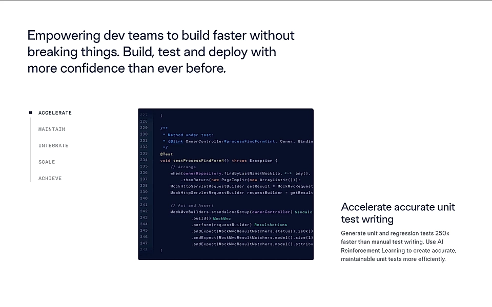
Just like all the other examples I chose, Diffblue’s product features section offers active, straightforward copy that speaks directly to its ideal customer.
But what really earns it a spot here is the phrase ‘with more confidence than ever before’.
It’s a powerful reminder that SaaS buyers don’t just choose products for cost savings or revenue boosts.
Often, their motivation runs deeper than the obvious. Diffblue understands its audience and knows that feeling confident about deploying new code is a constant challenge for developer teams.
Are you looking to improve your landing pages? A SaaS landing page planner might be the tool you need.
Evernote
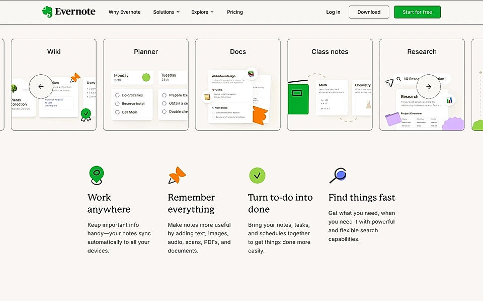
When crafting your product features section, you should really take inspiration from Evernote's titles.
At first glance, they seem like benefits, but as you read the descriptions, it becomes clear that this section – positioned just below the hero section and use cases Evernote supports – highlights its four key features.
It’s a smart example of how SaaS companies can structure their copy: using the title to present the outcome while the description outlines how to achieve it.
Are you dreaming of better-performing pages? With LandingRabbit, your team can plan landing pages and be confident that you are building pages that convert. Sign up for our 14-day free trial today!
Hey
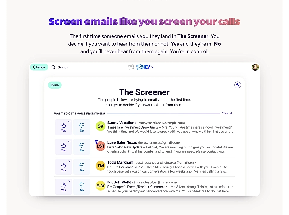
Hey, the email app by 37signals, has a product copy that’s beautifully crafted. Each feature is showcased in blocks with a title, a brief description, and a large image.
Titles like ‘Screen emails like you screen your calls’ speak directly to the user.
Small touches like ‘You’re in control.’ give the reader a sense that they can finally tame their chaotic inbox.
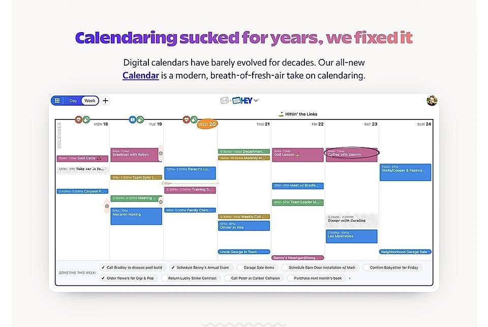
Bold claims like ‘Calendaring sucked for years, we fixed it’ convey that Hey’s team is on the customer’s side, building the app for themselves as well.
It might not appeal to everyone, but the copy pulls no punches – it’s all in.
Hoppy Copy
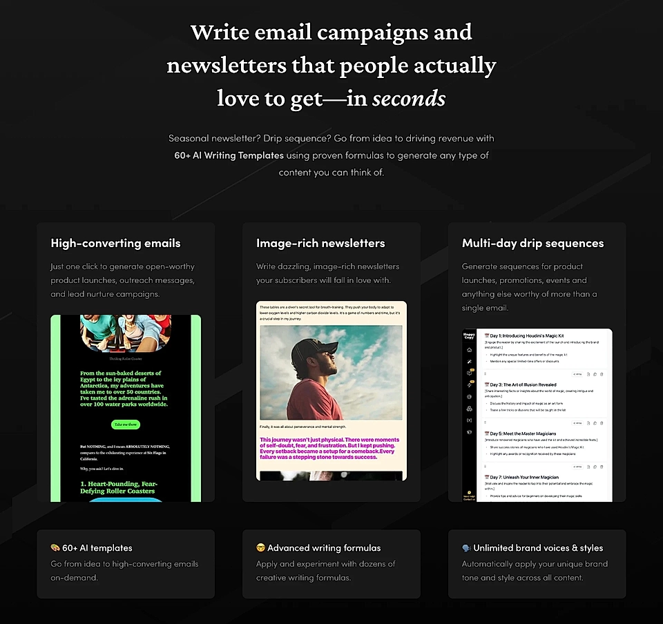
Hoppy Copy’s homepage showcases excellent SaaS copywriting, and the product features section is no exception.
When done well, the line between features and benefits blurs.
Take a look at a title like ‘Write email campaigns and newsletters that people actually love to get – in seconds’. It instantly gives visitors a reason to dive deeper into the features.
Descriptions like ‘Write dazzling, image-rich newsletters your subscribers will fall in love with’ tap into emotions, allowing visitors to envision their work becoming something recipients truly enjoy.
Are you looking to improve your landing page copy? With SaaS landing page planner, you can write pages that turn visitors into warm leads.
InfluenceKit
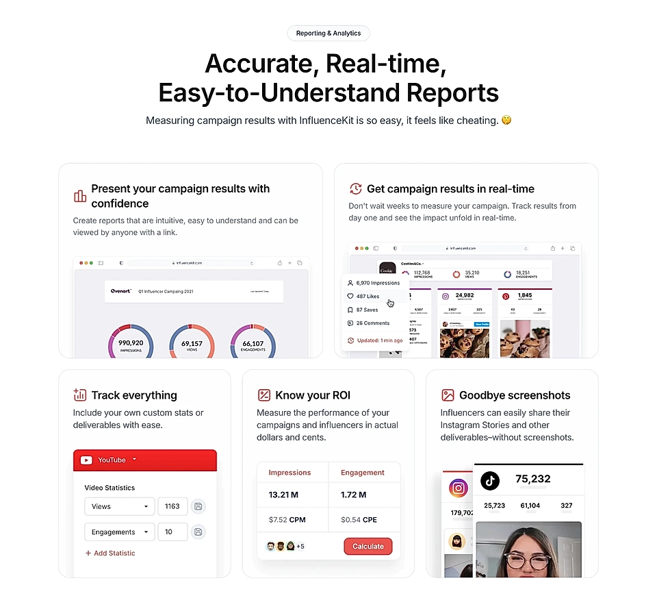
InfluenceKit’s features section is a gem.
The main description, ‘so easy, it feels like cheating’, and descriptions like ‘don’t wait weeks…’ showcase top-tier SaaS copywriting with a conversational, relatable tone.
Each product feature is paired with a benefit, such as ‘easy to understand’, ‘in actual dollars and cents’, and ‘without screenshots’, elevating the copy beyond a basic feature description.
Intercom
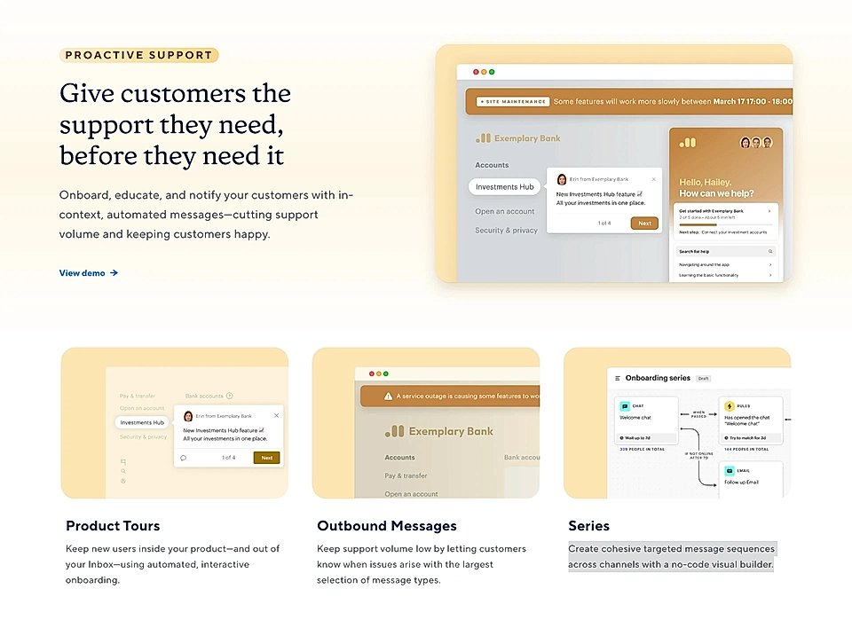
Intercom’s Google Ads landing pages are much more straightforward than the homepage you may have seen before.
On Intercom’s landing page targeting the search phrase ‘customer service platform’, one of the sections focused on product features uses a conversational and approachable title: ‘Give customers the support they need, before they need it’. It’s a fantastic example of a title that taps into visitors’ emotions, creating a connection between them and their customers.
In addition, description texts clearly explain what the tool does and the results it delivers.
Junip
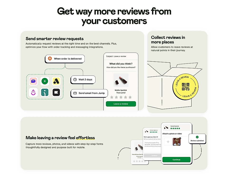
Junip’s features section might make many copywriters and marketers feel jealous.
‘Get way more reviews from your customers’ speaks directly to visitors struggling with collecting customer reviews.
Each title highlights the benefit (smarter, more places, and effortless), while the description texts explain how the product fulfils these promises.
Klaviyo
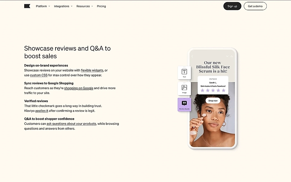
Klaviyo’s product reviews landing page has multiple sections that highlight product features in a way that feels impactful.
The title, ‘Showcase reviews and Q&A to boost sales’, explains why the four listed features are worth your attention.
To keep you engaged, phrases like ‘max control over how they appear’ and ‘drive more traffic to your site’ clearly communicate why these features were chosen and why they matter to you.
Liveblocks
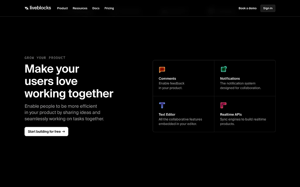
Many SaaS pages use a title like ‘All features, and some more’ without considering the visitor's perspective.
When done well, however, the product features section resembles the one on Liveblocks' landing page for collaborative forms.
The title and description on the left explain why the features on the right are worth exploring. With engaging copy like ‘Make your users love working together’, you can motivate visitors to stop and read instead of scrolling past.
Loom
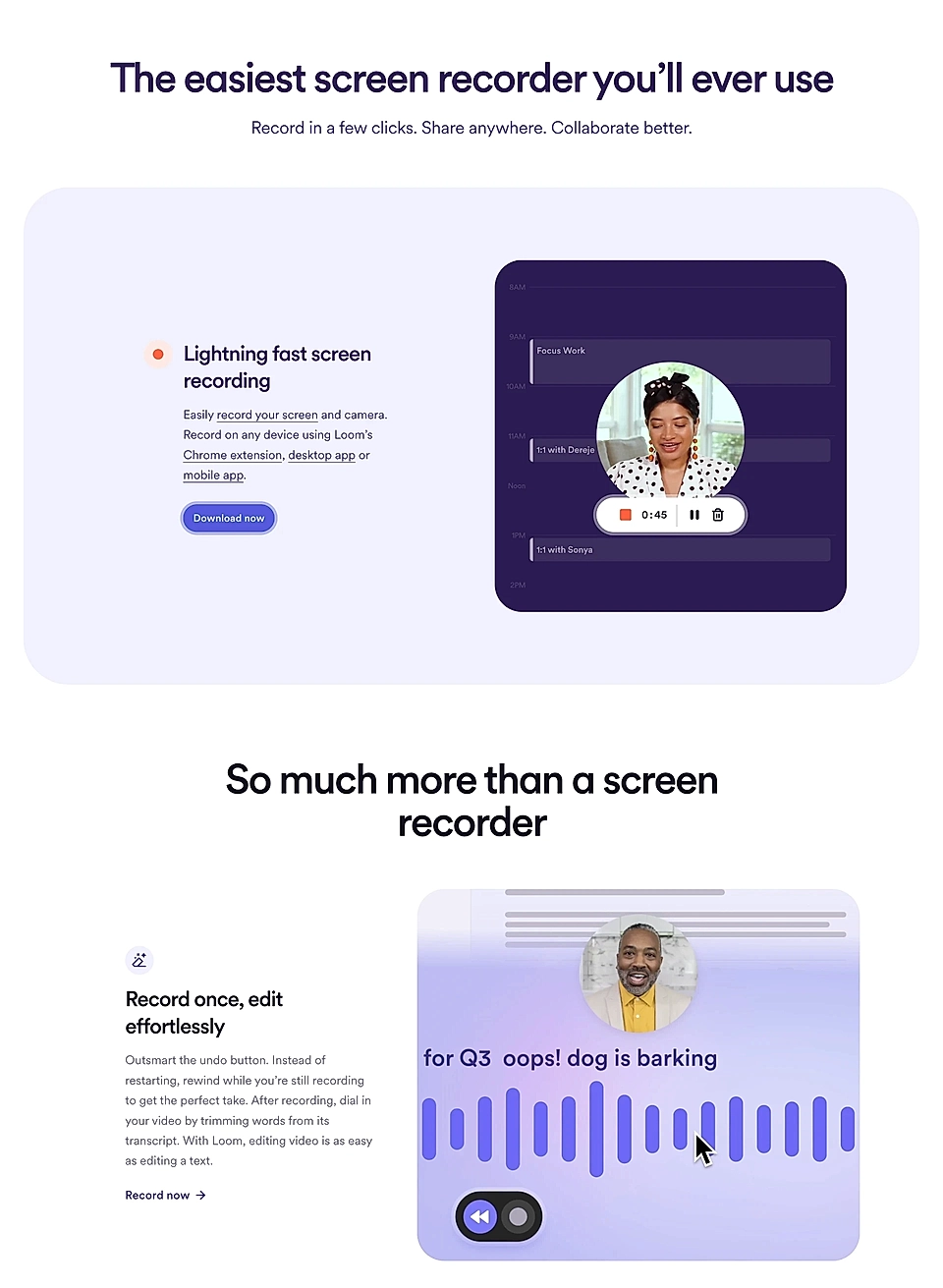
The features section opens with the title ‘The easiest screen recorder you’ll ever use’, immediately positioning Loom as a tool accessible to everyone on the team.
Subtitles like ‘Record once, edit effortlessly’ effectively convey both product features and their advantages in a single statement and only four words.
The language throughout is clear and approachable, making it easy to understand. Even the CTA links, like ‘Record now', are thoughtfully crafted to fit the context of each feature.
ModernLoop
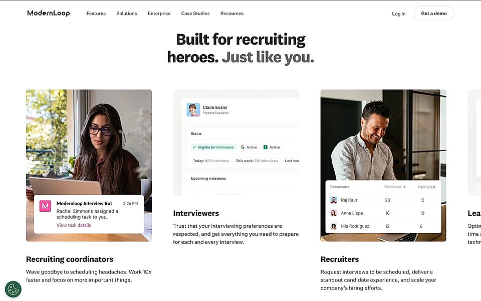
Technically, this isn’t a features section but rather a showcase of use cases on ModernLoop’s homepage.
However, it’s included in this list for a reason: the description texts are tailored to specific roles, demonstrating to visitors that the entire team can benefit from the tool.
If your SaaS serves multiple job roles and functions, this is a fantastic example of SaaS copywriting to keep in mind when building your next SaaS landing page.
OpusClip
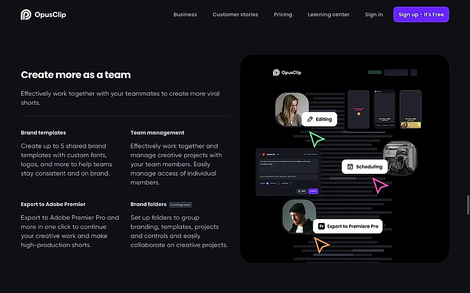
The product features section on OpusClip’s landing page for marketers could have easily been titled ‘Collaborate’.
However, the skilled copywriter at OpusClip chose to lead with the outcome instead: ‘Create more as a team’, followed by ‘Efficiently work together’ just below.
Like other well-crafted features sections, OpusClip seamlessly presents benefits, such as ‘help teams stay consistent and on brand’, within the feature descriptions.
Quickbooks
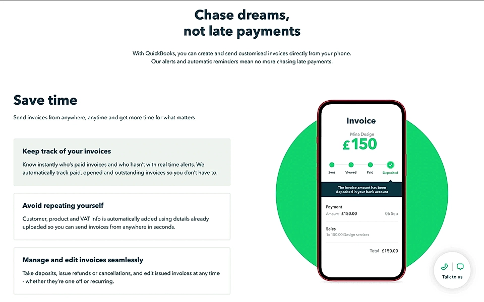
‘Chase dreams, not late payments’ on QuickBooks’ PPC landing page is a brilliant way to frame its features.
Now, imagine if they listed features like ‘Keep track of your invoices’ or ‘Manage and edit invoices seamlessly’ without the title – chances are, you’d lose interest and scroll through your social media instead.
That’s why top B2B SaaS websites emphasize benefits like ‘Save time’ and ‘Stop chasing invoices’ helping you see the value behind the features.
By making you care and understand the purpose of each product feature, QuickBooks creates a stronger connection. A description like ‘Send invoices from anywhere, anytime, and get time for what matters’ perfectly illustrates this approach.
Simpu
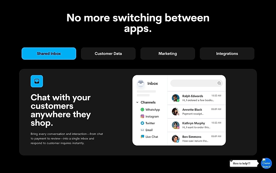
As your SaaS grows, you’ll often identify multiple ideal customer profiles. It leads to a rapid increase in landing page types, each targeting specific job roles, functions, industries, and more.
Simpu’s e-commerce page is a prime example of this approach.
Rather than repeating the homepage message, the content is tailored from the top of the page down to the feature descriptions. ‘Chat with your customers anywhere they shop’ speaks directly to e-commerce marketers.
And with phrases like ‘Respond to customer inquiries instantly’, the page ensures visitors are motivated to click through the tabs and explore further.
Are you looking to create audience-specific pages? A SaaS landing page planning tool can help you make sure page visitors find what they are looking for.
Slite
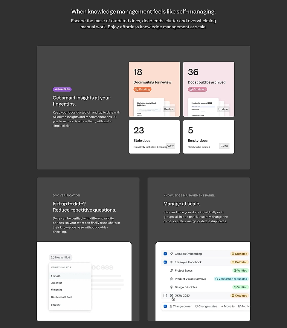
Slite refers to this as a features section, but a quick read reveals it's heavily benefits-driven.
The copy feels active and dynamic, clearly showing that Slite’s marketing team understands their customers and the language they use.
Small details like ‘Is it up to date? Reduce repetitive questions.’ really make the copy stand out.
While we might suggest tweaking the main title, ‘When knowledge management feels like self-managing’, to match the more active tone, Slite’s features section remains a strong example for any SaaS marketer to follow.
Storytale
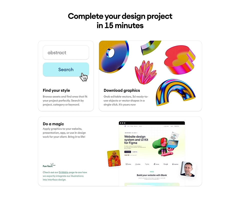
‘Complete your design project in 15 minutes’ is an excellent way to motivate your visitors to explore more of your features. Instead of using an adjective like fast, the concrete '15 minutes' makes the benefit quantifiable.
However, Storytale’s features section goes even further.
With benefits like ‘find ones that fit your project perfectly’ and ‘in a single click’ included in the descriptions, it encourages visitors to keep scrolling and discover more.
Todoist
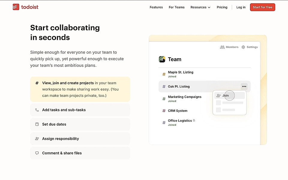
A less experienced copywriter might have chosen a title like ‘Collaborate’—which isn’t a bad option. However, more sophisticated and actionable copy (’Start collaborating in seconds’) written by the Todoist marketing team instantly turns the feature section title into a benefit.
By adding phrases like ‘in seconds’ and ‘make sharing work easy’, you give visitors a compelling reason to keep reading and dive into the product feature descriptions in detail.
Typeform
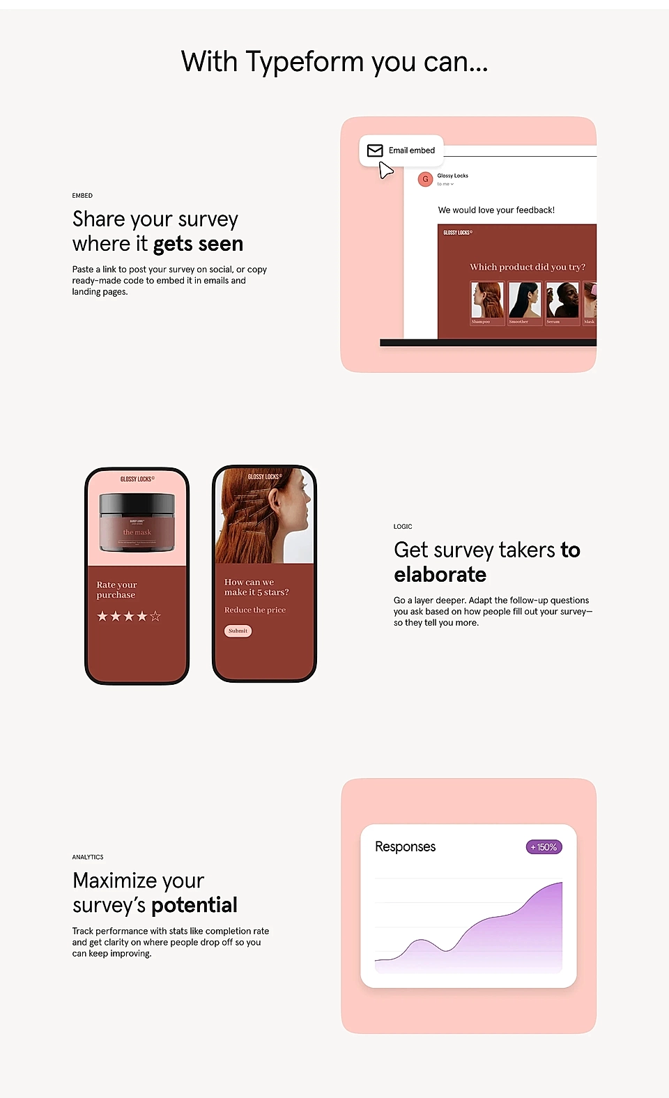
When a product features section is crafted effectively, it engages the reader on a deeper level.
Typeform’s Surveys product page uses powerful phrases like ‘where it gets seen’, ‘so they tell you more’, ‘Maximize your survey’s potential’, and ‘you can keep improving’.
The conversational and straightforward tone creates a sense that Typeform truly understands its audience.
Conclusion
The key takeaway: Effective SaaS product features copy texts should always connect to deeper benefits, not just list functions.
By tying features to real outcomes – such as saving time, improving workflow, or boosting confidence – you engage users on a more emotional level.
The best examples show how to frame features in a way that resonates with the audience, using clear, approachable language that highlights the "why" behind each feature.
Are you looking to create landing pages for your SaaS but struggle with them? With LandingRabbit, your team can plan landing pages and be confident that you are building pages that convert. Sign up for our 14-day free trial today.