9 fantastic Google Ads landing page examples for SaaS
Have you ever had your Google Ads management console showing a lot of clicks but very few conversions?
I’ve had it, too. Many times.
While sometimes the issue is technical and related to your analytics setup, more often, it is the poor message match between the search keyword, ad copy texts, and landing page content.
Your first instinct for getting better results is to find examples from other SaaS companies.
If you are on the hunt for examples right now or looking to bookmark best practices for later, you’ve arrived in the right place.
In this blog post, I’ll answer the top three Google Ads questions SaaS marketers ask on LinkedIn:
- Why does my SaaS need Google Ads landing pages?
- What content should my Google Ads landing page have?
- Where can I find the best Google Ads landing page examples for SaaS?
Let’s dive in 👇
Why does my SaaS need Google Ads landing pages?
If you already know why, feel free to scroll down to see what content goes into a high-converting Google Ads landing page and to learn from the best examples.
But if you are a touch unsure why it’s so important to invest in Google Ads landing pages, then hear me out.
Unlike ChatGPT, it’s really hard for us to find the needle in the haystack and summarise complex information to a clear output. We need the help from subject matter experts to do the work for us.
When writing a landing page matching a Google search keyword, you are the expert. Instead of asking the page visitor to connect the dots, make sure you present the information in a logical and easy-to-understand format.
Let’s look at a fictional example.
Imagine you work for a project management tool, and someone searches for ‘project management tools for startups’. You will maximize the impact of your page by tailoring the content – features, benefits, examples, and more – to match the startup context.
It sounds so obvious, but only 30% of Google Ads landing pages have a good message match.
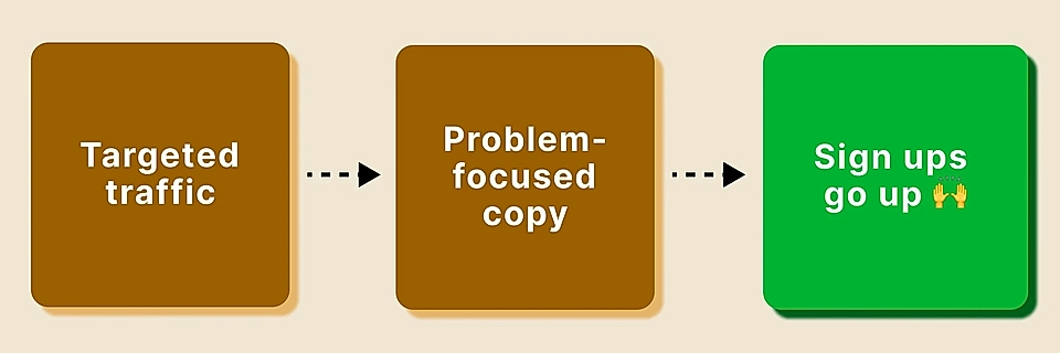
The better you understand your customers and page visitors’ user intent (the “why” they arrived at the page), the higher the conversion rate in the Google Ads console will be.
That’s it.
It’s not rocket science why SaaS companies need landing pages not only for Google Ads campaigns but for every message that goes out to customers. The clearer your message and the easier it is for prospects to buy, the better results your marketing and sales team delivers.
Are you looking to create landing pages for your SaaS? A Google Ads landng page builder might be the tool you need.
What content should my Google Ads landing page have?
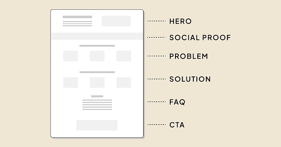
The user intent will guide the detailed landing page content, but there are some best practices regarding the structure.
If your Google Ads keyword is very solution-focused and there are signals that the visitor already knows quite a bit about the topic, I’d recommend using the PAS formula. The idea is to introduce a problem the page visitor is likely to experience, agitate it, and then provide a solution (your SaaS, obviously) to fix the problem.
Another way of thinking about this is to imagine a desired state, something the page visitor can achieve with your product – and something they lack with their current tools or ways of working today.
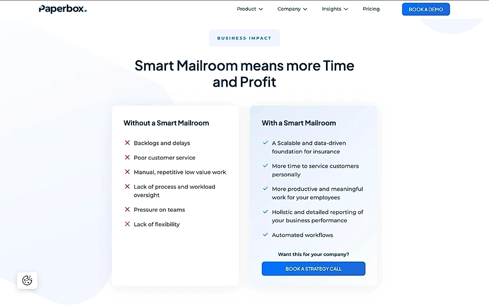
Paperbox’s website has a great example of a with/without element, showing the difference between customer’s current process and the better future:
There are multiple ways to create a problem section for your SaaS landing page. In general, that section drives the structure and order of the landing page content:
If your Google search keyword targets someone who’s still relatively early in their buyer journey, it will be hard for you to narrow down to a specific problem (your solution might help with many tasks).
Then, a benefits-driven template might be the right choice for you:
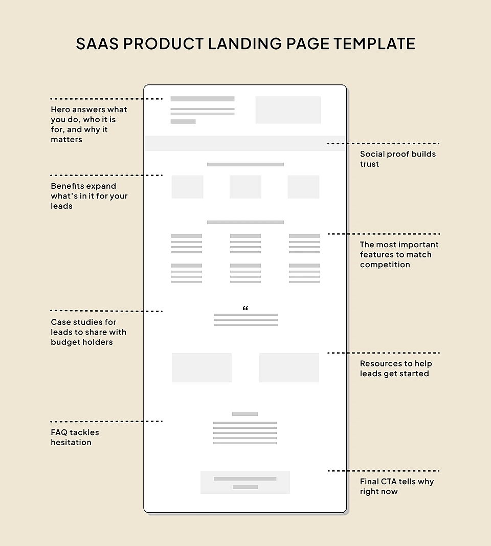
Instead of agitating a specific problem, focus on the value your SaaS provides and include links to specific products in the features section.
Are you creating Google Ads landing pages but need help deciding the best structure? Get LandingRabbit’s 14-day free trial to plan, write, and publish high-converting pages.
Where can I find the best Google Ads landing page examples for SaaS?
So far, we’ve covered the why and what of Google Ads landing pages. The only thing left is the how.
The search for examples ends here – I’ve collected nine fantastic Google Ads landing page examples for you.
Copperx: Payment links
Copperx’s Google Ads landing page has many good elements, but it all starts with a perfect SaaS hero section.
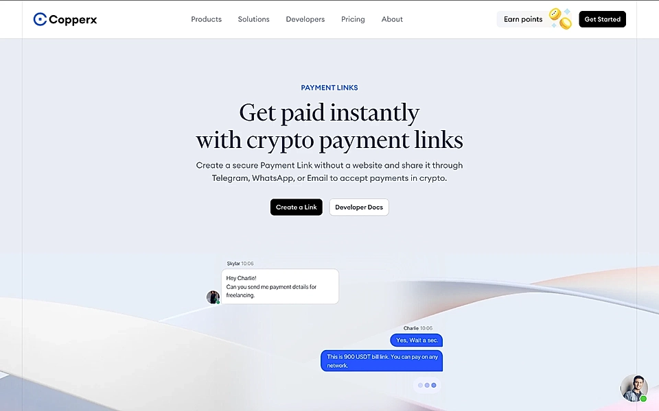
Web3 and crypto solutions often get criticized for overly technical language, but Copperx’s hero for crypto payment links keeps it simple and actionable. The title nails the purpose (‘Get paid instantly’), and the description tells you exactly how to make it happen.
Many SaaS experts like to repeat that a Google Ads landing page should only have one CTA button.
But if your SaaS targets developers, you might want to go against the bulk advice.
That’s why Copperx’s hero includes two CTAs: ‘Create a Link’ and ‘Developer Docs’.
‘Create a link’ is a great, action-oriented button.
But the “boring” link to ‘Developer docs’, which breaks the “one CTA” rule, might actually drive more conversions:
- Onboarding for many tech-heavy SaaS tools can begin well before signing up.
- If the documentation is solid, a product manager or tech lead might build a proof-of-concept without even creating an account.
In general, I like the “one CTA button” rule; it often works. "Keep it simple" converts.
But if you’re a SaaS founder or marketer, remember that typical advice doesn’t always fit every product context.
Klaviyo: Product reviews
There’s an easy trick to test the quality of any landing page: Is the features section listing technical terms, or does it sound like a collection of benefits?
Klaviyo’s product reviews page includes several sections where features come across as benefits.
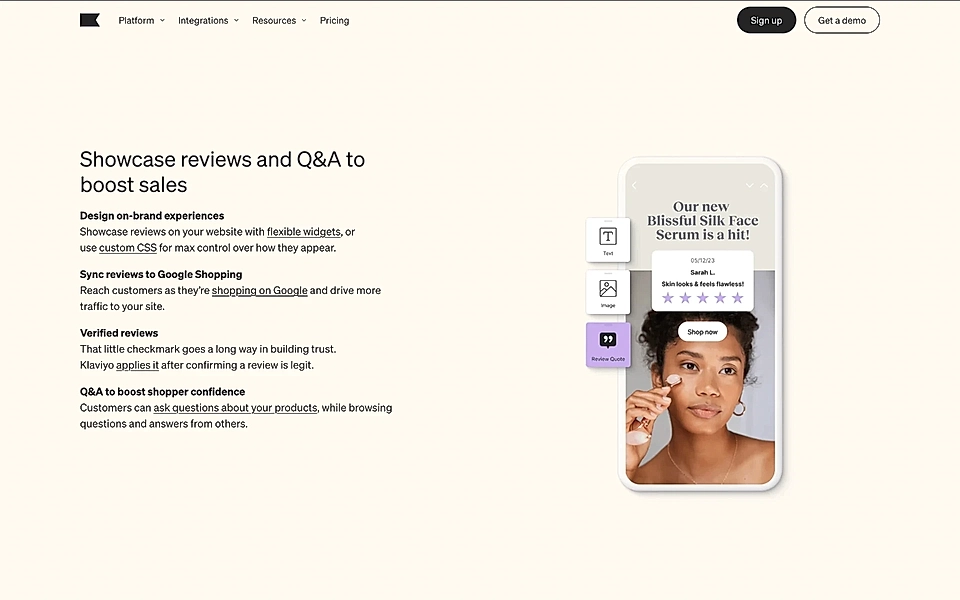
The features section title, ‘Showcase reviews and Q&A to boost sales’, immediately explains why the following four features are worth your attention.
To keep readers engaged, phrases like ‘max control over how they appear’ and ‘drive more traffic to your site’ emphasize why these features were chosen and why they’re valuable.
The theory holds: the overall quality of the landing page is as good as the features section.
If you are looking to write a new one for your SaaS website, these 21 brilliant features section examples will help you get started.
Scoro: Project management
Scoro’s project management page features a hero section with a clear, value-driven title, ‘Protect your bottom line’, and to-the-point language in the description (‘Ensure your projects make money’).
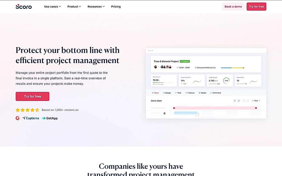
It’s a great example of how simple, direct language can be more powerful than clever wordplays. Social proof and a star rating just below the CTA button add an extra layer of trust.
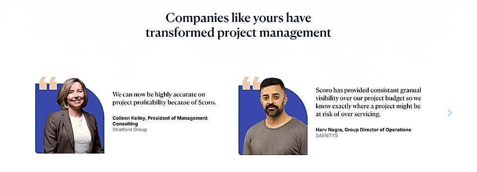
Right after the hero section, Scoro includes customer testimonials, which go beyond typical B2B logos by showing real customer images and feedback. These testimonials match nicely with the page’s message and add genuine appeal.
The pricing section is another strong point, helping visitors figure out if Scoro is the right fit for their needs.
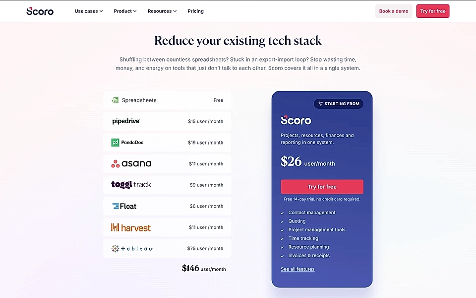
Here, the message focuses on ‘you pay for too many apps’, suggesting that Scoro’s all-in-one solution can simplify and save.
Also, the description highlights common issues decision-makers face, while the visuals amplify Scoro as a more affordable option than what visitors might currently be spending.
Scoro’s Google Ads landing page keyword, ‘project management tool’, might not be sexy, but it is answered by a great SaaS landing page example for any B2B SaaS marketer to follow.
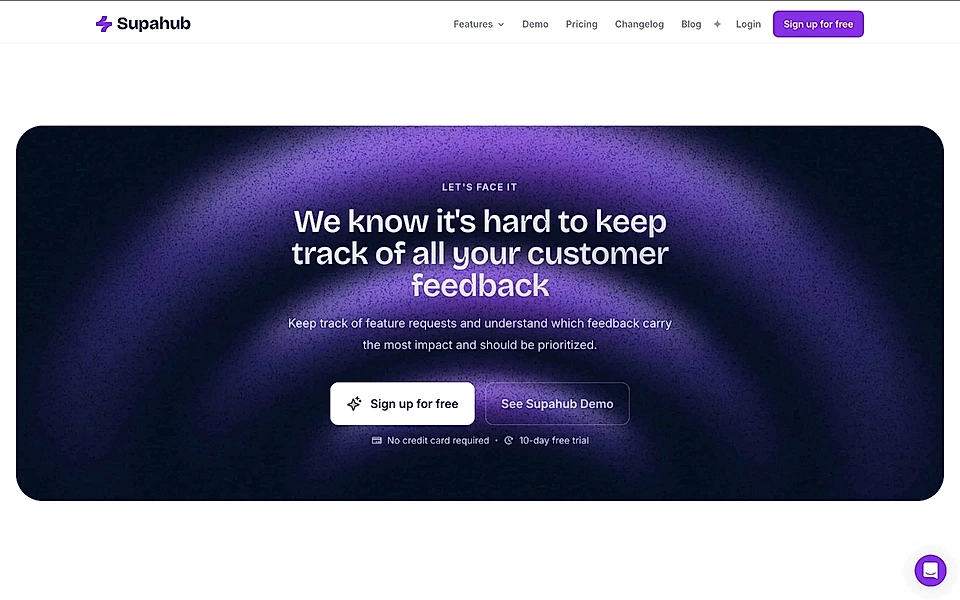
Supahub: Customer feedback board
Supahub’s hero text takes a smart approach with a straightforward formula: Give your users [outcome].
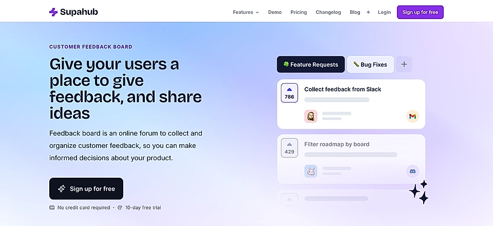
This style works well on SaaS pages because it speaks to both the customer and their users. It explains what the product does while also helping the buyer imagine how they’ll use the software to create real value for their own customers.
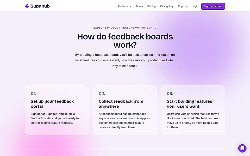
When visiting Supahub’s feedback board page, you should also pay attention to the ‘How it works’ section. A simple 1-2-3 element can do wonders and help visitors realize that getting started isn’t that much work after all.
When you scroll to the end, Supahub doesn’t let you down.
On many B2B SaaS websites, CTAs often feel like an afterthought, just copied from one page to another. Supahub’s product page, however, has a CTA that’s specific to this context. It also appeals emotionally to the visitor (‘We know it’s hard…’), showing a deep understanding of its customers’ needs.
Does your SaaS already have pages that match the use cases and jobs to be done? A SaaS product page builder can help you make sure your prospects find what they are looking for.
Wistia: Webcam & screen recorder
Marketers are well aware that images and videos help prospects get an idea of the product much faster than text.
And yet, SaaS product visuals are one area where most landing pages fail miserably. Images are often low quality or use vague illustrations and icons. Videos can be almost 10 minutes long, and only up to 10% of page visitors ever click play.
Wistia has the upper hand when it comes to product visuals – they sell a product for webcam and screen recordings, and when visiting their landing pages, you would not expect anything else but videos and animations.
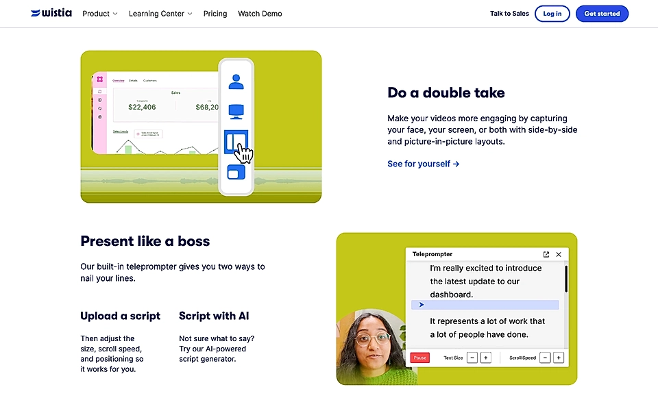
Their landing pages certainly meet expectations. On the webcam & screen recorder landing page, features are presented in 5-second videos. They support the text content perfectly and make it easier to understand if Wistia is the right product.
Intercom: Customer service platform
I’m sure you agree with me that Intercom’s homepage headline, ‘The new age of customer service is AI-first’, is not the most typical SaaS website hero text and leaves room for improvement.
However, Intercom’s Google Ads landing pages are much simpler and to the point.
On a page targeting the term ‘customer service platform’, approachable titles like ‘Give customers the support they need, before they need it' speak to visitors’ emotions by linking their needs with those of their customers.
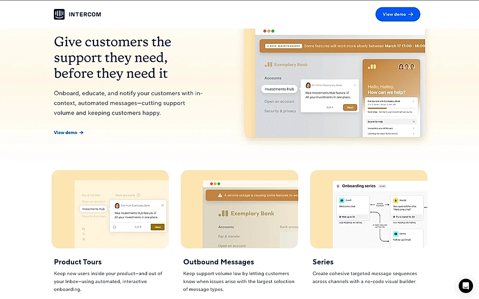
The descriptions clearly explain what the tool does and the benefits it brings.
The contrast between the homepage and Google Ads landing page is massive. To the Intercom marketing team’s credit, they’ve clearly understood that a user arriving from a Google search has a very targeted need, and the founder’s letter to customers visible on the homepage is replaced by direct product content.
Are you struggling with Google Ads landing pages? With LandingRabbit, you can plan the optimal page structure and content in no time. Sign up for our 14-day free trial to create high-converting landing pages.
Quickbooks: Invoicing software
The hero title on Quickbooks’s invoicing software landing page makes it clear that the page is geared toward busy business owners who want to send invoices anytime, anywhere, and get paid quickly.
‘Do invoicing on the go and get paid fast’ is a great example of an action-driven, easy-to-understand headline.
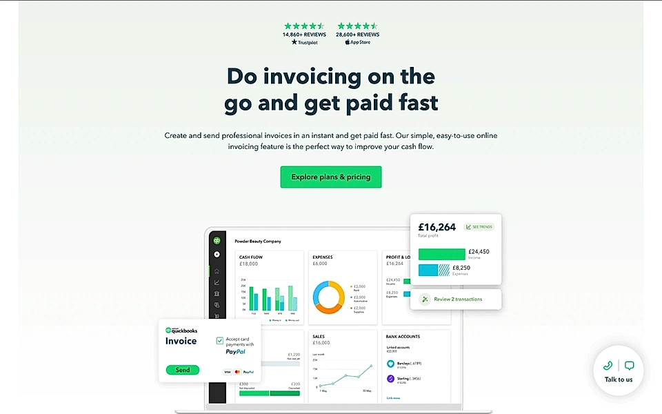
Imagine if they had gone with something like ‘Streamline Invoicing Anytime, Anywhere – Accelerate Payments with Ease’ – a small change in the tone of voice and they would lose a lot of punch and personality.
The description goes on to explain the solution more fully. While I might have kept the same tone throughout, the hero still works well as is. With social proof right above the title and a simple product image, this hero section is a great example if you are planning PPC landing pages.
There’s more to cover on this landing page.
Starting the features section with a benefits-focused title is always a smart move. ‘Chase dreams, not late payments’ on Quickbooks’s ads landing page is a perfect way to set the scene for the features.
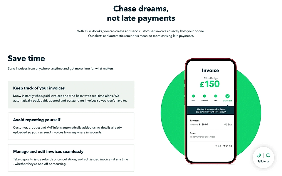
Imagine if they listed features after phrases like ‘Keep track of your invoices’ or ‘Manage and edit invoices seamlessly’ – you'd probably get distracted and start scrolling social media.
The best B2B SaaS companies, like Quickbooks, add benefits such as ‘Save time’ and ‘Stop chasing invoices’ because they want you to see the “why” behind the features.
‘Send invoices from anywhere, anytime and get time for what matters’ makes for a fantastic description text.
Quickbooks’s landing page is a great example for your team to save in bookmarks 🙌
Do you have Google Ads landing pages but struggle with conversions? A Google Ads landing page builder can be the tool you need to turn visitors into warm leads.
Mercu: Interview scheduling
Marketers get easily caught up by fancy phrases and clever wordplays.
However, for B2B SaaS buyers, clarity wins cleverness every single time.
And Mercu’s hero texts are as clear as they can be.
The title on Mercu’s interview scheduling page does a great job of quantifying results (‘reduce no-shows by 33%’) and explaining what the product helps with (‘Automate interviews’).
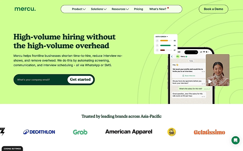
The description starts by tackling a key pain point – too many calls, emails, and messages – and then explains exactly how Mercu can help manage it all. It’s impressive how much value is conveyed in just 30 words, proving the power of knowing your SaaS audience and their needs.
The call-to-action section stands out, too.
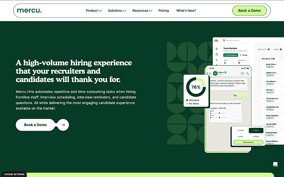
The title takes a double-sided approach, promising benefits for both your team and the candidates who “thank you for” choosing this platform. The description lists the key features and makes a final push to encourage the visitor to book a call.
Trunk: Merge queue
SaaS tech teams are always on the lookout for tools that save time and improve scalability.
But let’s be honest; some developer tool websites aren’t the easiest to follow.
Trunk’s merge queue page doesn’t fall into that trap.
The hero title gets right to the core issue for developers – queues in merging code into production.
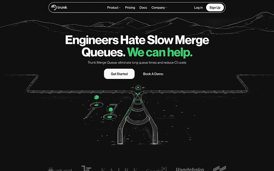
The description explains why it matters – Trunk speeds up time-to-live and cuts costs.
The visuals could be a bit clearer, but overall, Trunk’s hero section does a solid job of prompting visitors to keep scrolling.
For SaaS copywriters and marketers like me, it’s the little things that stand out on a page.
On Trunk’s page, it’s refreshing to see a CTA section with more creativity than just ‘Get started now’ and a signup button. The CTA title, ‘Frustrated with long merge times?’, directly addresses the same pain point that was introduced in the hero.
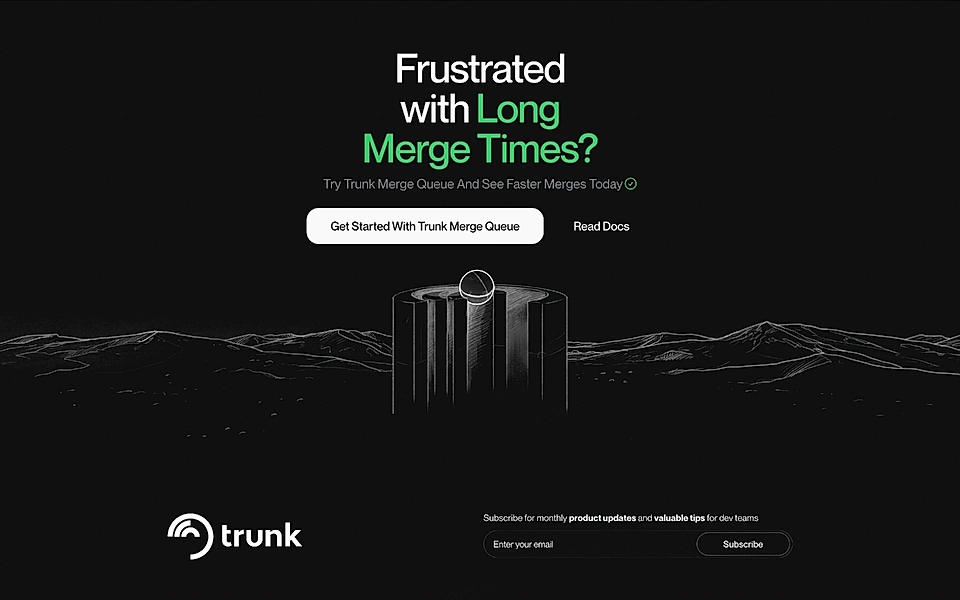
The description right below tells what you gain by signing up today. It’s a simple but powerful SaaS landing page copywriting trick that certainly increases conversions.
Are you looking to create landing pages but need help with planning the perfect structure and writing high-converting content? Get LandingRabbit’s 14-day free trial to create new SaaS landing pages that turn visitors into warm leads.