What’s the minimum viable startup landing page?
Just like you’ve got a minimum viable product (MVP), your first startup landing page doesn’t need to be perfect.
However, expectations for the minimum viable product keep climbing up.
In the past ten years, cloud services have allowed anyone to build a scalable SaaS company with very little initial funding. Now, AI increases software development speed and quality faster than ever before. Smaller teams, or even solo entrepreneurs, will be able to build services that used to require a team of experts.
It heats competition, and more outreach messages are sent to your prospects. Even if not messages from your direct competitors, they will steal the attention span.
To stand out, your startup landing page must be highly targeted and immediately answer the key question: Why should I consider this service to replace my current tools and processes?
To help you answer the question in a way that converts visitors to leads, let’s build the minimum viable startup landing page template in eight steps – with examples to inspire you, of course.
1. Define your key value proposition
No matter the structure and beautiful design, your landing page is doomed to fail if you don’t get the copywriting right.
SaaS landing page copywriting gets easier as soon as you’ve nailed your key value proposition: the secret sauce of what your product offers to kill the pain for someone willing to pay.
If you’ve done your user research properly (before writing a single line of code), you should have a pretty good idea of who the customer is, what their pain point is, and what the benefits of your solution are.
Still, it might be relatively tricky to draft a value proposition and make sure you’ll keep it focused on one key problem you can solve today. You might, for example, raise funding at the same time, and those visionary discussions tend to blur your day-to-day work. A lot.
Lucky for you, there are great frameworks and techniques for developing the value proposition that guides all content on the landing page.
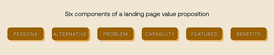
My favourite framework is introduced by Fletch, an agency focused on SaaS copywriting. A perfect landing page is built based on:
- Persona: Who’s the buyer/hero user?
- Alternative: What tools and processes do they use today?
- Problem: What do they struggle with?
- Capability: Why do you fix the pain?
- Features: How does your solution achieve that?
- Benefits: What’s the outcome and better future?
Let’s use Clay, a sales outreach enablement tool, as a concrete example.
"Clay is a tool for sales teams (Persona) who currently use cold email outreach tools (Alternative) but struggle to personalize the messages at scale (Problem). Clay replaces manual research work (Capability) with integrations to 75+ data enrichment tools and automation built for personalized outreach (Features). With Clay and personalized messages at scale, sales teams increase the volume of relevant outreach messages and improve conversion rates (Benefits)."
The value proposition statement guides the design and content of all future SaaS landing page components and your minimum viable landing page.
2. Create a compelling hero element
Now that we’ve sorted out the key value proposition, we can start building our website hero element.
Arguably, it’s the most important piece of copy and design on your startup landing page. If you fail to spark interest, website visitors hit the back button quickly. Some studies estimate that you’ll have approximately five seconds to convince users to continue scrolling.
Here’s how Clay has turned their value proposition into a hero element:
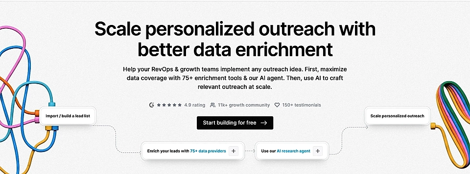
The hero title and description text include the key value proposition and pain point – sending personalized outreach messages at scale.
Instead of a vague “Sign up” often seen on startup landing pages, the CTA button text, “Start building for free”, is actionable and concrete. It also signals the costs, which immediately increases conversion rates.
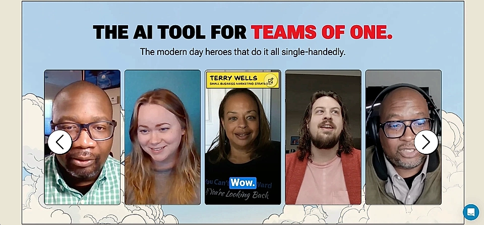
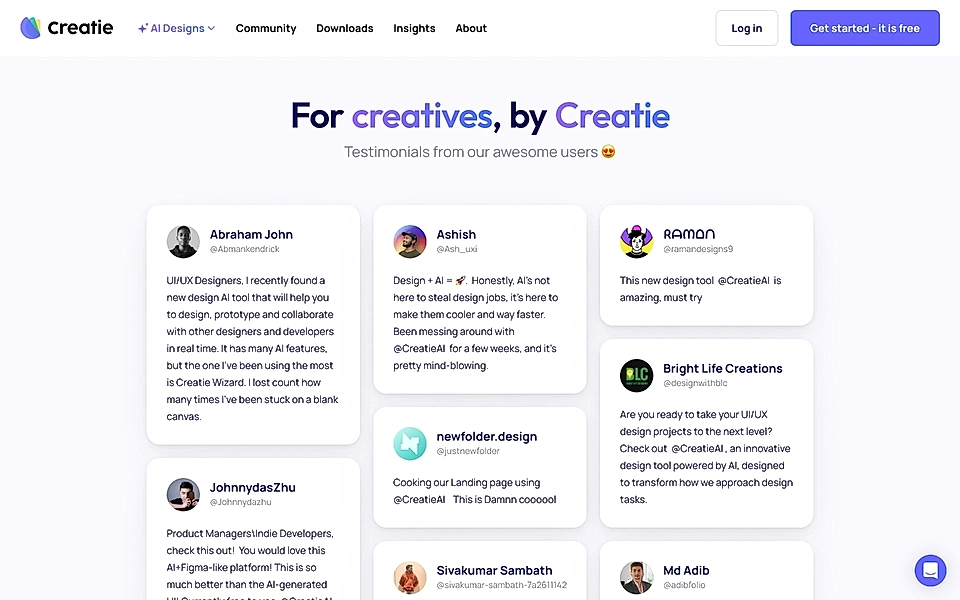
3. Show social proof
To be fair, adding social proof to your landing page might not be easy if you are just starting out. Many startups build their first page while they are developing their prototype, and they don’t even have beta customers yet.
But as soon as you get your first trial customers, you should relentlessly ask for feedback. Those discussions will be your first opportunities to collect social proof – quotes that align with your value proposition and the problem you solve.
For example, record the video calls with your early beta clients and use clips (with their permission!) on your page.
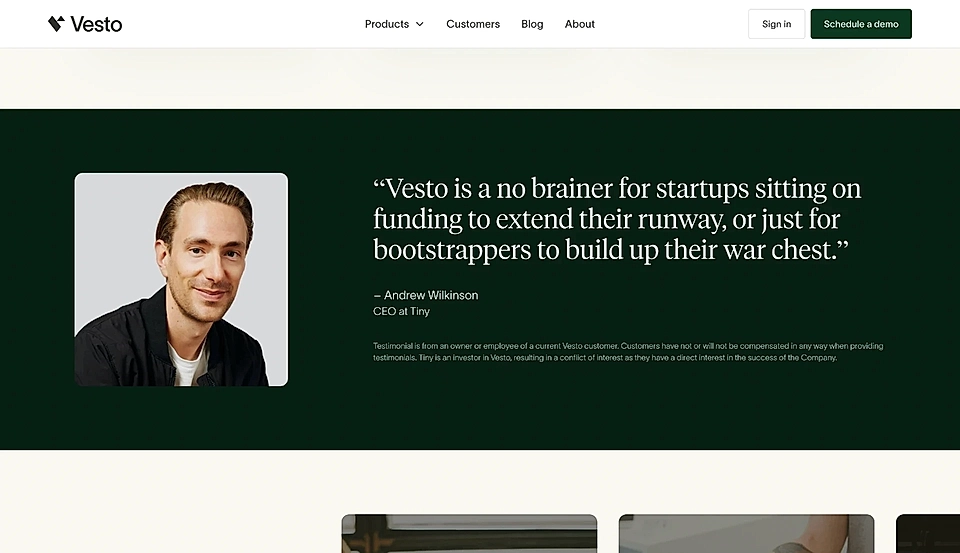
If you are looking for something simple and less time-consuming, a page-wide quote with relevant content is always a great choice.
If you’ve built an audience on Twitter, consider asking for feedback and displaying the best comments on a social wall.
4. Make the problem obvious
A fantastic way of pre-qualifying leads and ensuring you’ve got a scalable idea is to highlight the pain and adverse outcomes of the status quo straight after the website hero text and social proof elements.
The problem/pain element using the PAS copywriting formula helps you explain why your lead should change their current behaviour and try your solution. After all, most sales opportunities fail due to inaction – not because the current process works or because there are better alternatives in the market.
Here's the catch: you’ve had to force yourself to build a focused value proposition to get this right.
I know it’s tough.
However, companies like Antimetal are getting the problem/pain element right.
Antimetal is looking to solve the AWS costs monitoring and optimization for SaaS business – in other words, save your money.
Their problem section cleverly highlights the typical questions SaaS founders and the dev ops team are asking themselves when bills are higher than expected. As an AWS customer paying rather hefty bills, I’m intrigued!
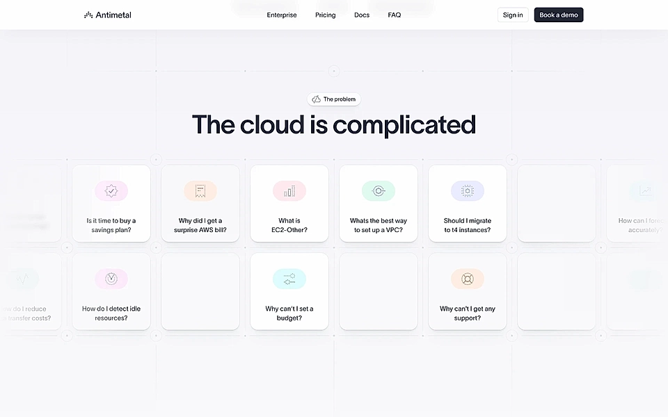
A straightforward and concrete pain/problem section makes your benefits and features much more powerful. Also, it helps make sure that the right leads continue reading your page – and the wrong kind exit early!
5. Fix the pain with benefits and how-to
If you’ve completed the first four steps, the journey gets slightly easier from here. Next, you’ll build an element that answers the problem and pain you highlighted above.
Instead of purely listing all features, focus on the benefits. We are all seeking results; features are just the cherry on the cake when choosing the right solution.
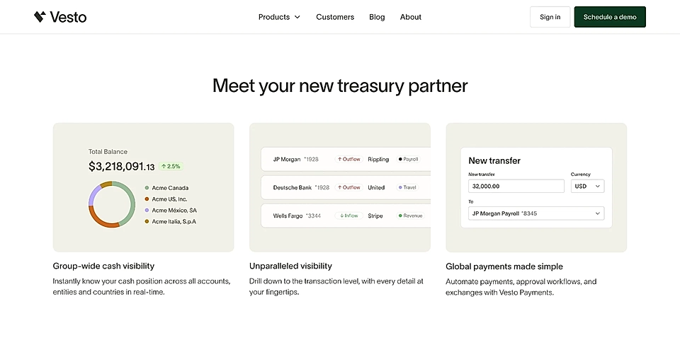
You can do it like Vesto and combine the key benefits and features. Straight after social proof, Vento shares three key benefits with short feature descriptions and simplified product images.
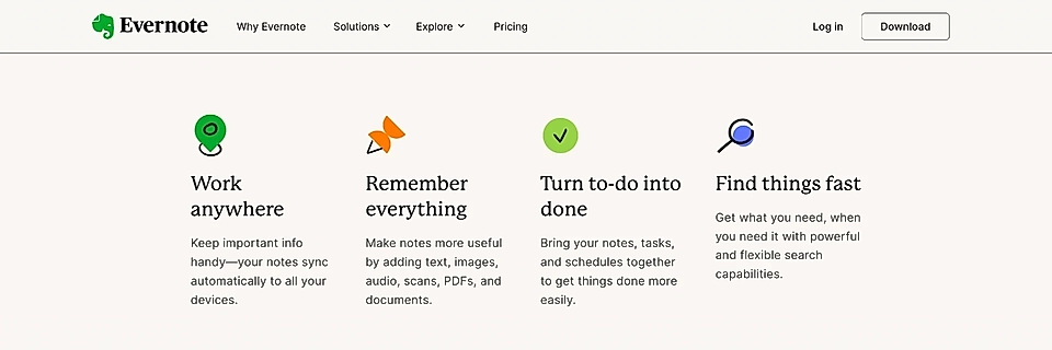
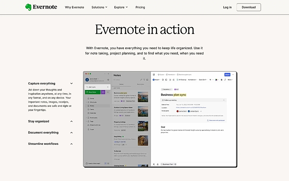
Alternatively, you can keep the benefits and features separate. Evernote can’t be called a startup any longer, but their page shows benefits before drilling into more concrete features.
6. Be transparent about the costs
If you are building your first startup landing page, you might just have a one-pager without navigation and a separate pricing page.
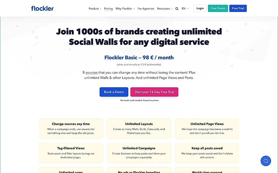
The best B2B SaaS websites have separate pricing pages as they are an opportunity to tell why you are different to alternatives. For example, Flockler’s pricing page immediately communicates why they are different from other social media aggregators – a lead comparing Flockler against competitors will get their answer immediately.
But if you are looking to keep things simple, make sure your one-pager is transparent about the costs. Being vague about the costs is one of the key reasons why SaaS landing page conversion rates tank.
7. Handle objections in the FAQ
An FAQ element is a great way of handling objections and hesitation. Perhaps something on your page wasn’t crystal clear, or the lead glanced through the key titles without reading everything in detail.
What should be included in your FAQ element?
You can approach the FAQ as a summary of the whole page. You’ll want to highlight why your solution is different from alternatives, how it works, and how much it costs.
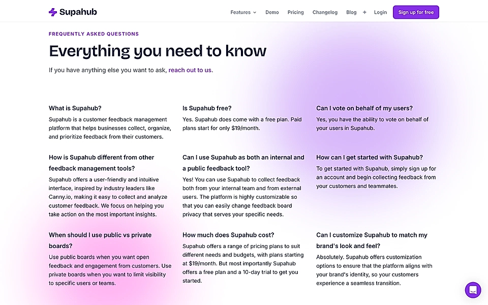
Supahub’s FAQ section does an excellent job of summarizing everything they’ve already discussed on the page.
8. Push leads to take action with a final CTA
The final piece of the puzzle is a powerful CTA element pushing leads to take action and sign up.
Again, your carefully drafted value proposition will help you out. The CTA element will be your last chance to convince the visitor to try your product, and you might want to highlight the pain and benefits.
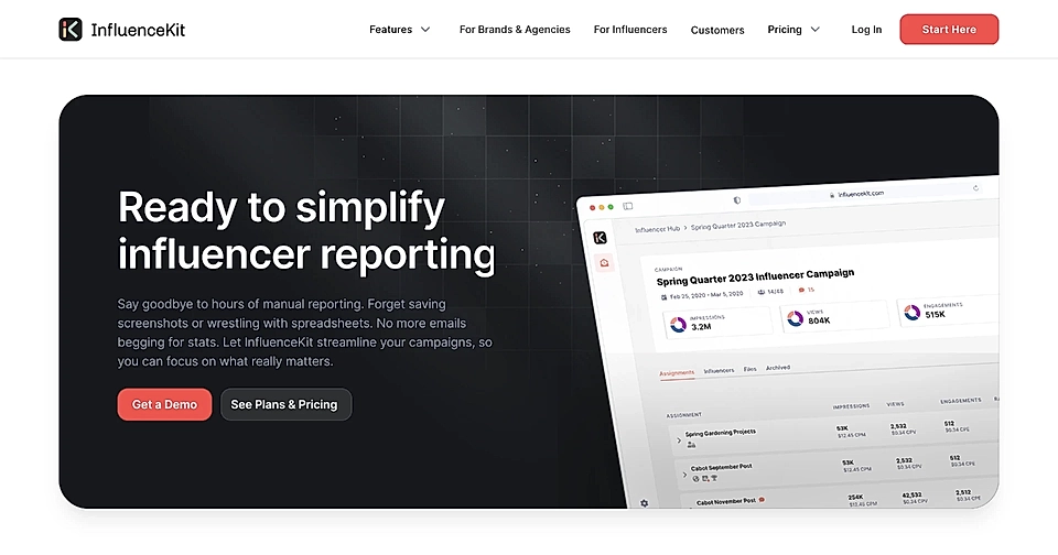
The CTA element on InfluenceKit’s page is one of my favourite startup landing page examples. Their CTA reinforces the pain and explains why a brighter future awaits you if you sign up.
That’s it – you walked through the structure of the startup landing page. Are you ready to implement it?
Getting the first one done with a clear plan and structure helps you build tens of landing pages in the future. When your SaaS scales, you’ll need a targeted landing page for each value proposition, audience segment, Google Ad campaign, email newsletter, and more.
That’s where LandingRabbit can help. In minutes, marketers and copywriters like you create high-converting SaaS landing pages – instantly ready to publish on your existing website. Sign up for our 14-day free trial today!