How to add and customize a Tabs section
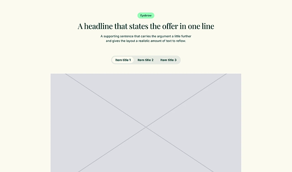
The Tabs section lets you show different content to different audiences without taking up too much space on the page. Visitors click a tab and see content relevant to them.
It comes with three layouts and four pre-made style options per layout.
How to add a Tabs section
In the page editor, click the + button to add a new section and choose Tabs.
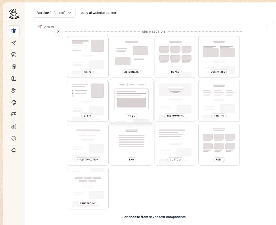
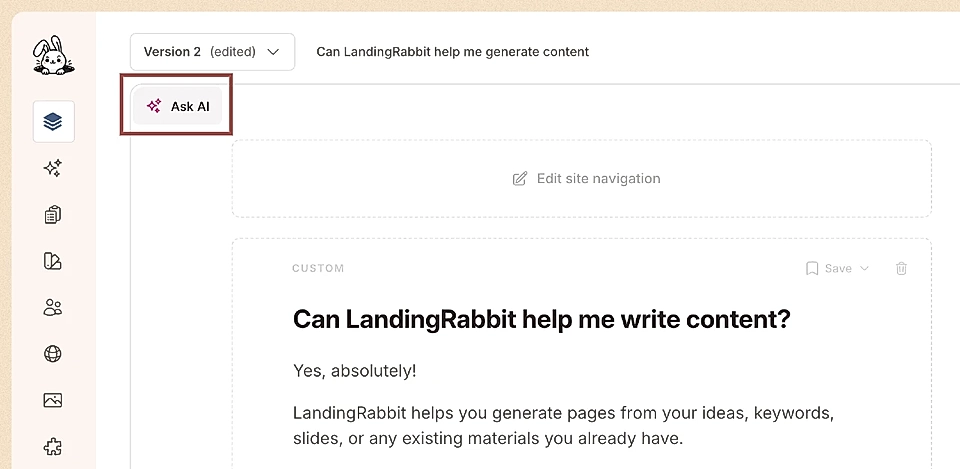
You can also click the Ask AI button in the page editor and describe what you want.
What content can you add to a Tabs section
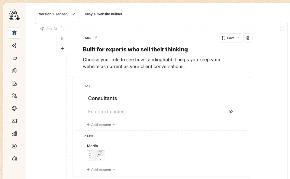
The Tabs section is built from three parts:
Section header: eyebrow, title, description, and CTA buttons
Tab: eyebrow, tab title, text, and CTA buttons
Card: image, video, or embed, plus card title, text, and CTA buttons
For each tab, you can also choose what content shows when the tab is inactive.
How to change the layout
Hover over the page preview on the right and click the Edit layout button.
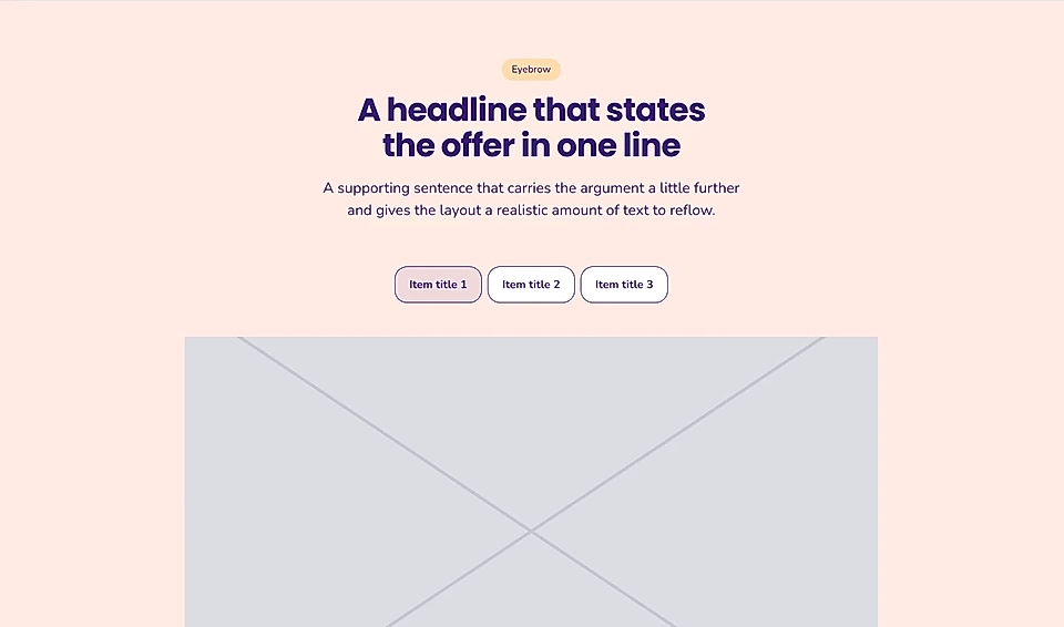
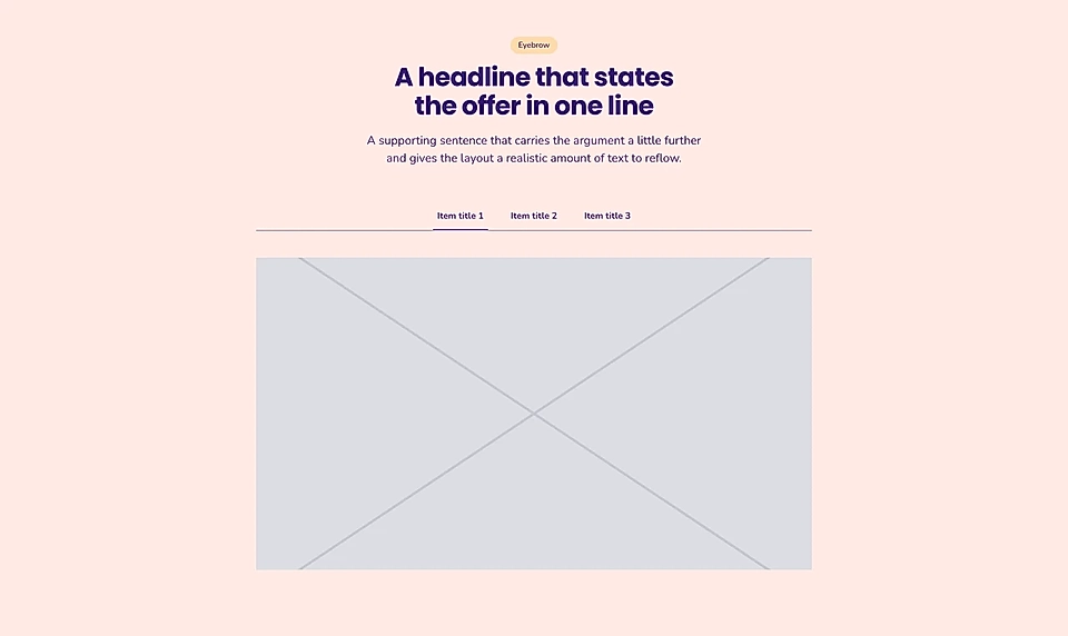
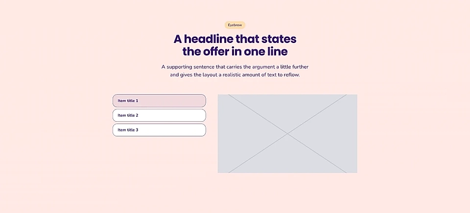
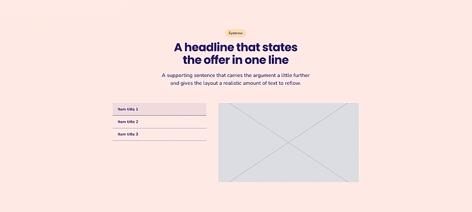
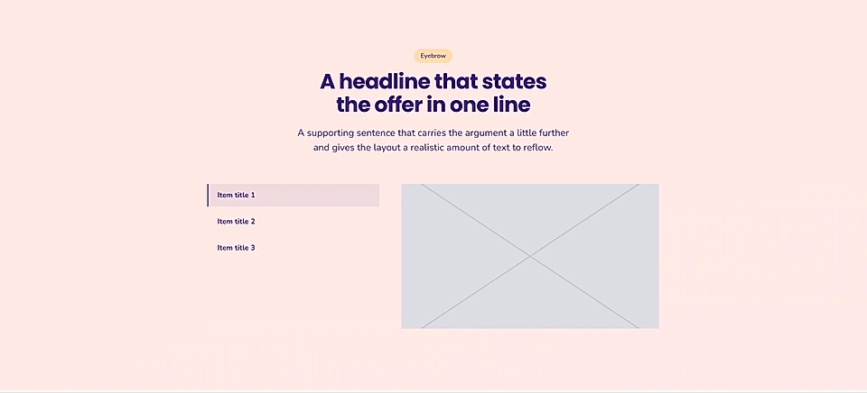
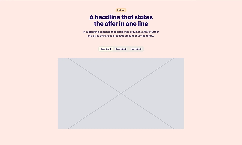
Switch between three layouts: top, left, and right.
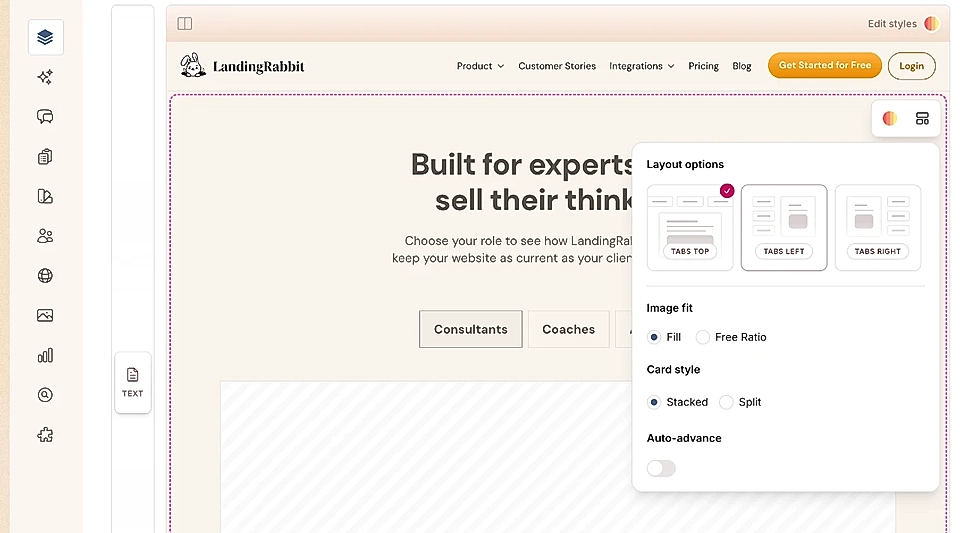
For each layout, you can set:
Image ratio: free or fill
Auto-advance: how long between tabs changing, and whether a progress bar shows
Side tabs: show tab content when active only, or show all at once
Top tabs: show card content stacked or split
How to edit Tabs section styles
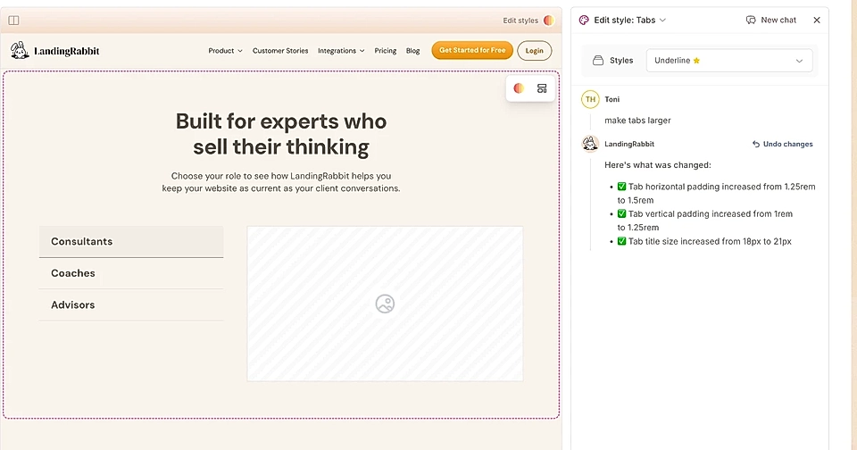
Hover over the page preview and click the Edit styles icon. You will see pre-made style options for the layout you have selected.
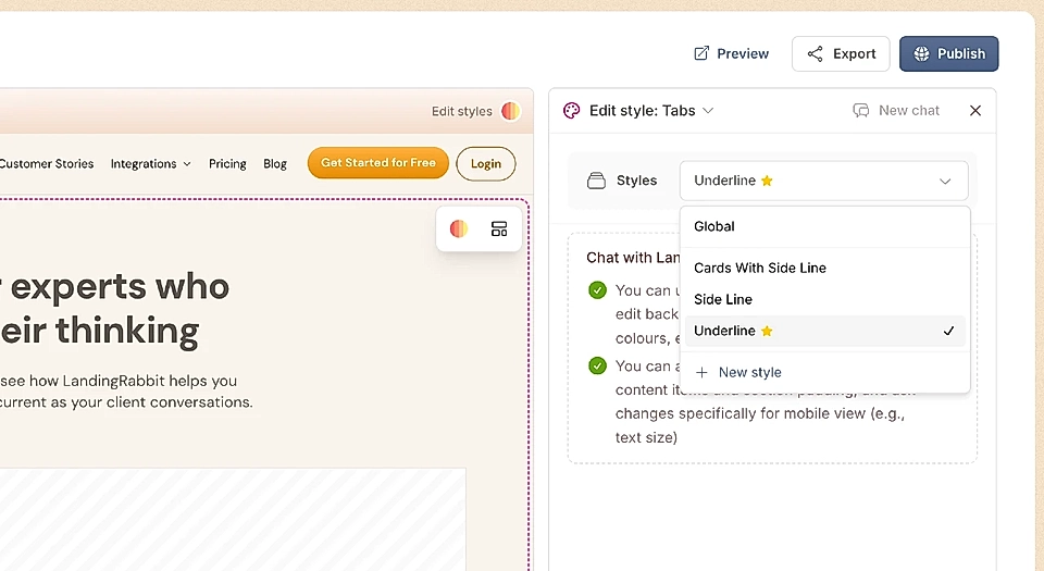
You can switch between styles in the Edit Styles chat and try different pre-made options.
You can also type a request to make specific changes, such as:
Section background colours
Section header position; center and left
Font sizes, font type, and colours
Tab colours
The position of the tabs; center and left for top tabs and side tabs
The proportional size of media and text in a sidetab card
And more
How to set auto-advance for Tabs
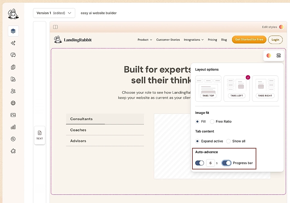
Open the Edit layout panel and turn on auto-advance. You can set how many seconds pass before the next tab becomes active and choose whether a progress bar appears on the tab to indicate when it will switch.
Adding tabs to custom design sections
In addition to Tabs section, you can also add tabs to any of the custom design sections you are creating.
Examples of Tabs section layouts and styles
Here are examples of how the Tabs section looks with the pre-made layouts of a colourful brand.