12 PPC landing page examples to drive your SaaS sign ups
Do you feel like you are pouring money into PPC campaigns but not getting the results you wished for?
I’ve been there, too.
In my previous startup, I saw Google Ads search term opportunities, but I was only able to turn a handful of them into pages that convert.
But there’s a solution, and you don’t need to reinvent the wheel. By studying proven examples, you can create a powerful and high-converting template for your PPC landing pages.
In this blog post, I’ll share 12 PPC landing page examples that get it right. We’ll dive into the key ingredients that make these pages effective and show you how to apply them to your SaaS landing pages for better results.
What makes a high-converting PPC landing page?
The best PPC landing pages have two things in common:
- They are very targeted at a specific ideal customer.
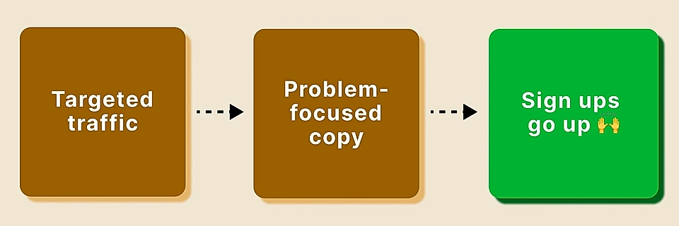
- The page copy truly resonates with the problem the ideal customer is facing.
The key challenge SaaS companies often face is that they don’t have enough resources to create highly targeted landing pages.
They might, for example, see in Google Ads search terms data that people are using very variable phrases to discover them. However, because of the limited resources and few landing pages, the copy needs to be generic.
The more generic the copy you write, the fewer conversions you get.
There’s only one solution to it – get tools like LandingRabbit to create highly focused SaaS landing pages to match the different buyer journey stages and personas.
Only then you’ll have a chance to write a copy that is targeted at a specific ideal customer and the problem they face.
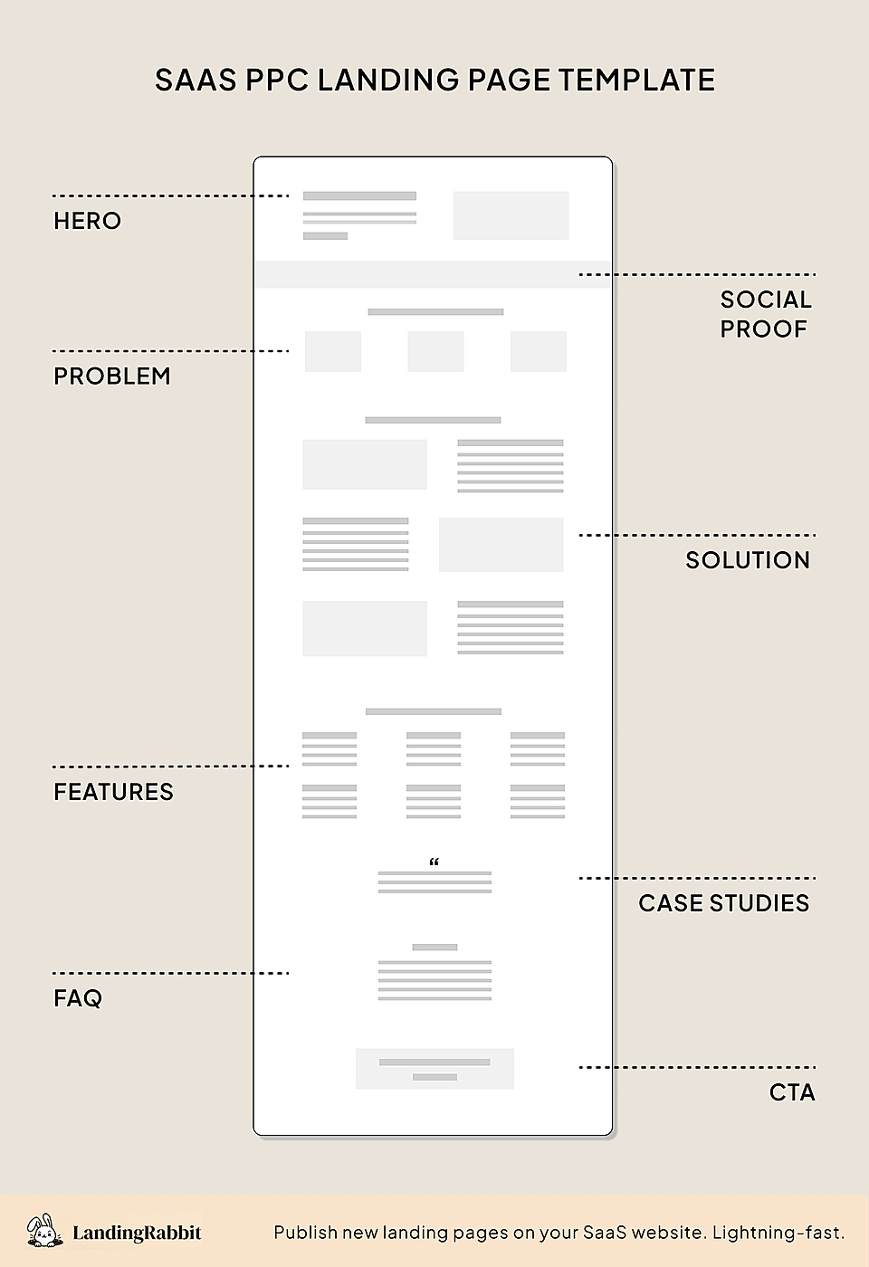
When crafting a landing page, I prefer to use the PAS copywriting formula and build the structure around that.
The seven key ingredients of my PPC landing page structure are:
- Hero copy texts that drive action.
- Striking hero visuals to make the offer tangible.
- Pain points and the solution to show you really know your customers.
- Features to stand out from the competition.
- Social proof to convince.
- FAQ to tackle hesitation.
- Strong CTA elements to convert.
12 PPC landing page examples that you should copy
Let’s have a look at each ingredient in detail – through the best SaaS landing page examples.
Craft hero copy texts that drive action
Most page visitors via PPC ads have never viewed your website before. They’ve only seen a short teaser, typically a Google search ad, and the SaaS website hero text either successfully keeps the visitor on the site or makes them hit the back button in seconds.
We’ll have a look at the hero visuals and social proof separately, but these three hero copy text ingredients are proven to keep users scrolling:
- Message match: Make sure the search keyword, Google Ad, and the page hero copy texts are tightly aligned. The hero element’s role is to answer the search keyword as accurately as possible.
- What-Why-Who: The best SaaS website hero sections clearly tell what your product does, who it is for, and why it matters. Strike the careful balance between what you do and what’s in it for your target customers.
- Actionable language and CTA: Keep the copy as common language and actionable as possible. Use verbs like get, save, and take (instead of passive form) and words your customers use.
Xero’s simple Google Ads landing page ticks all three boxes.
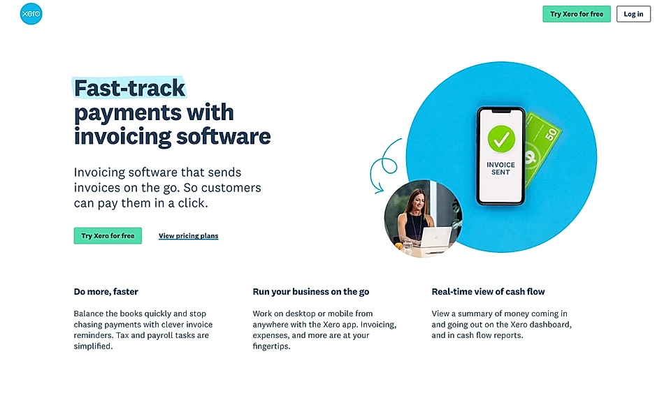
The hero title, “Fast-track payments with invoicing software”, tells what (invoicing software) and why (get paid faster). The description continues the story and reveals that the solution not only allows you to create invoices on mobile but that they are easy to pay as well.
Because of the simple design choices, Xero has managed to include three benefits neatly at the bottom of the hero.
Supahub’s SaaS landing page copywriting is of high quality. The landing page hero title, “Give your users a place to give feedback, and share ideas”, is a fantastic example of how to bring your page visitors’ customers into the story.
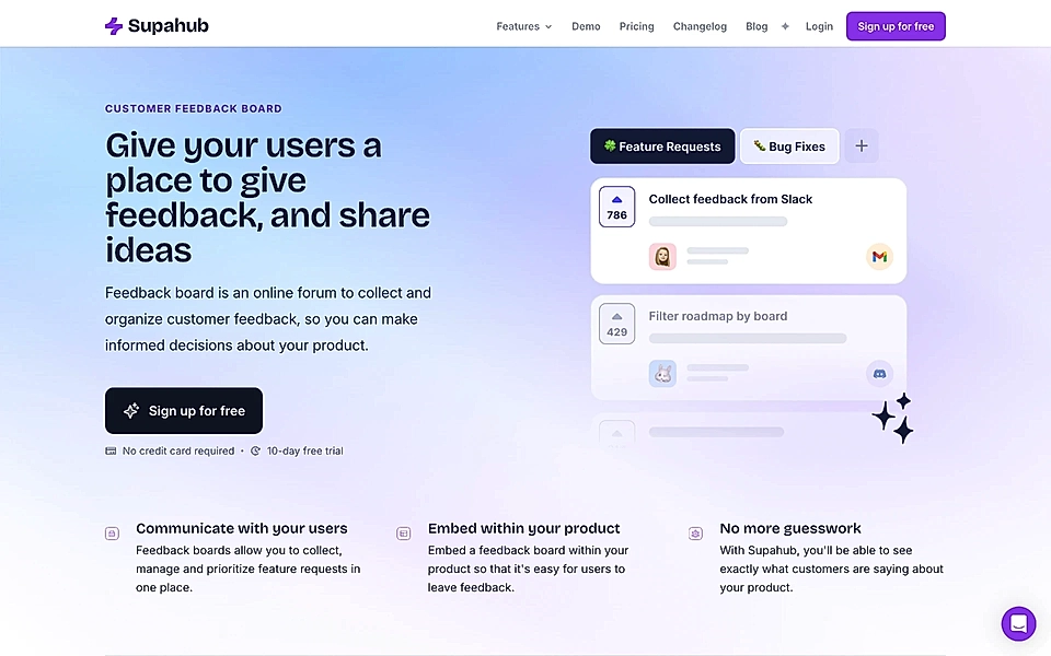
The description further clarifies what a feedback board is and what the expected outcome is.
Are you looking to improve your landing pages? A Google Ads landing page builder might be the solution you are looking for.
Design striking hero visuals that make the offer tangible
You could argue that a great copy text discussing the what, why, and who doesn’t really need an image or video. A great hero copy text feels just right when you first see it and makes your page visitors feel you really know them.
While there’s some truth to it, the challenge is that without visuals, you let the page visitors’ imagination run wild.
Trust me – that’s not always a good thing.
Instead, you’ll need fantastic visuals to anchor page visitors’ expectations from the start.
Also, the image or video gives you a great opportunity to communicate much more than the text could do alone.
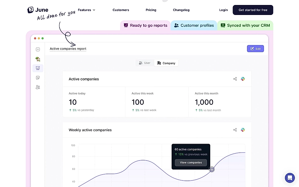
June’s short video on auto-play is a fantastic example – you can learn the key features in 30 seconds.
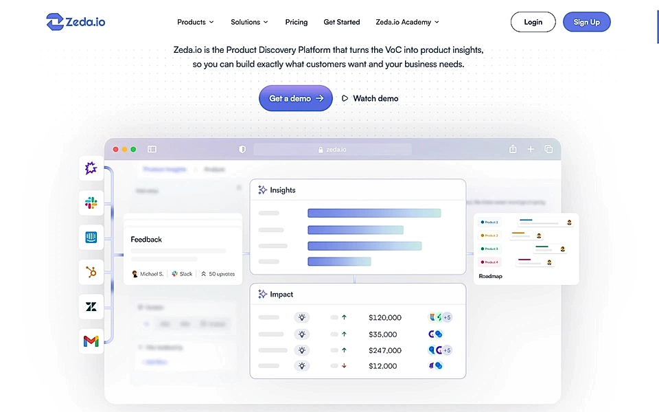
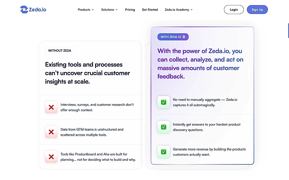
Often, the realistic screenshots feel a bit too much – especially for visitors who just arrived and if your SaaS product is relatively complex. Zeda’s hero successfully shows the most important features and keeps it all a bit abstract.
Show you know customers’ pain points
If you got the page visitor interested, now it’s time to double down and really rub the problem your page visitors have encountered with their existing tools and processes.
Now, this is where most Google Ads landing pages fail.
The page might include tons of problems and solutions, and it’s really hard for page visitors to follow the storyline and understand what’s really important to know.
Or the audience is so broad that the copywriter has no other option than to leave the problem section out. Nothing guarantees a faster page exit than a badly formulated, broad problem section that doesn’t resonate with any lead.
But if you have built a very targeted Google ad campaign and only use 5 to 10 close keyword variations in your ad group, the Problem-Agitation-Solution (PAS) formula is unbeatable.
Let’s take a look at an example.
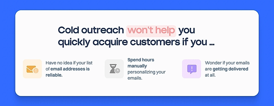
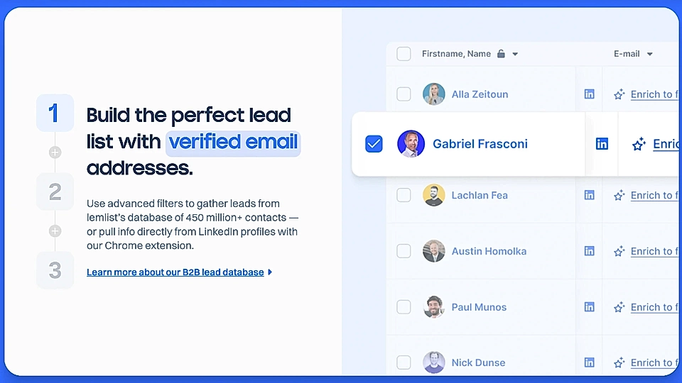
Lemlist’s landing page introduces and agitates a problem sales teams face.
And then, the page introduces the medicine to cure the pain in three different sections – each answering one of the pain points. The example below answers the common sales team problem of not having a high quality and reliable email list.
A well-written problem vs solution structure works every time.
If your boss is one of those who’s worried about the page length and visitors losing interest, follow Zeda’s example and show the problem and solution elements side by side.
Assuming you follow the PPC landing page best practices, really know your customers and their pain points, and get targeted traffic to your landing page, the PAS formula increases your SaaS conversion rates dramatically.
Do your landing pages have room for improvement? A Google Ads landing page builder might help you out.
List the most important features to stand out from the competition
If you are just getting started and your SaaS product is still relatively simple, the solution section might cover the most important product features.
But more often than not, a growing SaaS company faces serious competition – successful SaaS companies tend to enter new competitive markets as they go and at a fast pace.
Even if your page doesn’t directly mention competitors, you should use this section to cover features your customers expect to have when they are looking to switch their provider – and definitely features that separate you from competitors.
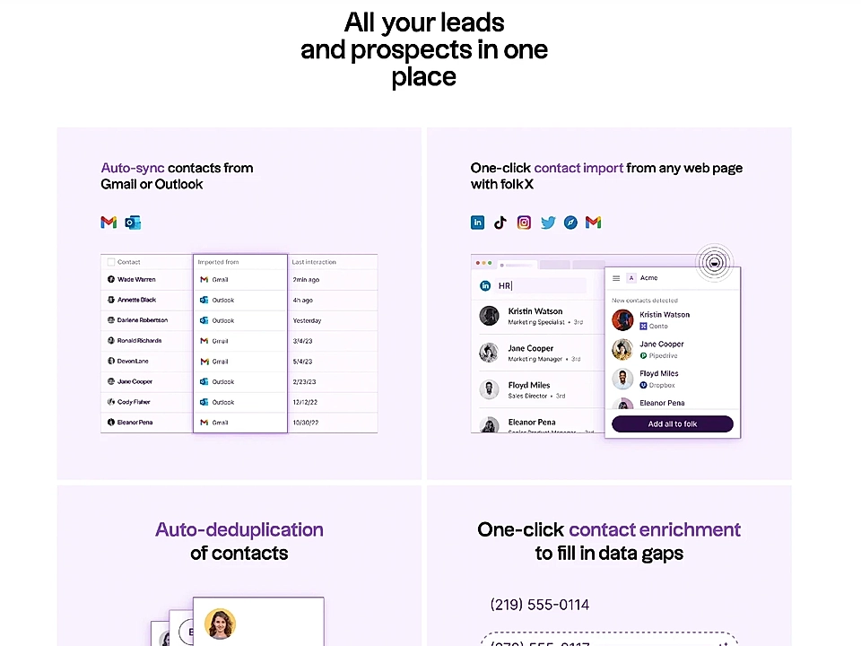
Folk’s landing page for pipeline management is a fantastic example. If you are looking to win customers in one of the most competitive markets like CRMs, even feature-specific product landing pages are extensive.
Folk’s page has three sections similar to the example below.
Do you need help with creating landing pages and using the PAS formula? With LandingRabbit, SaaS teams plan pages fast and easy. Get access to our early beta to create SaaS landing pages that convert.
Convince with social proof
80% of SaaS product landing pages include social proof.
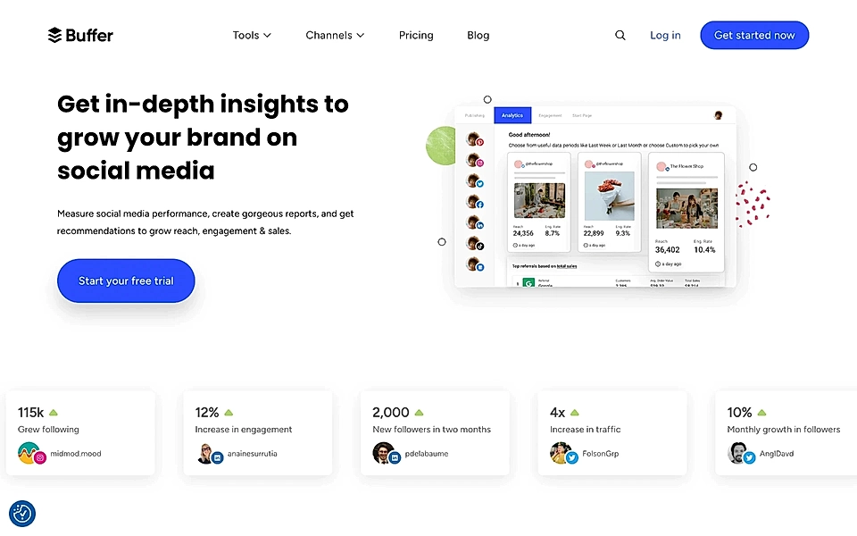
Social proof is most often seen straight after the hero section. Typically, SaaS companies show customer logos, but if you serve smaller companies and creators, consider the example from Buffer’s PPC landing page, showing the social media handle and real results.
In addition to customer logos, case studies in the middle of the page are very powerful.
Your goal doesn’t need to be clicks and page views – you might even consider hiding page links altogether, making sure the user stays on the page.
More than a click, case studies’ role is to build credibility and nudge towards the conversion.
Tackle hesitation with the FAQ element
You might wonder why an FAQ section is needed for a PPC landing page.
You will typically find FAQs on SaaS pricing pages, but many SaaS companies miss the opportunity and don’t generate page-specific FAQ sections.
They should.
The FAQ element allows you to keep the copy on the PPC landing page much more focused.
Also, it allows you to show (again) that you truly know your customers. Use the questions and words your customers express in your support emails and chats to make the best out of this element.
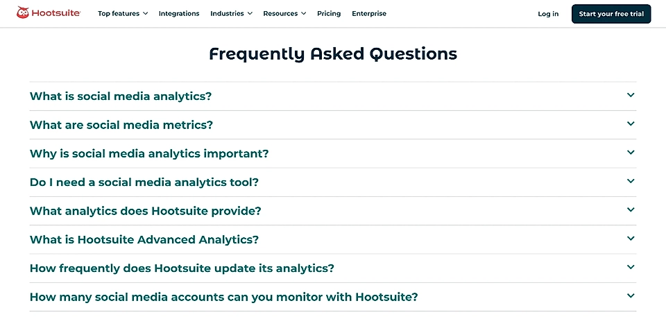
For example, Hootsuite’s FAQ section covers questions that seek to explain broader terms, tells why you need a tool like Hootsuite, and shares details on what Hootsuite’s solution offers.
Finish with an actionable CTA element that converts
It’s the last call to action before the footer element. The stakes are high. Now or (perhaps) never.
The best CTA elements:
- Reinforce the problem your customer experiences and offer the solution.
- Communicate clearly what you get and what awaits next.
Even if I spent a week browsing the best B2B SaaS websites, I couldn’t find many examples to beat Supahub’s CTA element.
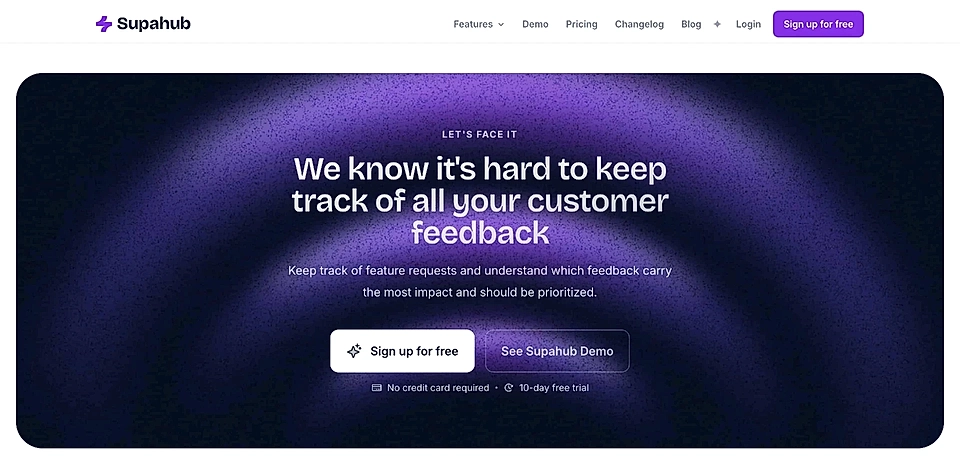
The CTA element is your last chance. Be like Supahub – appeal to emotions and tell what the outcome will be if your lead takes the final step and hits the sign up button.
However, just like any other advice, everything’s context-specific. What you get and what’s next might look slightly different depending on your CTA.
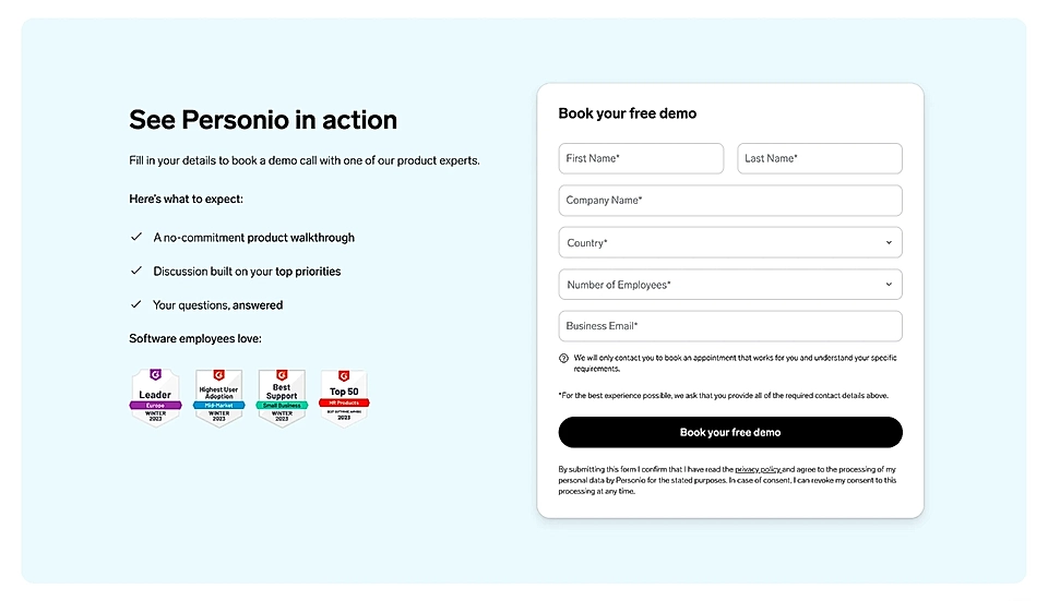
For example, if you are looking to get your sales team’s calendars filled with demo meetings, you’ll need to clearly tell what to expect from a call.
Personio’s landing page is doing a great job on that.
Are you struggling to create focused SaaS landing pages and do you feel like wasting money on advertising? LandingRabbit helps SaaS teams plan high-converting pages without the back-and-forth. Sign up for our 14-day free trial to create SaaS landing pages that convert.