11 SaaS landing page design tips for your next campaign
According to Hubspot, companies with 40+ landing pages see a 500% uplift in conversions.
That’s an astonishing statement.
But it’s easy to believe. The more targeted the message and narrow the audience, the higher the landing page conversion rates.
Launching and optimizing a ton of SaaS landing pages is not easy. But with a solid plan and following landing page design best practices, you will achieve the results that make it all worthwhile.
In this blog post, I’m planning to walk you through 11 SaaS landing page design tips:
- Define your value proposition and audience
- Ensure ad-to-page relevance
- Create a compelling hero element
- Write an easy-to-read and concise copy
- Use colours to help scannability
- Showcase the benefits and how your SaaS works
- Show social proof
- Add a strong CTA element
- Remove navigation
- Optimize for speed
- Test variations
1. Define your value proposition and audience
You wouldn‘t believe how many SaaS businesses refuse to choose one key value proposition for their landing page.
Instead of making sure their most important message is conveyed in the website hero section, they make the story incredibly difficult to follow by listing everything the software does.
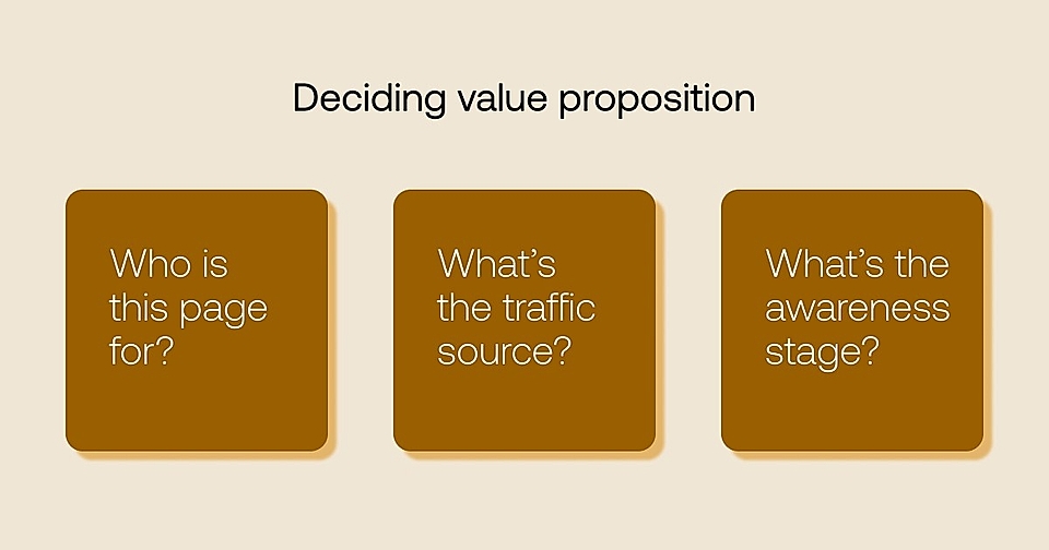
The key to success is to define:
- Who is this landing page for?
- Where are the leads coming from?
- What’s their awareness stage?
Even if you are still determining who the customer is, resist the desire to please all customer profile options on your page. For example, your product could be suitable for developers, marketers, and decision-makers (at least in theory).
However, creating a high-converting page that resonates with three different profiles is a rare chance. Choose a single ideal customer profile (ICP) and test your messaging with separate landing pages one at a time.
The traffic source is another key variable of your landing page value proposition. While people search in Google using very concrete phrases, and you can anticipate their search intent, someone clicking the link on social media isn’t necessarily searching for anything specific right now. Social media visitors might relate to your story, but you’ll often need a much more educational tone and page structure to get the best results.
Finally, the awareness stage makes a huge difference.
You should design most SaaS landing pages for problem and solution aware leads – these visitors are already searching for a helpful product, and your SaaS might well be the answer.
2. Ensure ad-to-page relevance
Many SaaS companies drive ad traffic to their homepage instead of building targeted Google Ads landing pages.
They lose money.
When a lead watches your YouTube video or finds your service via social media, ensuring ad-to-page relevance dramatically increases conversion rates.
And if you are running ads on Google, you’ll buy clicks cheaper by using dedicated landing pages that answer the search term.
Why?
Google ranks all your ads using Quality Score. The score measures the ad relevance by looking at three criteria:
- How do your keywords match your ad copy texts?
- How do your ads match the landing page copy texts?
- How does all of the above match a user’s search intent?
The higher the Quality Score, the more impressions and clicks your ads will receive and the better their position on the Google search results page.
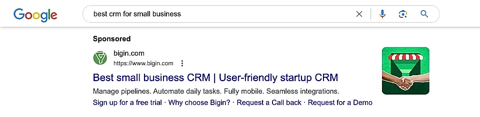
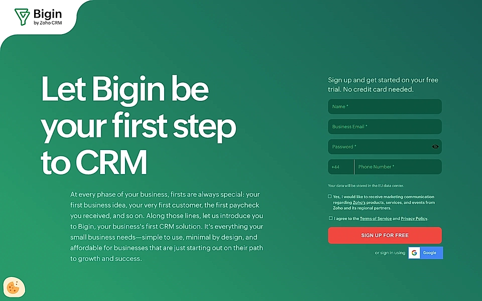
Bigin, a CRM by Zoho, beats their main competitors, Monday and Zendesk, by having matching ad and landing page copy texts.
3. Create a compelling hero element
The hero element is the most important part of your page. Many visitors never scroll past it, and you are usually the one to blame.
A perfect SaaS landing page hero section has four building blocks:
- A compelling title and description
- A clear and actionable call-to-action (CTA) button
- A simple visualization, interactive demo, or video
- Social proof
A compelling title and description
A compelling title and description start with the key value proposition and clearly explain the benefits of your product. The goal is to get users to continue scrolling.
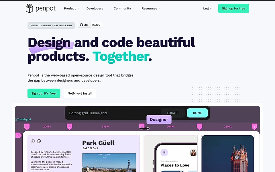
You can choose a positive value proposition statement describing the benefits, such as “Design and code beautiful products. Together.” seen on Penpot’s landing page.
Or lead with the problem like Equals with a title “Because startup reporting is so damn hard”.

The landing page leaves no questions about who the ideal customer is and what Equals does.
A clear and actionable call-to-action (CTA) button
Despite the name, CTAs aren’t always actionable. Too often, SaaS companies use vague button texts like “Sign up” or “Join now” when they could highlight the concrete outcome (e.g., Create Your Video) or communicate what you get (e.g., “Start Your 14-day Free Trial”).
In addition to the actionable text, just below the CTA button is often a logical place to handle objections. For example, “No credit card needed” lowers the sign up barrier significantly.
Hoppy, an AI-powered email marketing platform, has an actionable CTA with the text “Join 100,000+. No CC required.” just below the button.

A simple visualization, interactive demo, or video
You often need help from others to get visualizations right.
The best possible image shows your product and service in action and added text layers could communicate the key benefits at one glance.
Savvycal, a calendar and meeting scheduler app, has added an interactive demo just below the hero text. Website visitors can click through the core functionalities, helping to drive sign ups much faster than a standard SaaS landing page.

Some products are not very visual, and having your ideal customer shown in the hero is a great option – but avoid using stock images where people are often overly happy.
If you are planning to add a video, I’d recommend:
- Keeping the length between 60-90 seconds.
- Talking about benefits over features, but making sure you’ll show how to get started with your product in a few simple steps.
- Having a voiceover with an enthusiastic presenter.
But keep in mind that only a fraction of your leads will press play, and an even smaller percentage will finish the video. Use a proven SaaS landing page template to make sure all the relevant information is presented in the text.
Social proof
Social proof helps leads make decisions and boosts your landing page conversions.
One of the most powerful ways of adding social proof is to place it just below the CTA button.
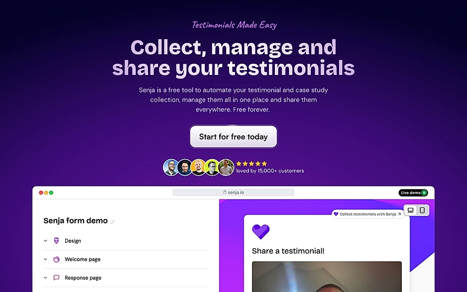
For example, Senja, a testimonial curation app for creators and small businesses, shows some of the recent sign ups and the number of people who are already using the software.
If you are a B2B SaaS selling to enterprises, you can use the classic logo carousel element. It might feel a bit outdated, but it is surely an efficient way of demonstrating that others trust you.
4. Write an easy-to-read and concise copy
Copywriters don’t often think of themselves as designers.
But they should.
A concise copy powers landing pages, which are fast to consume and scan through. Landing page visitors rarely read every piece of text – instead, they’ll pay attention to some of the key headlines, bulleted lists, and other visually appealing texts.
Therefore, keep your sentences short like this.
In addition to the text length, ensure you are not using overly complex and sophisticated words and phrases.
Your SaaS can attract buyers worldwide, and often, a significant part of your audience does not speak your language natively. Secondly, your target is to get the message across as fast as possible. Using common language can feel less inspiring than words borrowed from the Oxford dictionary, but straightforward text converts better.
For more inspiration, check our tips for writing SaaS landing pages that convert.
5. Use colours to help scannability
Another trick to help scannability and build hierarchy is to use background colours.
For example, you might have a very calm overall look and feel with a white background, but bright colour elements in the middle of it all can help a specific copy stand out. Also, using colours to indicate that the purpose of the content section has changed can help your leads get an overall picture of the offering.
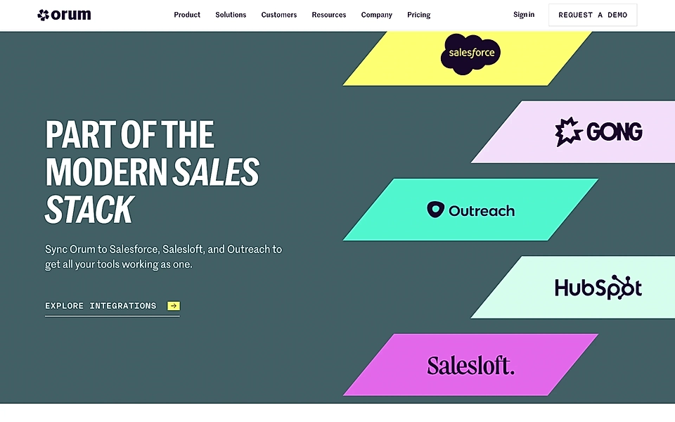
Orum’s design and marketing team has decided to highlight third-party integrations by changing the background colour from white to a shade of blue and grey.
6. Showcase the benefits and how your SaaS works
Landing page design experts in LinkedIn and blog posts hammer down the concept of “benefits over features”. It’s a great design tip. It’s often difficult to understand SaaS features without using the product – and at the end of the day, we all buy results.
But take the tip with a pinch of salt.
The last thing you want to do is to leave your web visitors confused about what your product actually does.
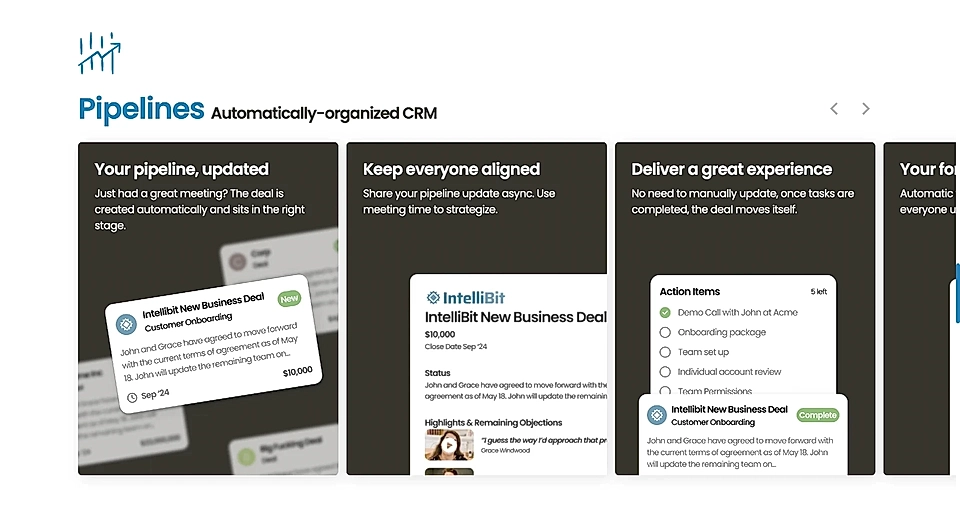
One way of keeping the balance is to create titles that communicate the benefits while the description below tells how and what you can do to achieve them.
Day.ai’s benefits and features section shows the above approach in action.
7. Show social proof
We already discussed social proof in the hero element, but the best SaaS landing pages drop the customer’s voice further down the page, too.
For example, you might have a powerful customer quote taking the whole page width.
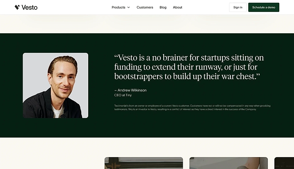
Or, if you’ve been busy gathering many fantastic quotes, you might be able to accompany your solution’s benefits with a perfectly matching quote.

For more inspiration, take a look at social proof examples.
8. Add a strong CTA element
It’s rare that a lead reads your hero element and instantly clicks the sign up button. It happens, but not usually on the first visit.
You are much more likely to get that sign up button click further down the page.
That’s why a visually appealing CTA element is a must-have element in your landing page design. I’d recommend to place it just before the footer.
Instead of repeating the exact same message that you were showing in the hero, use a modified version of the key value proposition and consider asking a question.
Your job is to create a sense of urgency and make sure the landing page visitor is not leaving without taking action – a question appealing to the visitor’s emotions might well do the trick.
9. Remove navigation
If you dig deeper into LinkedIn’s marketing discussions on how to build a SaaS landing page, you’ll find landing page experts throwing arguments for and against having a navigation on a landing page.
I’ll take my side and recommend that you remove the navigation from your landing pages. Especially if your homepage navigation is complex, I’d either add just a logo and your main CTA or show a simplified version with key pages like ‘Case studies’ and ‘Pricing’.

Every additional link distracts visitors from your primary goal. The more users you push towards exploring your full site (and potentially viewing pages targeting fully different ICPs), the more money you’ll spend on marketing over time.
10. Optimize for speed
A perfect landing page is carefully balancing the visual look & feel and the page loading speed.
Surely, your website visitors might enjoy animations and gifs, but beautiful design doesn’t matter much if your site is slow to load and visitors don’t bother waiting.
11. Test variations
I’ve been building SaaS landing pages for 10+ years. Luckily, with tools like LandingRabbit, they are faster to build than before.
Companies with high traffic (and big ad spend) can use A/B testing tools and gather enough data in a few weeks to incrementally improve their landing pages.
With tools like CrazyEgg, you’ll be able to see what users are actually doing on your landing page and take action based on thorough (read: time-consuming) analysis.
However, truly testing different approaches requires a high volume of landing page variations: different copy texts and structures, all targeted for various awareness stages and traffic sources.
Today, the landing page building tools are not able to answer the speed desperately needed by SaaS marketing teams.
That’s why we are building LandingRabbit, a tool allowing you to plan landing pages for your existing SaaS website lightning-fast and without the back-and-forth. Sign up for our 14-day free trial today!