What makes a great SaaS landing page?
It’s a question I’ve spent almost a decade thinking, testing, and iterating for Flockler, where tens of thousands of B2B customers signed up via various product landing pages. Recently, I’ve also helped other SaaS businesses go through the same process.
Most SaaS marketers overcomplicate this task.
Instead of focusing on the most crucial elements and fantastic landing page copywriting, they spend too much time building fancy components and perfecting the visual layout. All this increases the campaign’s cost. Also, the more complex and fancy the landing page, the more difficult it is to make changes and optimize it later.
But what are the absolute core elements?
These six key SaaS landing page components will take you far:
- Hero
- Problem and benefits
- Features
- Social proof
- FAQ
- CTA
Let’s take a look at each component through inspiring examples 👇🏻
1. Hero
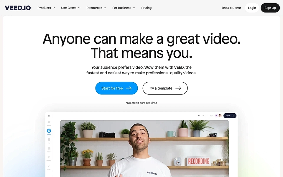
The hero section is arguably the most crucial element of any SaaS landing page. As brutal as it might sound, you will only have a few seconds to convince your website visitors it’s worth scrolling down – do a lousy job with the website hero text, and potential customers will hit the back button (and seek another solution).
Despite the limited space and concise copy text, the best SaaS website hero sections answer these three questions:
- Who is this solution for?
- What does the solution do?
- Why should I care?
Often, companies forget at least one of those three questions.
But not Resend.
Their hero answers to all three questions:
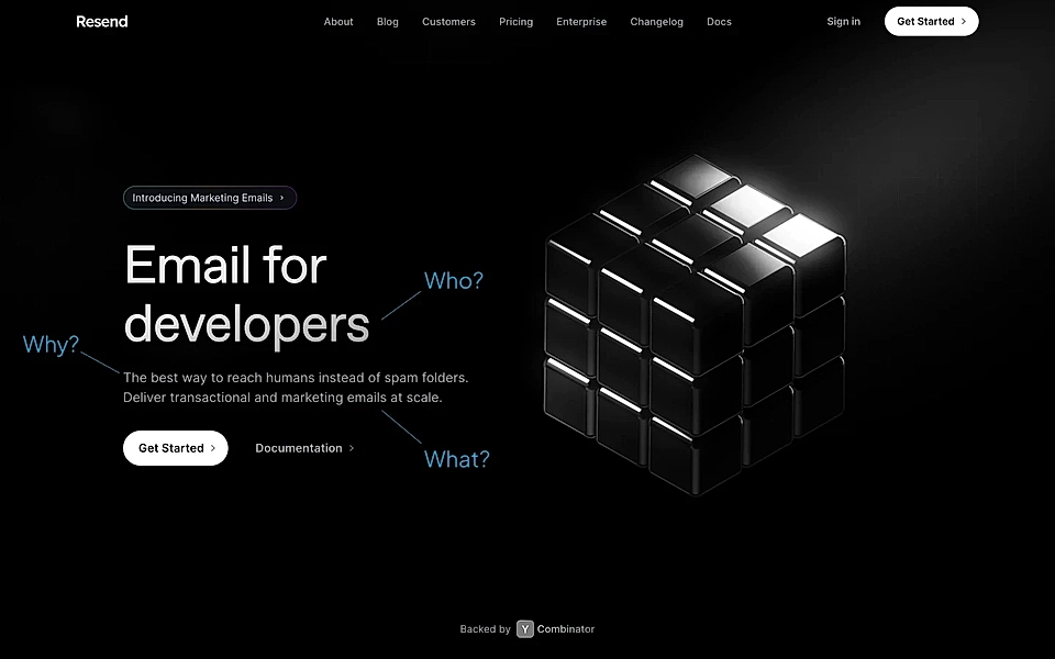
Resend’s hero is a somewhat extreme example with three separate lines and the straightforward main title ‘Email for developers’. Often, companies use a more subtle way of including those three questions in the copy text.
But as long as you include the who, what, and why, the style doesn’t matter that much.
Resend is using fairly standard CTA button text ('Get Started'), but you can make the button much more actionable.
Opus Clip’s hero is a fantastic example – I love the call-to-actions to drop a link to a video and upload a file.

2. Problem and benefits
The second most important landing page component is the problem and benefits. Some companies set the stage with a problem section, diving deeper into the homepage tagline’s promise. Others go straight into benefits.
There’s no right or wrong, and the perfect approach depends on your solution.
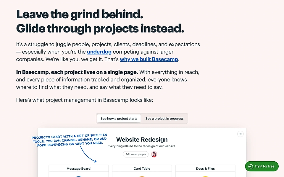
One of my all-time favourites is Basecamp’s statement, which combines the problem and benefits. The ‘We are like you, we get it’ seeks to appeal to their target audience – small companies competing against larger ones.
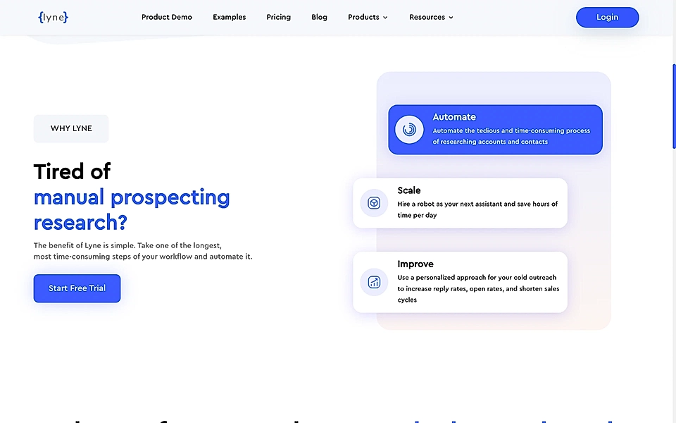
Lyne’s approach is much more straightforward yet powerful. A short question, 'Tired of manual prospecting research?' gives context for the benefits section.
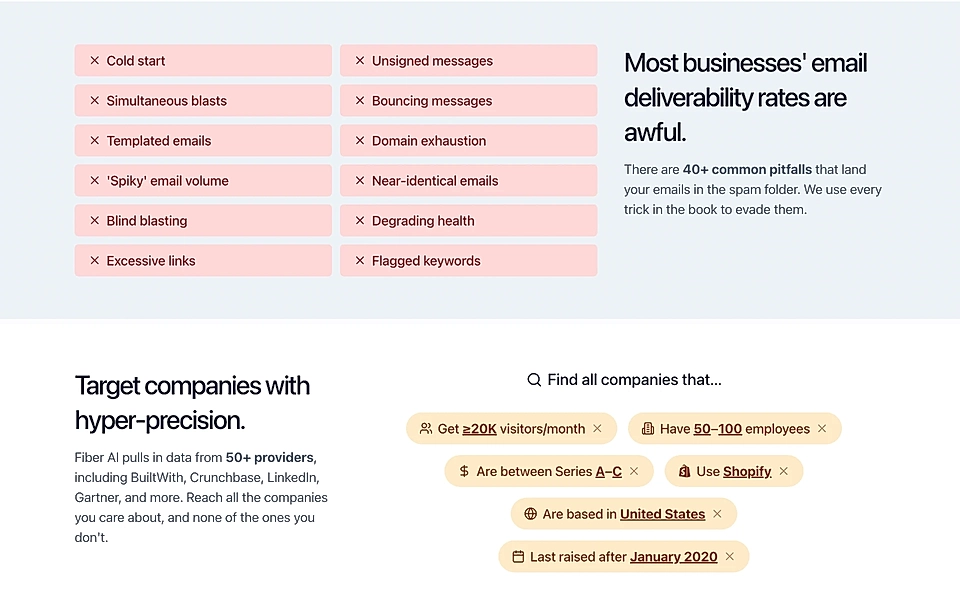
Another inspirational example is Fiber AI’s listing of the most common pitfalls of email outreach. Their problem statement could not be much clearer, and it surely resonates with anyone who’s had poor-performing email campaigns.
If you’d like create a problem section for your SaaS website and landing pages, check out our blog post on the PAS formula.
3. Features
A SaaS landing page that does not introduce the key product features leaves website visitors feeling confused and unsure whether they’ve landed on an agency website instead.
On the other hand, a detailed list of features might be somewhat abstract for someone who’s exploring alternatives and doesn’t fully understand your solution yet.
How to tackle that dilemma?
Many SaaS marketing experts recommend dressing features as benefits by creating a title conveying what benefit the user gets, combined with a short explanation of how the solution does the job.
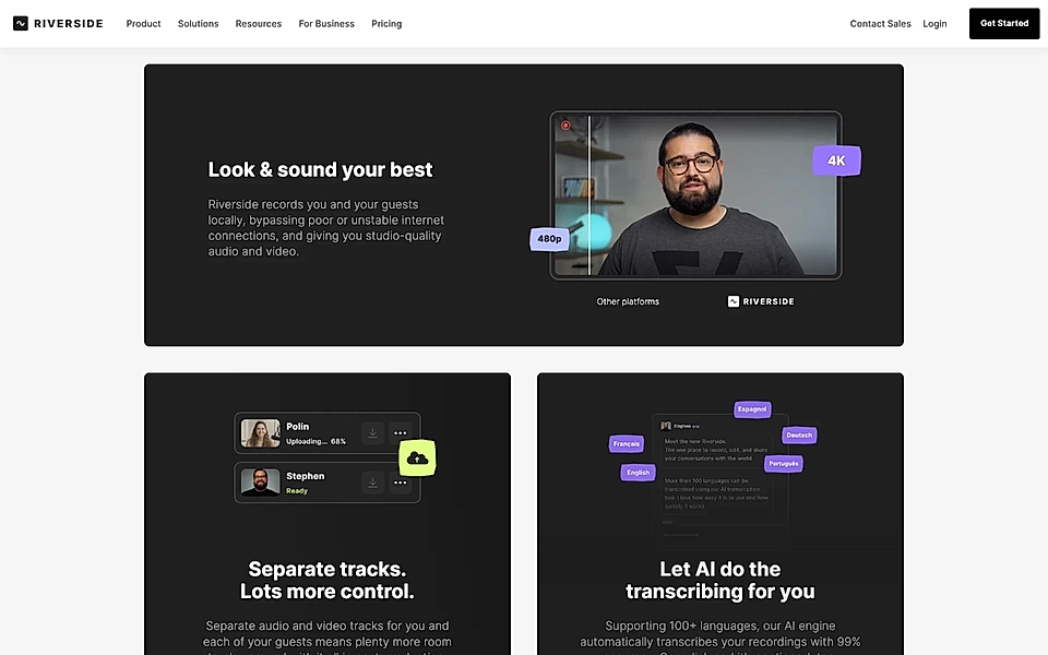
For example, Riverside, a podcast and video editing software, follows this approach with the title ‘Look & sound your best’, followed by a concrete explanation of how and why the software delivers the promise.
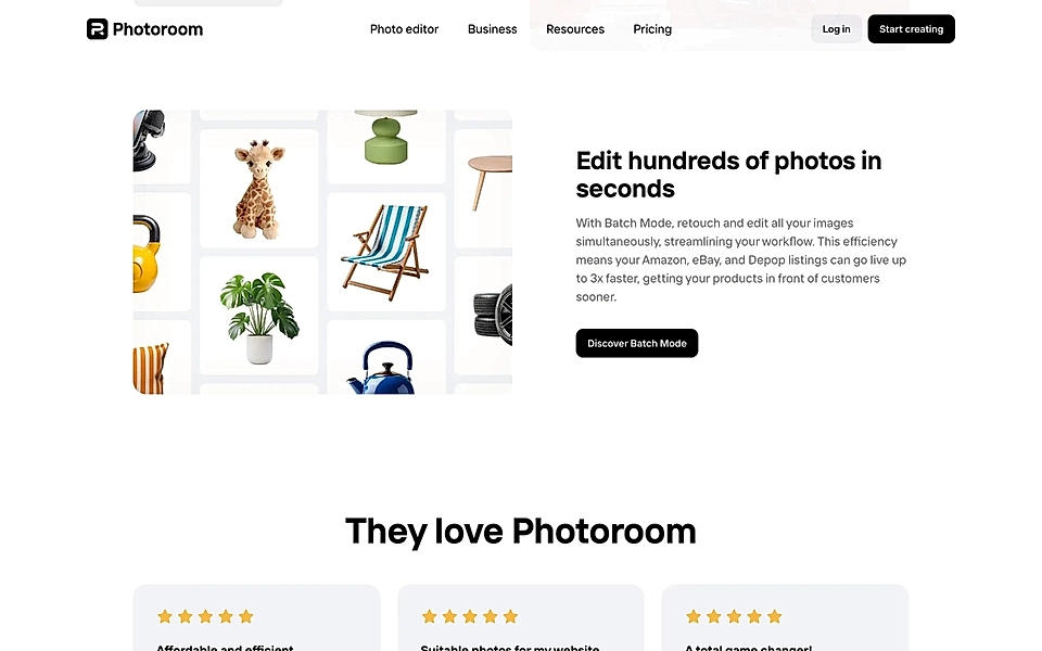
Another example is Photoroom’s ‘Edit hundreds of photos in seconds’, which communicates both the speed (benefit) and the key feature (process large batches).
Does your SaaS team struggle with creating landing pages? With LandingRabbit, you get help in planning the best possible page structure and content. Sign up for our 14-day free trial today and publish SaaS landing pages without the back-and-forth and guesswork.
4. Social proof
Social proof comes in many formats: case studies, reviews, quotes, social media posts, etc., and a social proof element on your landing page helps build trust and increase conversion rates.
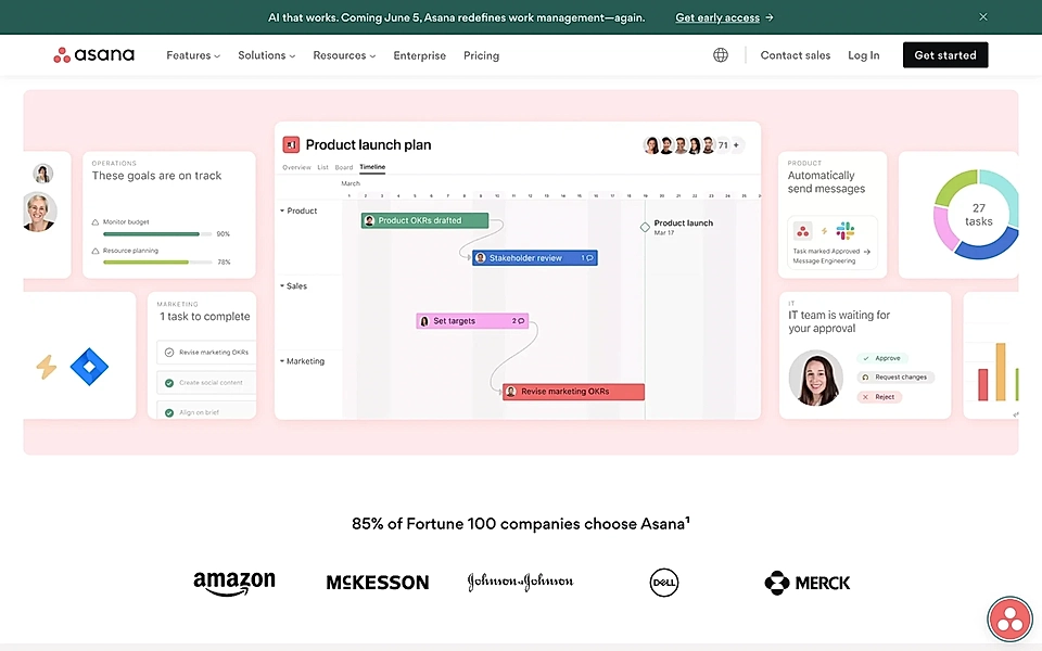
One recommended method is to add social proof early on the page. If you are running an enterprise SaaS like Asana, you would probably show the most prominent logos.
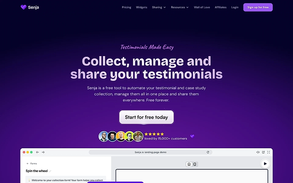
But if your SaaS serves, for example, individual creators, Senja’s hero with ‘loved by 15,000+ customers’, combined with a visualization of five stars and real customer avatars, is a fantastic example to follow.
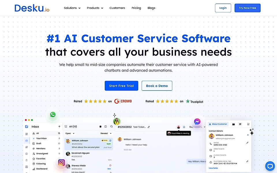
A third option is to look at Desku’s strategy and show ratings from trusted, well-known services like Trustpilot and G2. While this strategy is sometimes criticized because you can see it everywhere, as a software buyer, I find it helpful to know that I can look for reviews from the usual services.
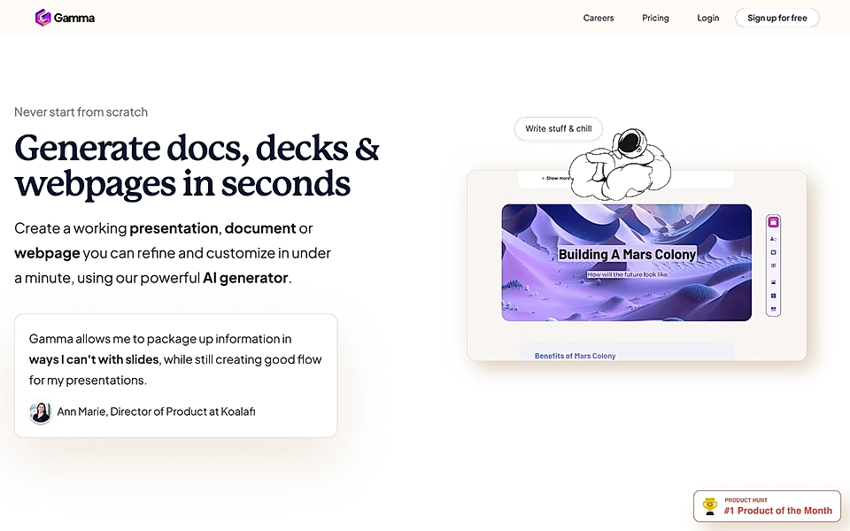
Finally, testimonials and customer quotes can be very powerful – as long as they relate to the context and problem, benefits, and features you discuss on the page. Gamma’s website does an excellent job of showing a testimonial matching each benefit.
5. FAQ
So far, your customers have seen the who, what, and why in the hero, a powerful problem statement, features linked to benefits, and social proof, but some visitors will still hesitate. No SaaS landing page copy text can answer all questions prospects might have.
That’s where the FAQ section comes in. In a concise format, you’ll be able to add a lot of valuable information and handle the most common objections.
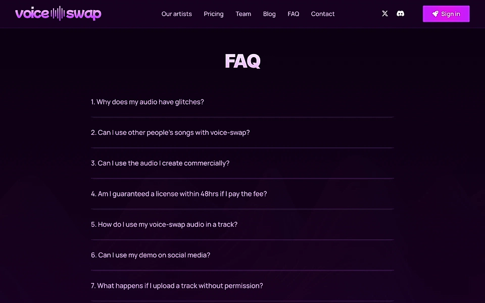
VoiceSwap’s FAQ is a great example of how to answer the most common questions.
6. CTA
Last but not least is the CTA element. Obviously, the CTA is present in the hero and sticky navigation, but the area just before the footer is your last chance to grab the visitor’s attention.
You can approach this part from two different angles:
- Consider it your last chance to convince a visitor to sign up and use a single CTA throughout the page. If they don’t sign up, you’ll have a lot of work to do to get them to revisit.
- Add a secondary, softer CTA asking visitors to “Subscribe to our newsletter” or “Download our lead magnet”. You might have a higher chance of getting a revisit.
What’s the right approach depends on the SaaS offering that you are selling.
As a rule of thumb, I’d say that the lower the average customer value, the more likely it is that one call-to-action throughout the page serves its purpose better.
I’d consider a softer approach at the end of the page for higher ticket values. If the B2B SaaS website visitor isn’t ready to sign up or book a call with you, you might try to give them something valuable in exchange for an email address and keep nurturing them with informational content in the coming weeks and months.
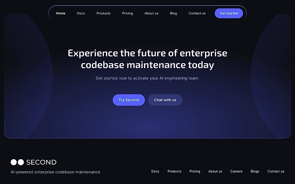
I like how Second, an AI-powered codebase maintenance tool, has added a 'Chat with us' button as the softer call-to-action.
Conclusion
The six key components – hero, problem and benefits, features, social proof, FAQ, and CTA – are all you need for your next landing page project.
You can, for example, add a section featuring your latest blog posts and news, but keep in mind that each element potentially diverting user’s attention from your primary goal comes with a risk. “Keep it simple” is advice that doesn’t have an expiry date.
Are you looking to create landing pages but unsure where to start?
With LandingRabbit, you get help in planning the best possible page structure and content.Sign up for our 14-day free trial today and publish SaaS landing pages without the back-and-forth and guesswork.