Why we chose this SaaS landing page example
Recently, I’ve thought a lot about what makes a certain SaaS app different and how your SaaS website messaging can stand out from the crowd.
And not just be different for the sake of it, but make sure your page visitors can tell why they should choose your service over competitors.
In the past few years, Figma has started transitioning from a designer tool to a project management tool. Design files allow interactions and commenting, Figjam is built for teams to collaborate, Slides help designers and marketers present ideas – and much more.
What’s the reason for this direction? It’s the pressure for VC-backed companies to find their second big thing and become a tool for everyone in the organisation. More user seats, more revenues.
And that’s what Sketch can attack.
The attack starts in the hero section with a sentence, ‘We’re not a do-everything product. We’re a toolkit made by designers, for designers.'
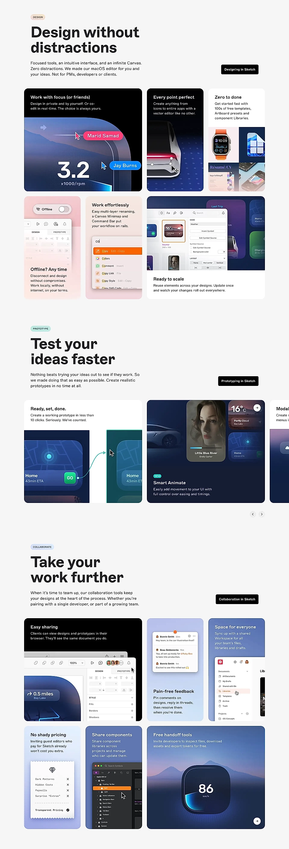
And when you scroll a bit further, the features section continues the same story. ‘Zero distractions. We made our macOS editor for you and your ideas. Not for PMs, developers or clients.’
It’s a direct attack against the main competitor and targets users who are frustrated with Figma’s current direction.
If you scroll a bit further, you’ll find a copy text saying, ‘No shady pricing. Inviting guest editors who pay for Sketch already won’t cost you extra.’
It addresses the current frustration with Figma’s pricing. Even if someone has a Figma license with their organisation, you’ll need to pay extra to get someone outside your organisation to join your file. It’s madness for agencies that might collaborate with hundreds of clients.
Finally, ‘Free handoff tools. Invite developers to inspect files, download assets, and export tokens for free.’ tackles the third frustration. In Figma, you’ll need to pay extra for the Dev Mode seat, which allows your team members to export designers' work.
The copy and content, in general, are just like you’d expect a SaaS product features section to be: very benefits-heavy but carefully explaining how you get the outcome with Sketch’s features.
But what makes this features section special is the clear point of view and attack against the main competitor. If the page visitor is thinking about switching, Sketch’s page makes sure the key differences won’t be unclear.
What’s Sketch?
Sketch is designed for UI/UX designers and creative teams who use tools like Figma or Adobe XD but find limitations with prototyping, collaboration, or component sharing. Sketch offers a powerful, design-focused platform with vector editing, real-time collaboration, and smooth developer handoff. Key features include a macOS-native design editor, component libraries, prototyping tools, and options for collaborative feedback. This streamlines design workflows, enables rapid iteration, and boosts team collaboration.