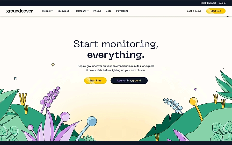
Why we chose this SaaS landing page example
The call-to-action section is one of the most important elements of the SaaS product landing page. Depending on the page's goal, it might drive users to a free trial, book a call, or visit another page. However, the purpose is the same: keep the users who have already read your copy engaged with your SaaS page.
The best SaaS websites decide on the call-to-action buttons based on customer knowledge and user intent. On Groundcover’s homepage, the CTA section has two buttons: ‘Start free’ and ‘Launch Playground’.
That’s no coincidence.
Many customers are not immediately ready to sign up and invest time in testing your SaaS – especially if your SaaS requires quite a bit of set up work to get started.
Also, applications in which users might need to connect their databases and give access to non-public data might need approvals from other team members and security officers.
That’s why Groundcover’s secondary CTA leading to ‘Playground’ allows anyone to see how the platform works with mockup data – it should lower the barrier for signing up and getting users’ data integrated for proper test.
As you can see, call-to-action sections are not just a tagline and buttons. The CTA section should be optimized based on your SaaS acquisition strategy and all the information you have about your ideal customers.
What’s Groundcover?
Groundcover is built for DevOps and site reliability engineers who currently rely on open-source tools like Prometheus or Grafana but face challenges with complex setups, high costs, and scalability issues. Groundcover offers a next-gen observability platform powered by eBPF technology, providing zero-code instrumentation and full-stack visibility across Kubernetes environments. Key features include instant log, metric, and trace collection, in-cluster data storage, and a flat pricing model. This helps lower monitoring costs, speed up troubleshooting, and ensure complete cloud observability.