Graphy: Problem
Why we chose this SaaS landing page example
When you land on a SaaS website and read the hero texts, you might sometimes ask yourself, “Do I really need this tool to replace my current stack?”. Perhaps your tools are not perfect, but you’ve learned workarounds to make your life easier.
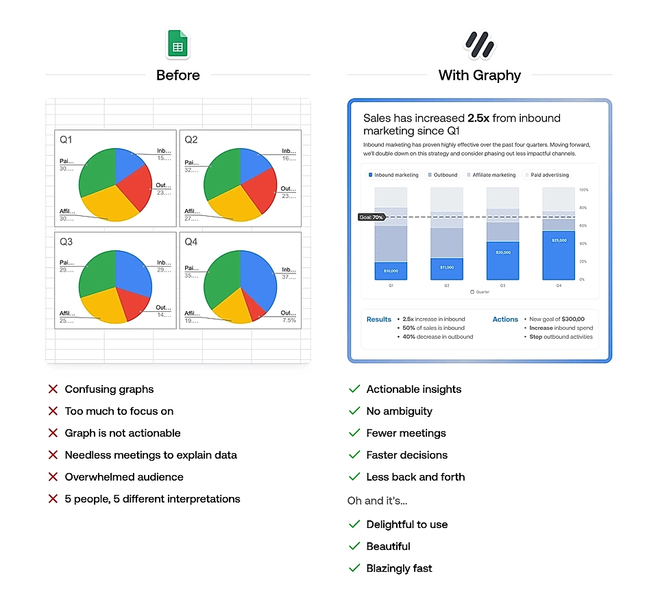
That’s when a problem section just after the hero might help your SaaS landing page convert more visitors. On Graphy’s page, the problem section explains that graphs created with Excel and Google Sheets might not be clear and that additional meetings are needed to go through them. On the left, the page visitor can see what life will look like after using Graphy.
You shouldn’t ever expect page visitors to connect the dots for you. Attention spans are short, and the before/after element like this can be a powerful tool for making sure that users understand the difference between their current workarounds and your solution.
If you are looking for another example with a before/after element, check Paperbox’s problem section.
What’s Graphy?
Graphy is made for data-driven teams who rely on tools like Excel or Google Sheets but find it challenging to quickly create graphs that are both useful and visually appealing. Graphy makes data visualization easier by generating interactive, eye-catching graphs and offering AI-powered insights. Its key features include AI-generated charts, annotations, trend lines, Google Sheets integration, and collaboration tools. This helps teams create reports faster, cut down on miscommunication, and make better decisions based on clear insights.