Why we chose this SaaS landing page example?
Let me start by saying that this one isn’t the most typical hero I’ve featured in our SaaS landing page examples.
But Senja isn’t the most typical business either.
It’s a platform that helps creators collect testimonials in text, images, videos, social media posts, and more.
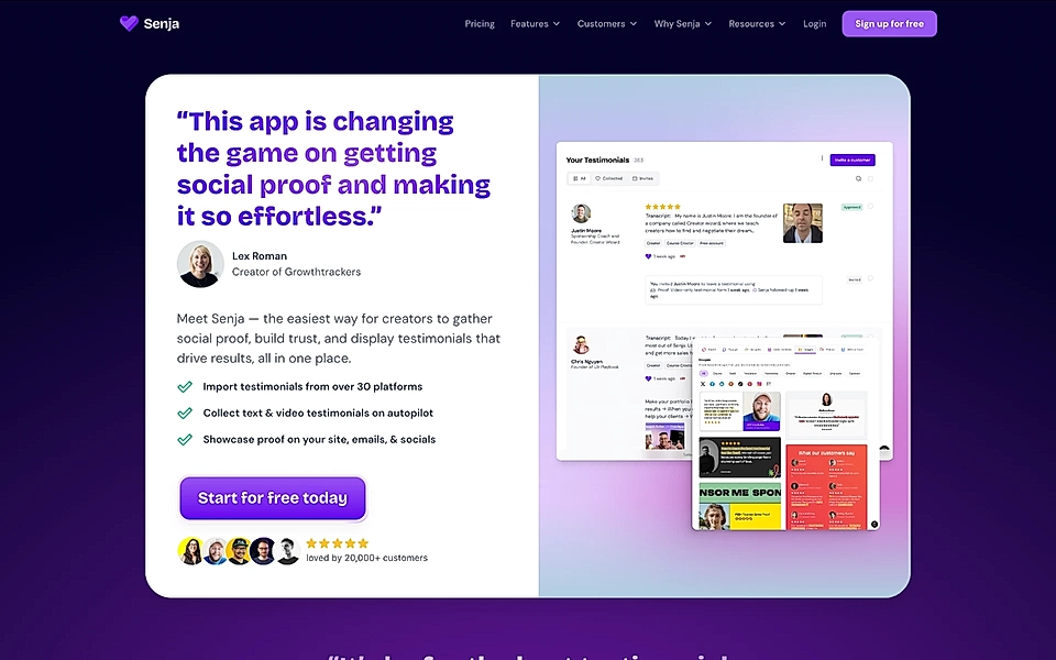
And what is the only option for the main tagline? A testimonial, obviously!
If you’ve explored more examples on our website, you might have read about Slite and its homepage, which is full of testimonials. Senja puts up a fight to win the "highest amount of social proof trophy" by placing a testimonial at the very beginning of the page. It’s hard to beat that.
I wouldn’t necessarily recommend this tactic to other SaaS companies, but given the context, it feels genius.
The hero section has all the other success elements, too:
- Explains who the platform is for and why creators use it.
- Uses bullet points to list some of the key features.
- Images on the right give an idea of the app’s functionalities.
- The CTA button is actionable and lowers the barrier by saying it’s free to get started.
- Additional social proof with 20,000+ customers and a few well-known creators build trust.
I’d consider moving visuals underneath the texts to show more about the product, but overall, this is a perfect example of how heroes can (and probably should) reflect your business.
What’s Senja?
Senja is designed for marketers, creators, and e-commerce teams that collect testimonials manually or use tools like Testimonial.to but struggle with organizing, showcasing, and using testimonials effectively. Senja makes it easy to collect, manage, and display testimonials with automated text and video gathering, customizable galleries, and multi-platform sharing. Key features include testimonial imports, sentiment analysis, “Walls of Love,” and no-code embeds for websites and social media. This helps teams build trust, boost conversions, and streamline social proof management.