How to create a helpful SaaS competitor comparison page
When I mention competitor comparison pages, many people say they are useless and full of lies.
And I can’t blame them.
I’ve witnessed the low quality both as a SaaS buyer researching products and as a SaaS marketer looking at what our competitors do. I think one of my competitors had 30 misleading points on a single landing page, including features they could not deliver themselves due to third-party restrictions.
But competitor comparison pages that are done right are extremely helpful and high-performing.
The fact that others are doing them wrong should not stop you from writing them for your SaaS. Quite the opposite, the competition is low, and you can stand out by writing a page that really answers customers’ questions and hesitations.
In this blog post, I’m going to share the three points I think your competitor comparison pages should get across, what a high-performing page looks like, and how to create one.
Three points your SaaS competitor comparison pages should get across
When you really think about it, the recipe for the best possible page is very simple.
Just like any other high-performing SaaS landing page, you just need to do the hard thing and imagine yourself in your prospect’s shoes. What would help them to make the right choice?
When I’m researching for a SaaS service to buy, I know I’m going to test at least a few services (if the trial is available). But that might happen later once I‘ve found the right candidates.
There are three points that I’d like your competitor comparison pages to deliver:
- At least one really important reason why you.
- What type of customers benefit the most, and are they like me.
- Social proof that confirms the two points above.
I really don’t need a list of features that might not be even relevant to me. Right now, I’m just looking to establish if I’m the right prospect and what the key differences are between you and the competitor.
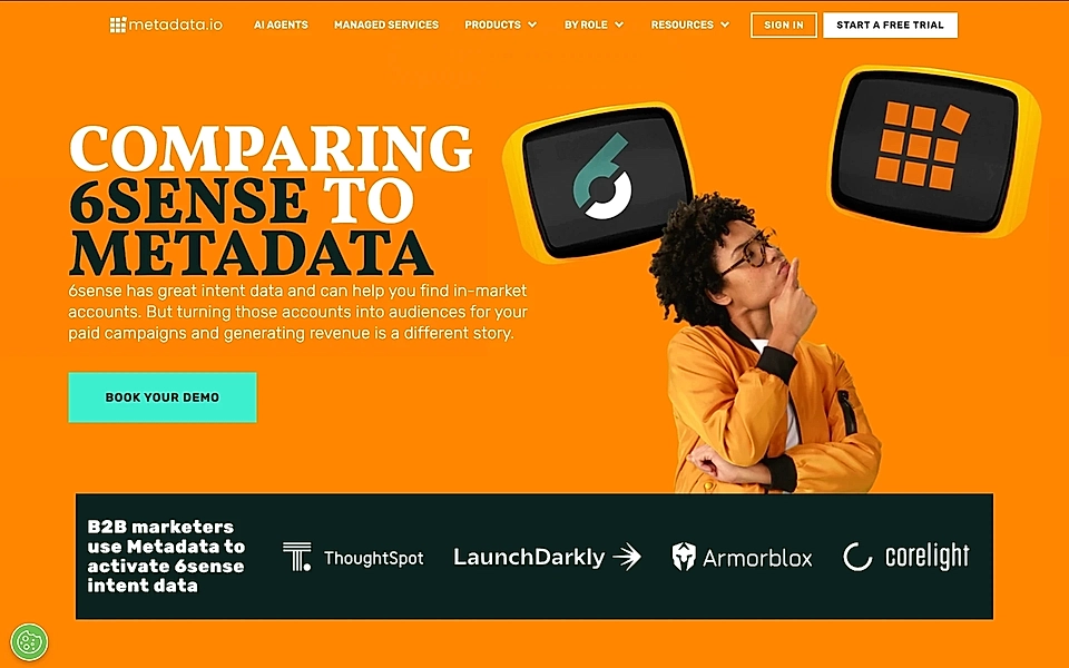
SaaS competitor comparison page example
Most SaaS competitor comparison pages come with a table and a list of features. Usually, the green checkmarks are on your app’s side, while the red cross marks land on the competitor’s side.
I’m not fully against adding a table, but it can lead your content creation efforts in the wrong direction.
Let’s take a look at a competitor comparison page example from ClickUp. Their competitor comparison page against Monday has a 17-point list of features and capabilities.
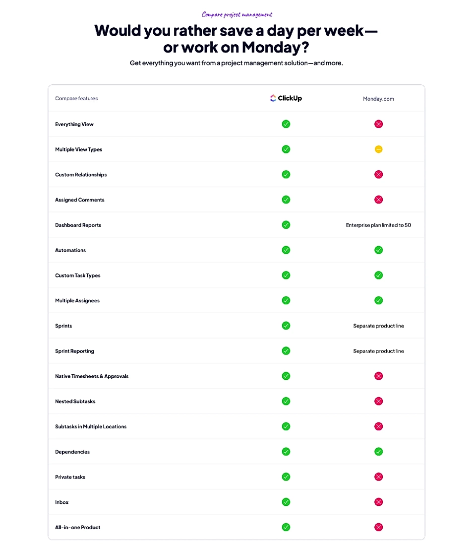
Custom Relationships, Nested Subtasks, Inbox, All-in-one Product etc. – what do they tell you as a prospect looking at the table?
Nothing.
I doubt there’s ever been a person looking at the table and making their mind based on it.
When you are reading a competitor comparison page, you are not there to compare each feature. Without testing both products, you don’t even know if you need them at all.
Instead, you want to understand the true, profound differences between the tools and how they fit into your workflow.
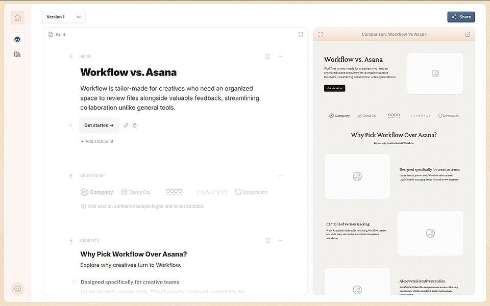
A much better SaaS competitor comparison page could look like this example:

Instead of listing features, a more powerful layout discusses the reasons why customers choose your application and who the right kind is. That’s what we care about.
Are you planning a SaaS competitor comparison page right now? LandingRabbit can help. Sign up for our 14-day free trial and get your first competitor comparison pages created today.
How to create a SaaS competitor comparison page with AI
How do you create a page like the one above?
I’m going to use LandingRabbit for this task, but you can replicate parts of the process with other AI tools.
The first step is to analyse the key differences between your SaaS application and the competitor. You can use AI for help, but you probably need to do some manual investigation and try the app if it’s available for trial.
Next, list the key reasons why a customer should choose you.
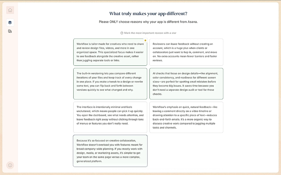
I’m not an expert user of Workflow, but the reasons look pretty convincing to me.
Next, I’ll create a page brief. Again, LandingRabbit helps me to compile one by using AI and the data we’ve provided, but you can create a similar plan in Miro or another visual task planning tool.
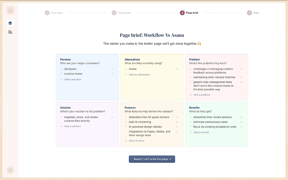
Creating a proper plan really helps later.
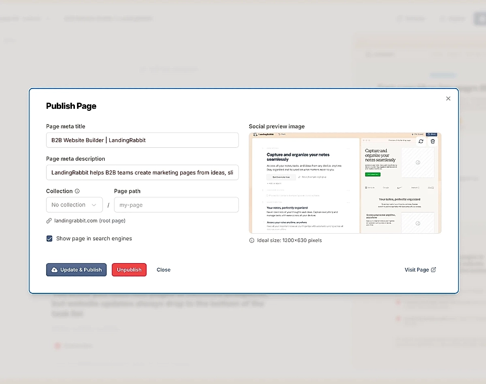
The final step is to write, visualise, and publish the page.
That’s where LandingRabbit saves a lot of time, and this step might take quite some time for you to complete otherwise.
In the Google Docs-like editor, I can edit the AI-generated content, finalise the page layout, and then publish the page.
Creating competitor comparison pages isn’t a one-off task, though. In the future, both you and the competitor develop – potentially in different directions. The market might change, too. Keeping the page up-to-date and A/B testing versions is as important as the initial work.
Are you looking to create competitor comparison pages for your SaaS? With LandingRabbit, you can be confident that your page plan is solid and the content resonates with your audience. Sign up for our 14-day free trial today.